our 1927 bathroom restoration with true value

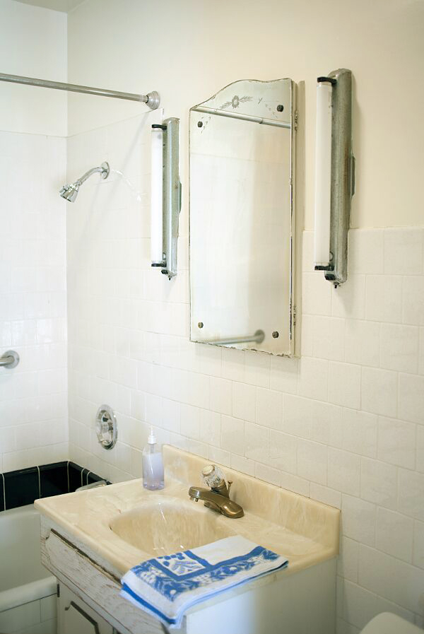
Since our one really big renovation last year, I haven’t had a whole lot to share about the house. We’ve mostly just been enjoying the space and keeping things mellow. But the one space we haven’t been enjoying? THE BATHROOM. It was the one really big, glaring project that didn’t get done last year despite the fact that our little vanity was literally falling apart, our bathtub was pitted beyond belief, and the window was… well, nonexistent. Our house was built in 1927 and even though it may be small, it’s always been big on charm. Except for the bathroom. And we only have one bathroom in the house! It had one unfortunate remodel somewhere around 1967 in which almost all of the original vintage features were removed and all that was left was a very hideous faux marble (?) sink and the persistent smell of old people. Literally. No matter how many times we cleaned, you’d always get the strongest waft of powdery perfume and mildew when you opened the cabinet door or the medicine cabinet. No, we weren’t living in squalor, but it was definitely creepy. A gross. And time for a change.

It’s always been my dream to restore this little house to it’s former 1920s glory. And I’ve always had some pretty strong ideas about what I’d like to do with the bathroom. I did a ton of research on vintage bathrooms from the time period and really wanted to go as historically accurate as possible while still, of course, acknowledging that we do live in modern times. I could write an entire post dedicated purely to all of the little details (and I probably will), but it’s not nearly as much fun as talking about (drumroll, please…) PAINT. I’m not kidding! It’s so funny, but of all the decisions that I had to make about this little bathroom, the paint color was definitely the most debated topic. For those of you who followed along on my Instagram stories, you’ll know what I’m talking about!

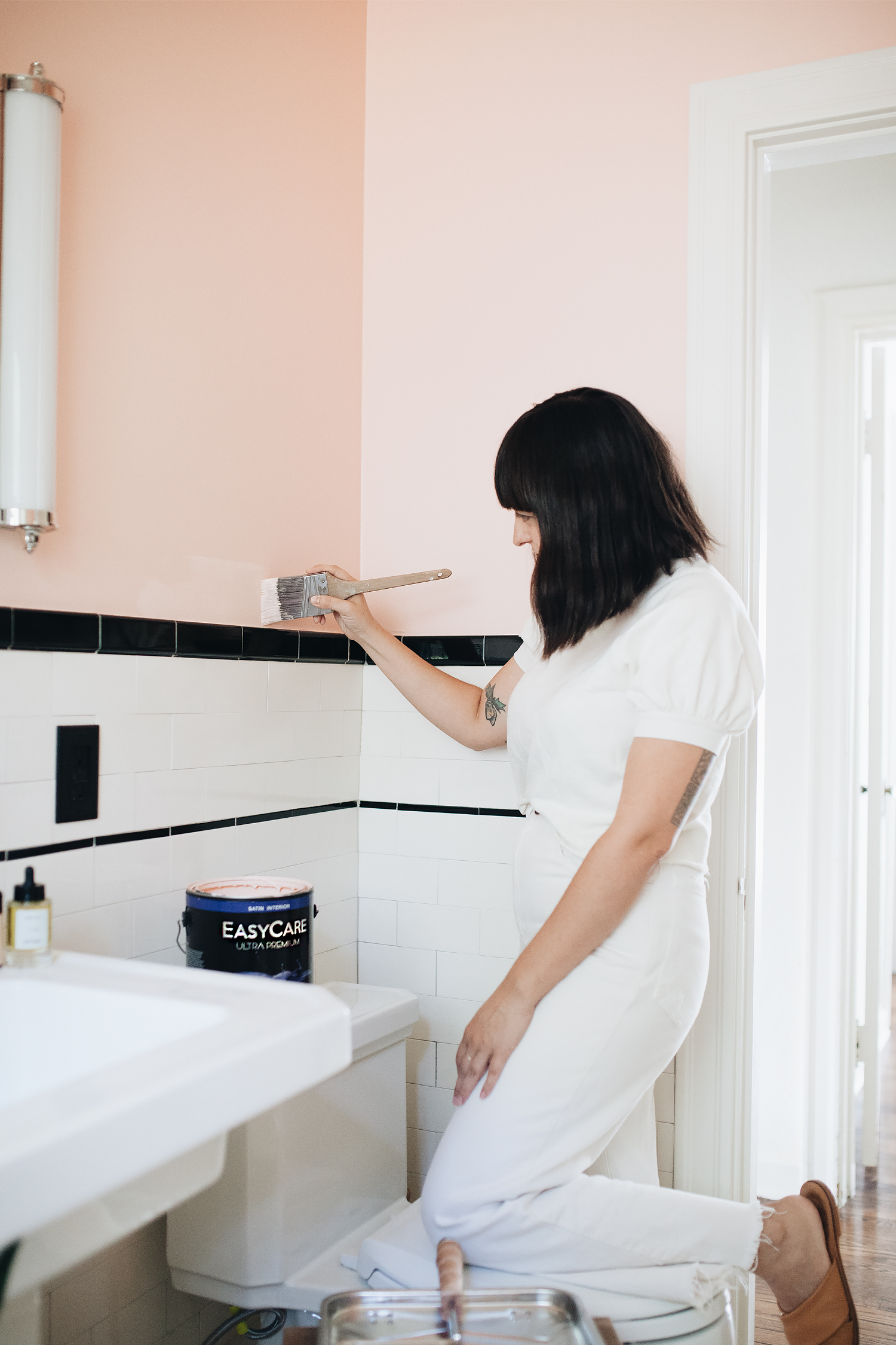
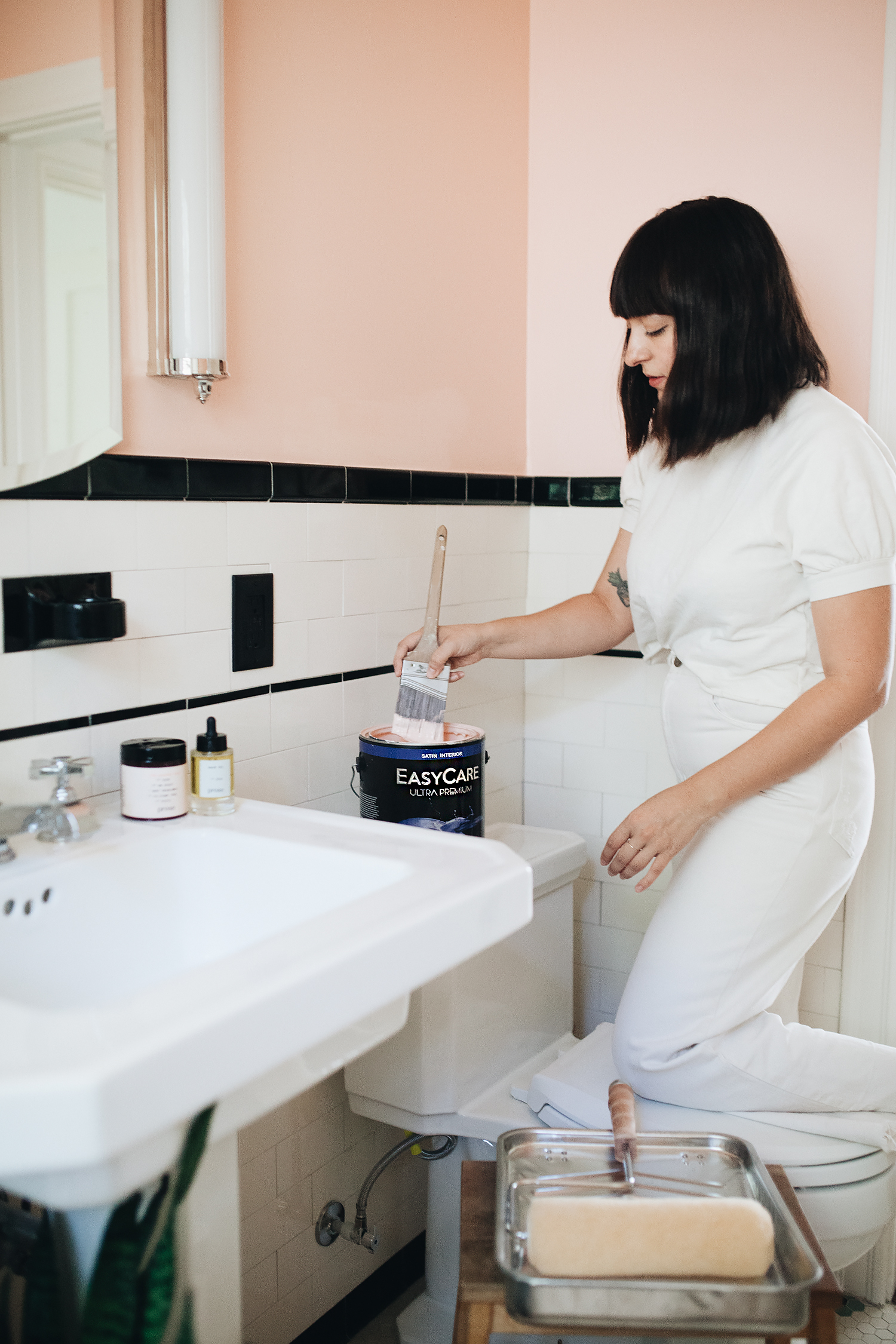
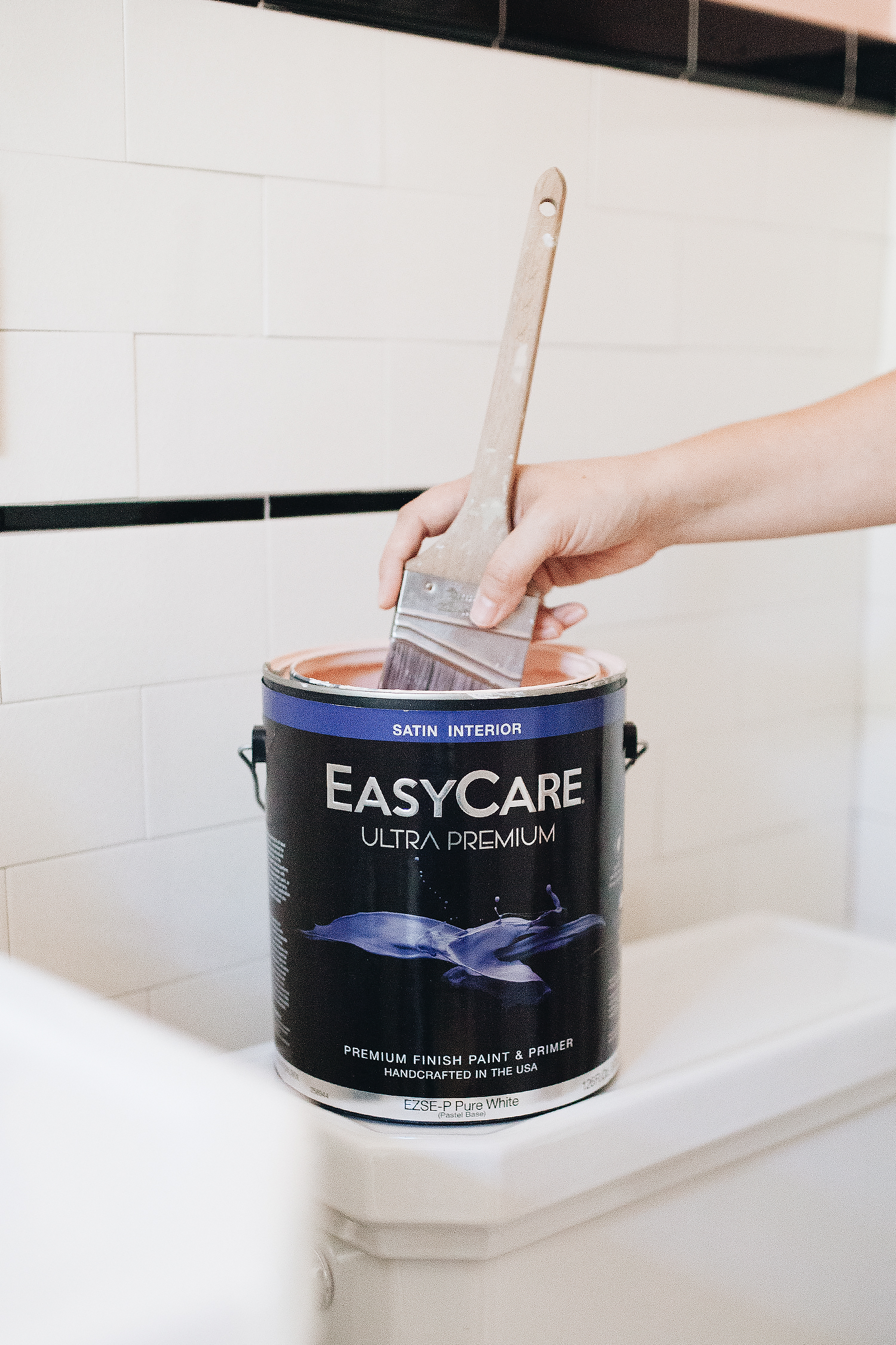
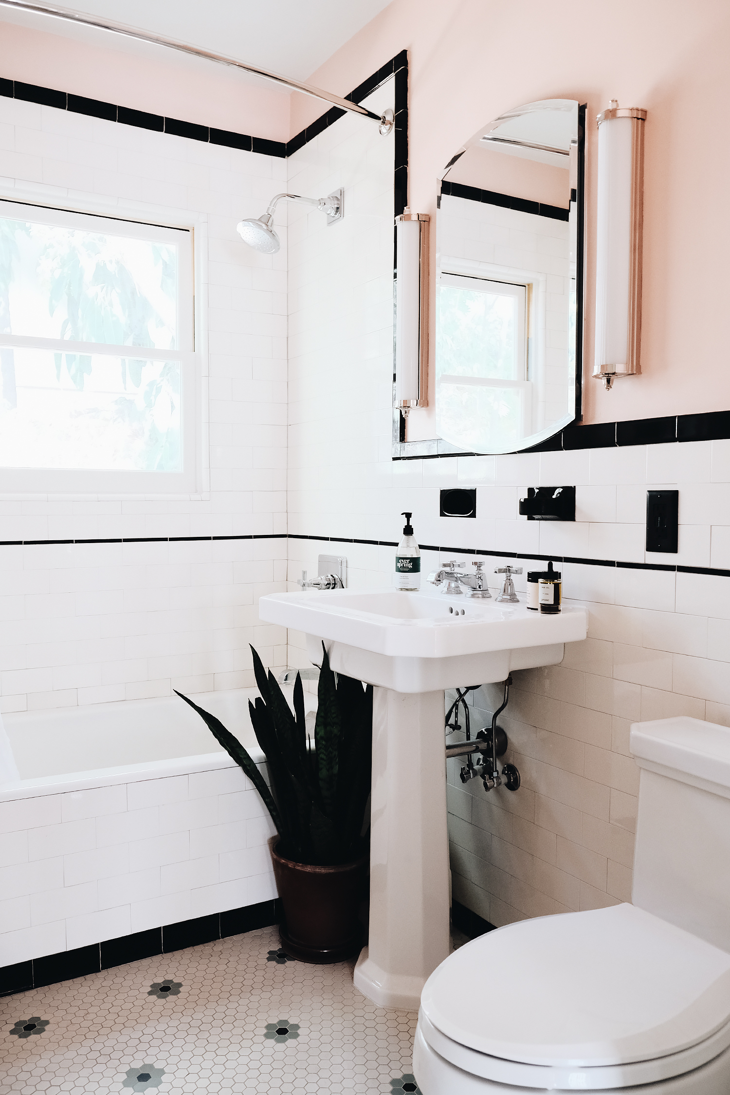
The bathroom itself is fairly simple. I went with an antique white subway tile and black accent details with just a little splash of green in the daisy pattern mosaic tiles on the floor, so we started with a nearly neutral base. I really enjoy designing this way because it means you really can’t go wrong with just about any color palette you choose for decorating. And even though changing the paint color is a lot easier than pulling out all of your tiles, it still manages to become one of the hardest decisions to make! Perhaps because it’s one of those final decisions. The color that finishes off the design and really pulls the room together. After comparing various brands, I decided to work with True Value’s EasyCare Ultra Premium Paint, which is known for their long lasting and superior products! I was quickly able to narrow it down to three options: a bold mustard (EasyCare Paint SUNBATH), a unique green (EasyCare Paint PARSLEY ROOT), and a soft pink (EasyCare Paint ROSE QUARTZ). Despite being my favorite color of the bunch, I could tell as soon as I swatched the mustard that it wasn’t going to work for the tiny space. Still, you always have to try something really out-of-the box because you never know until you get it up on the walls. But then it came down to team green vs. team pink. Do I echo the color of the floor tiles on the walls? Or do a bit of complimentary pink to balance it out?

In the end, I went with my gut. The kids were both taking a bath and singing and playing. I sat there watching them with three little swatches painted on the wall above them and just chose what jumped out at me in that very moment. Something about the pink just felt so fun and cheerful for a period bathroom. Using the EasyCare Paint Color Gallery, I explored the pink options and in the end, I landed on THE COLOR:  EasyCare Paint GLEE, in the Interior Satin finish. (Also available in flat, eggshell, semi-gloss, and gloss sheens for both interior and exterior applications, btw.)

I’ve been a fan of EasyCare Paint since I worked with the brand to find the perfect neutral yet complex white for our living room and fireplace. It’s become my go-to paint around the house, so I was really excited about this project because I knew I wanted to have some fun playing with COLOR. And it’s super easy to use because it’s a paint-and-primer in one that offers durability, smooth application, impeccable finish, and rich color. It has superior stain resistance and delivers long lasting color and performance which is especially important for a bathroom that has to endure tons of moisture and plenty of wear and tear, particularly when you’ve got two little kids! And most importantly for them, it’s low-odor, low-VOC, and certified by the Asthma and Allergy Foundation of America. It minimizes irritants and pollutants in the air, creating a healthier indoor environment for your whole family in a range of colors to suit literally everyone. Picking a color is literally the hardest part, and they even make that easy.

Available at True Value stores nationwide and many independent paint and hardware retailers. Visit the Store Locator on EasyCarePaint.com to find a retailer near you.
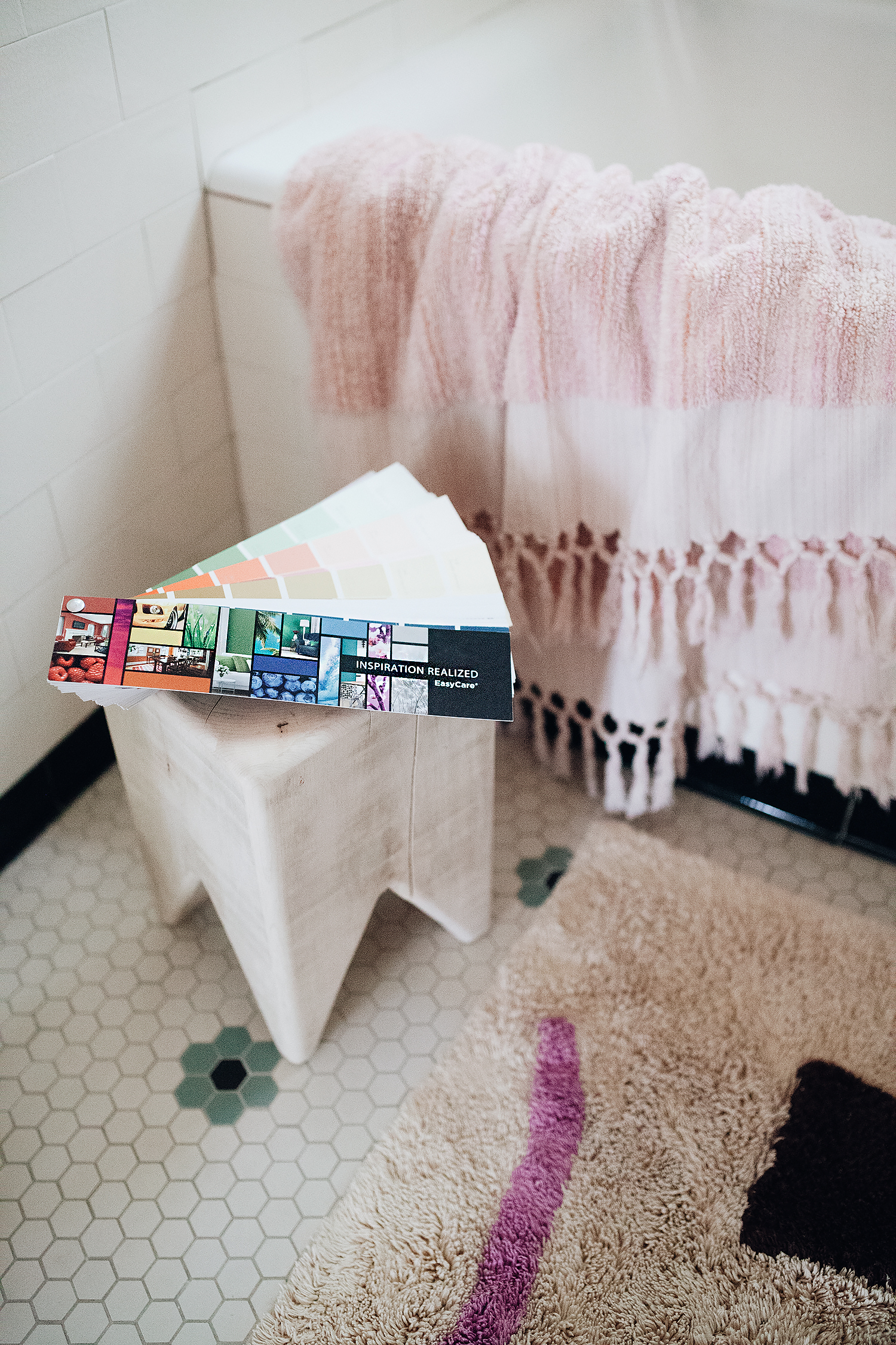

I used the fan deck to get an idea of what colors to swatch, comparing against some of the tile and decor
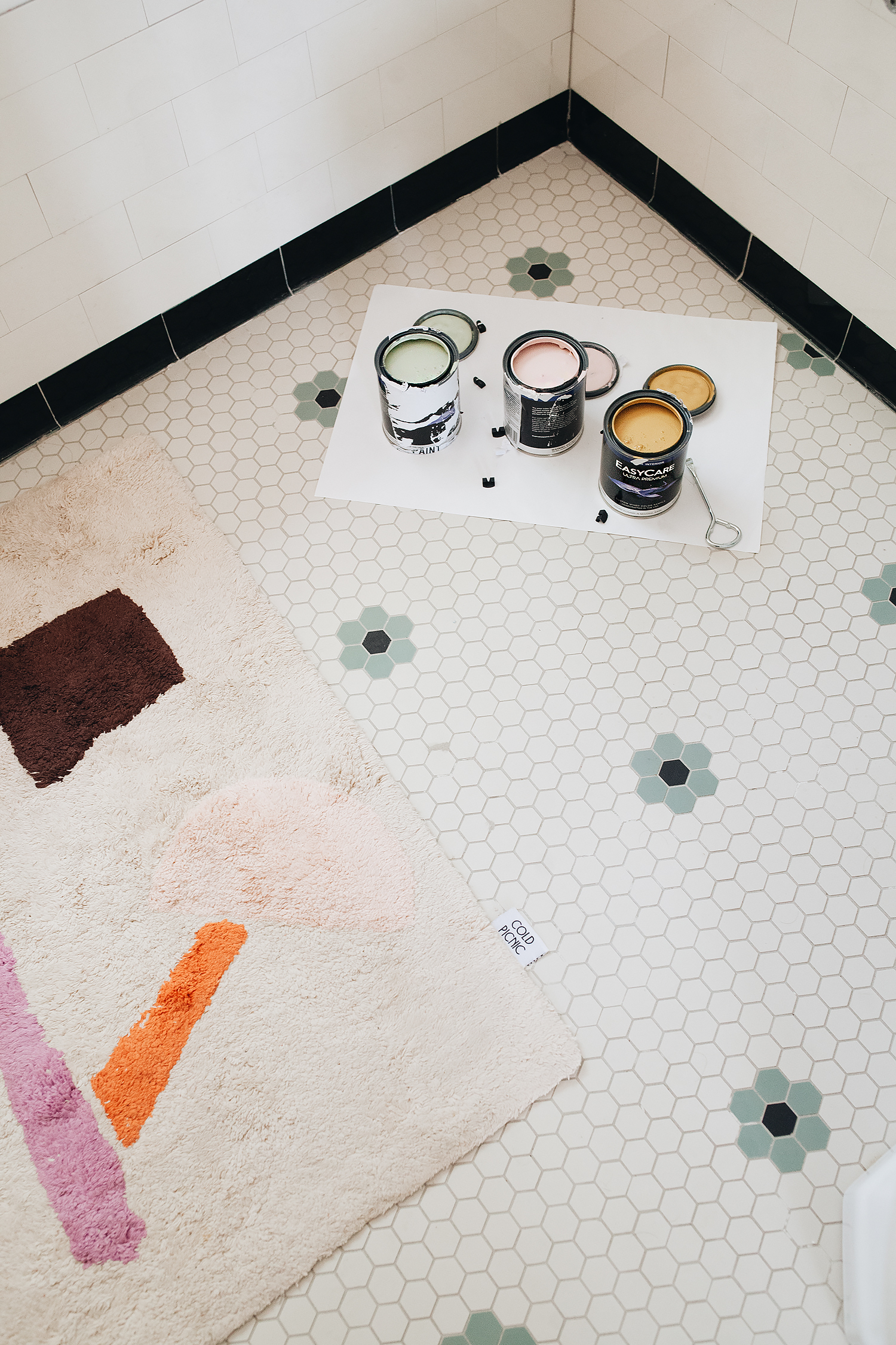

Ready to sample swatches!
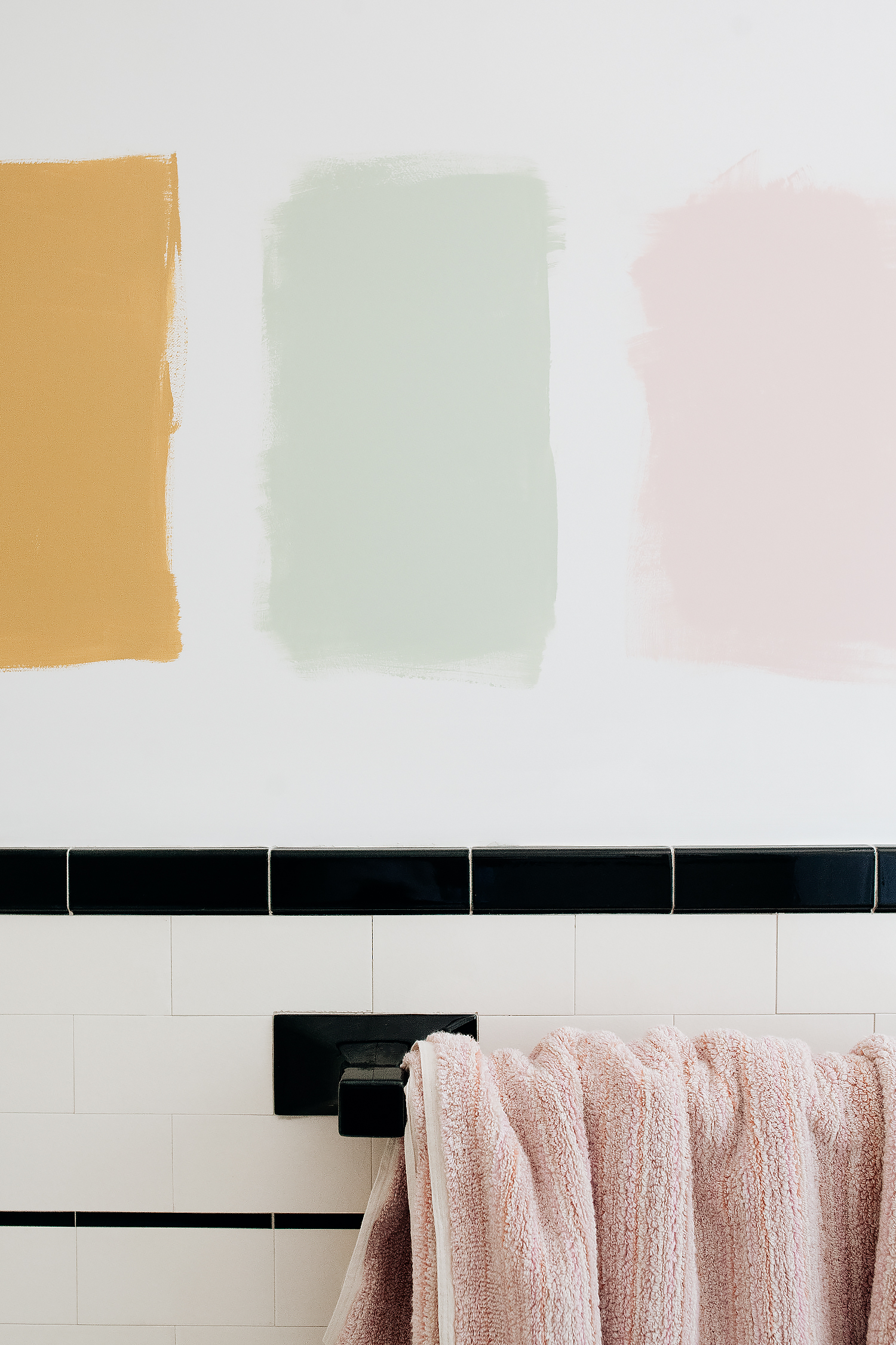

Are you team mustard, team green, or team pink?
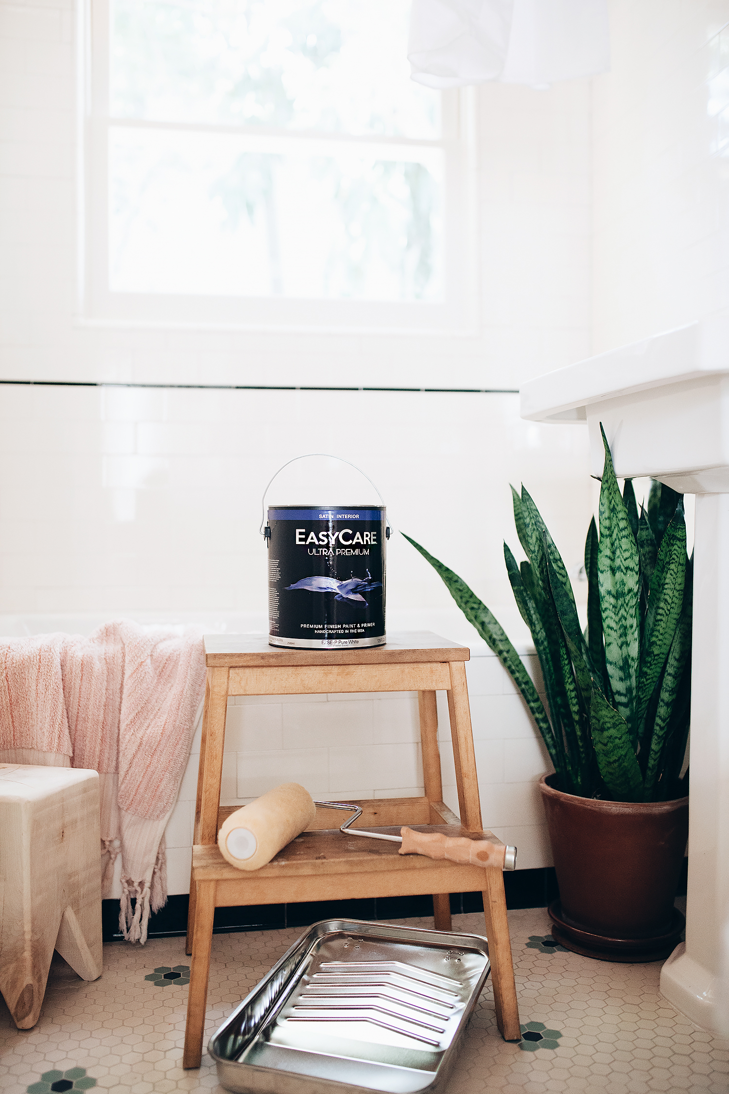

Drumroll, please…


Just doing the final touch-ups to the room with the winning shade: EasyCare Paint GLEE

THE BEFORE:
AND AFTER:
This post was sponsored by True Value and EasyCare Paint. 

woven play

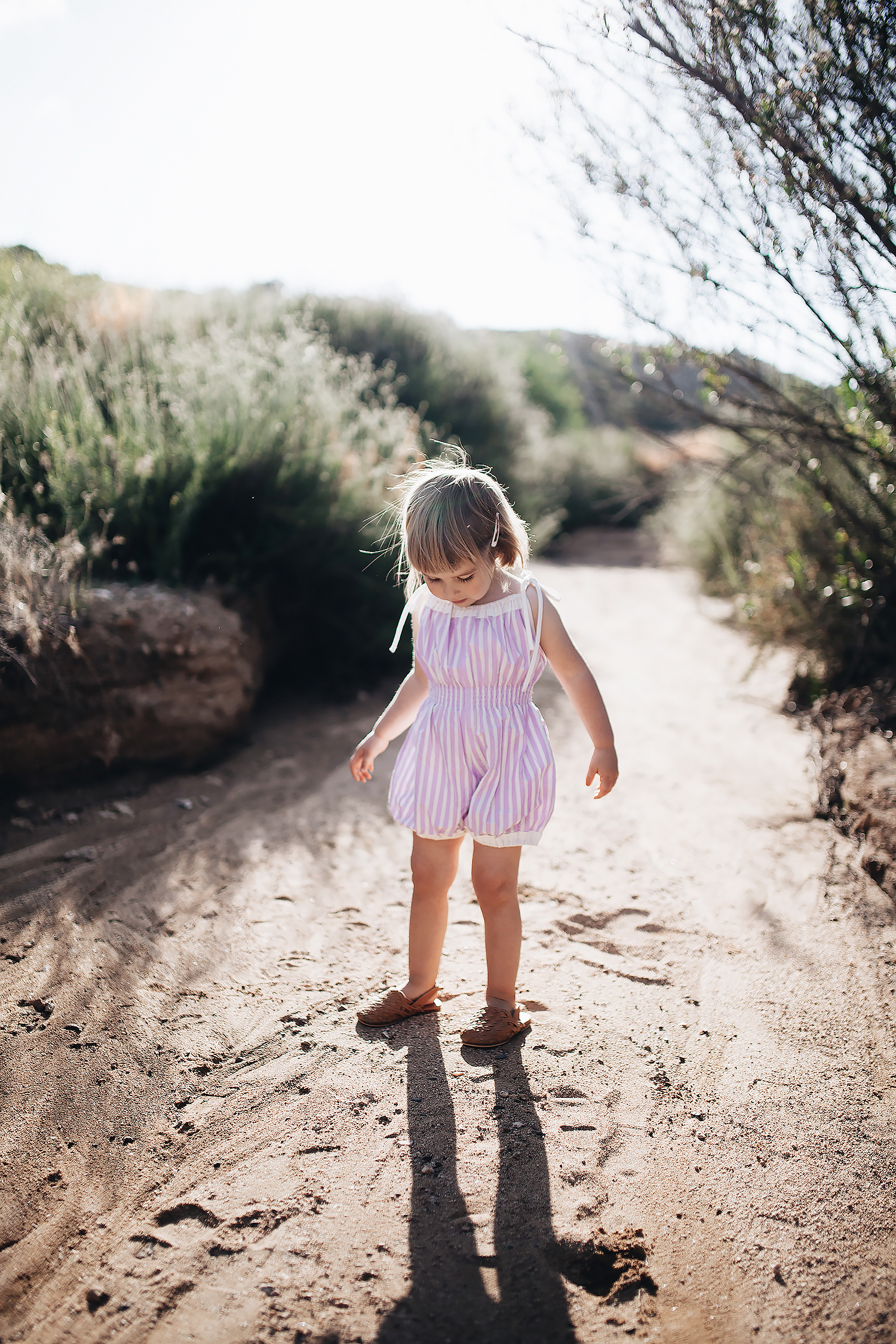
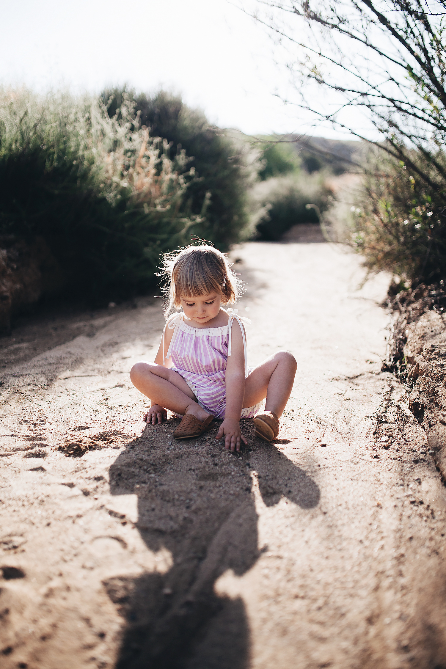
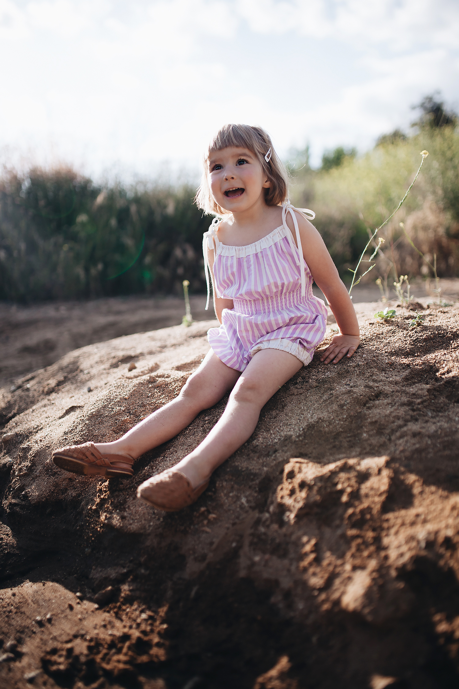
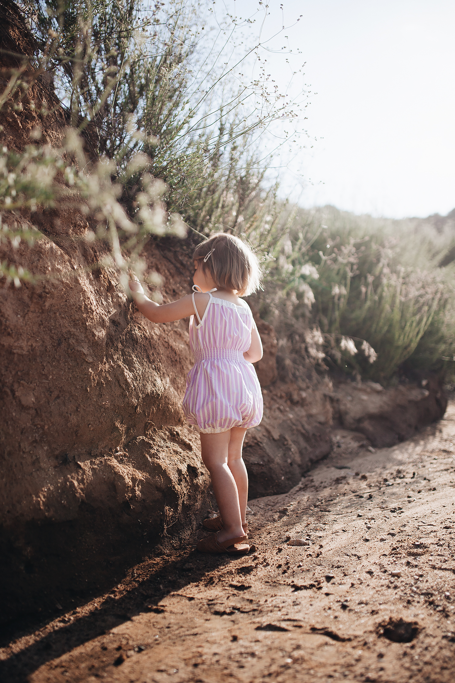
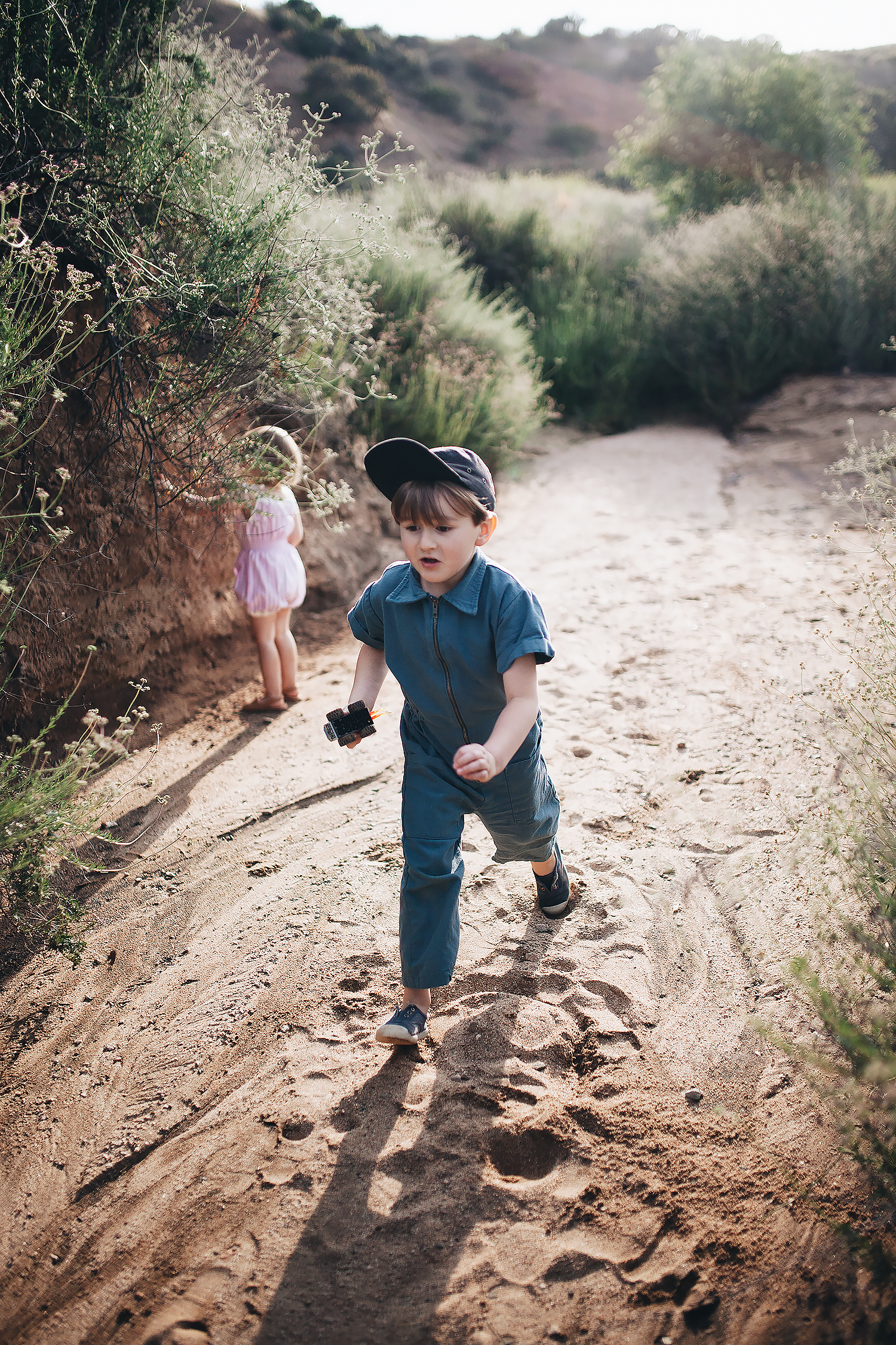
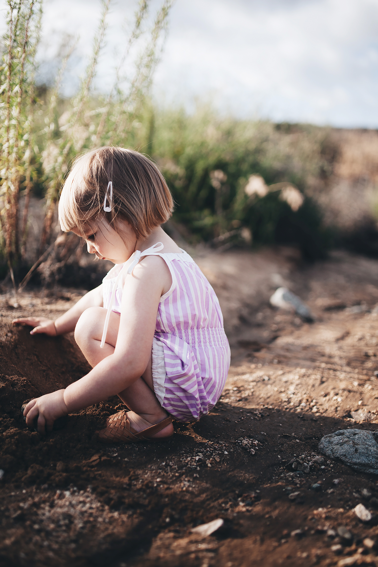
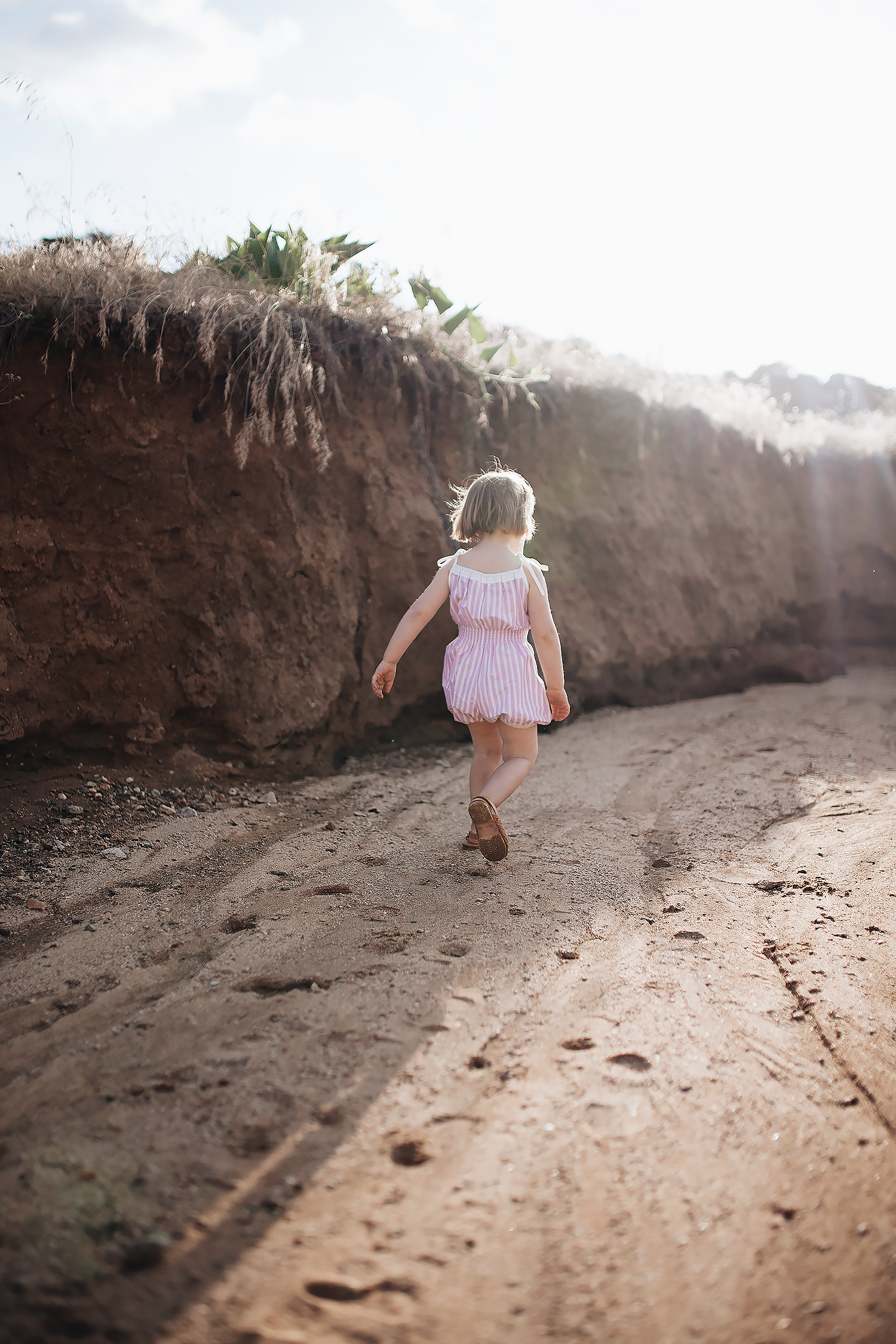
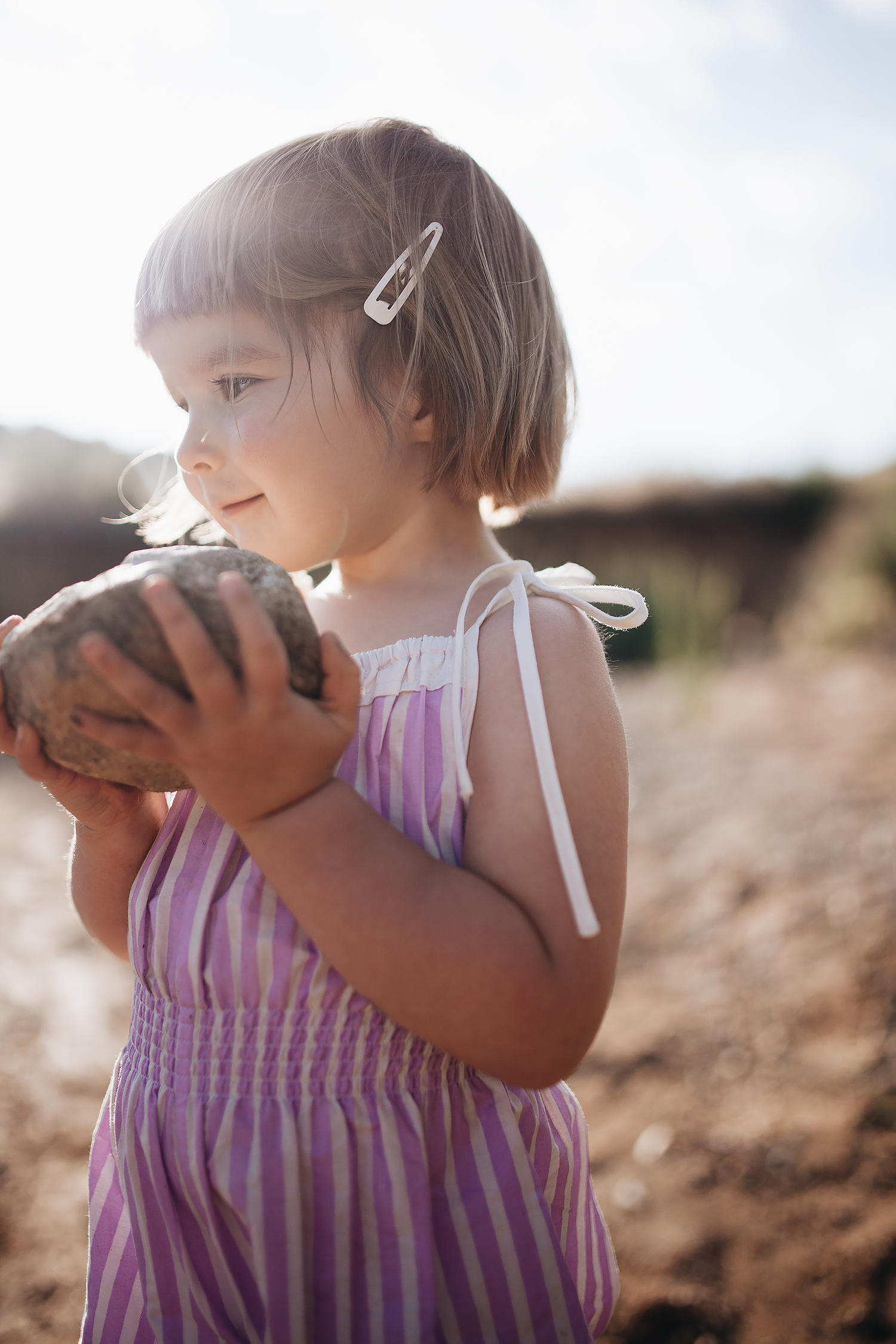
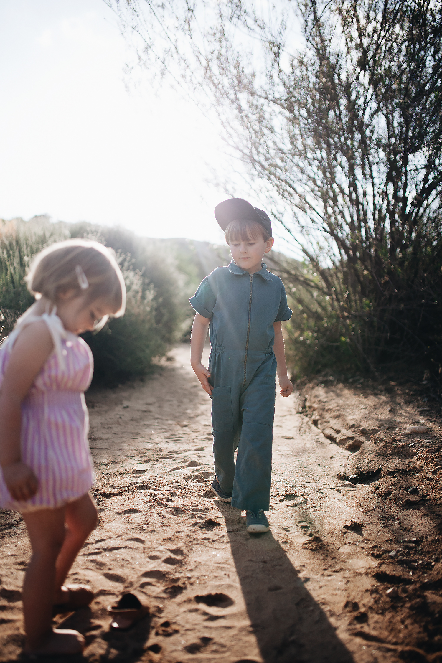
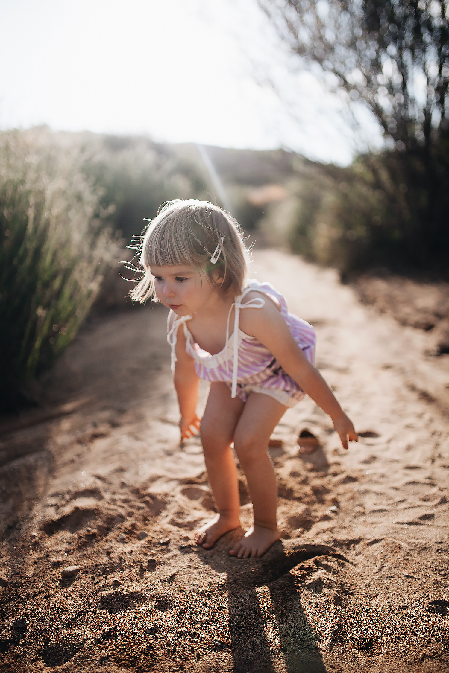
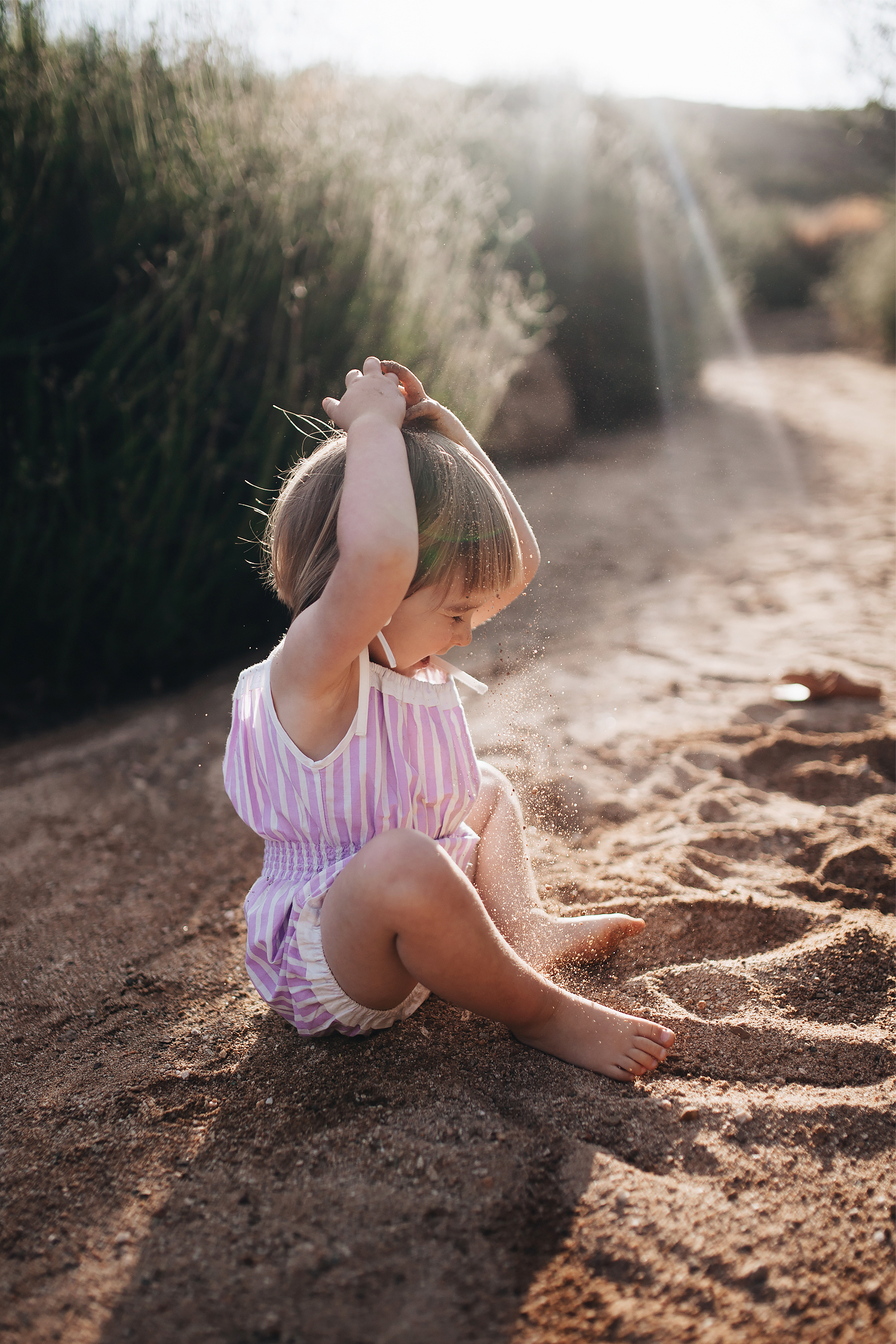
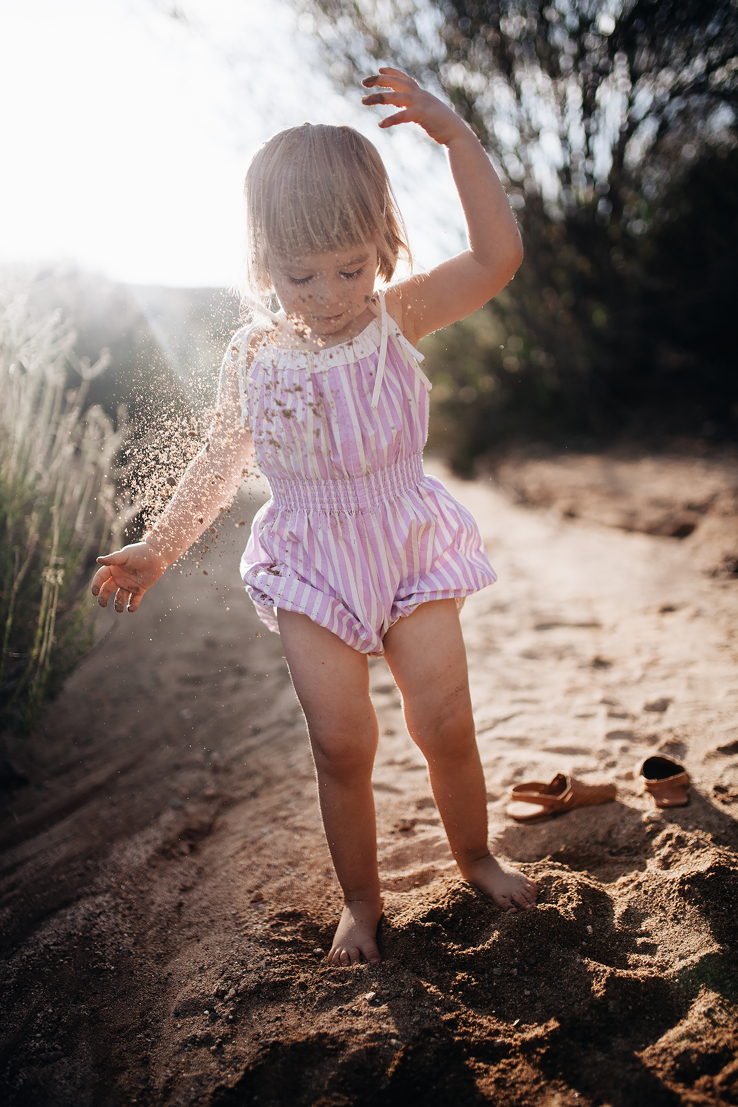
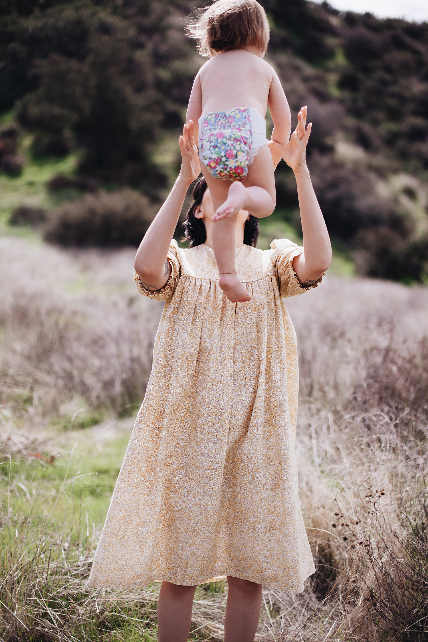
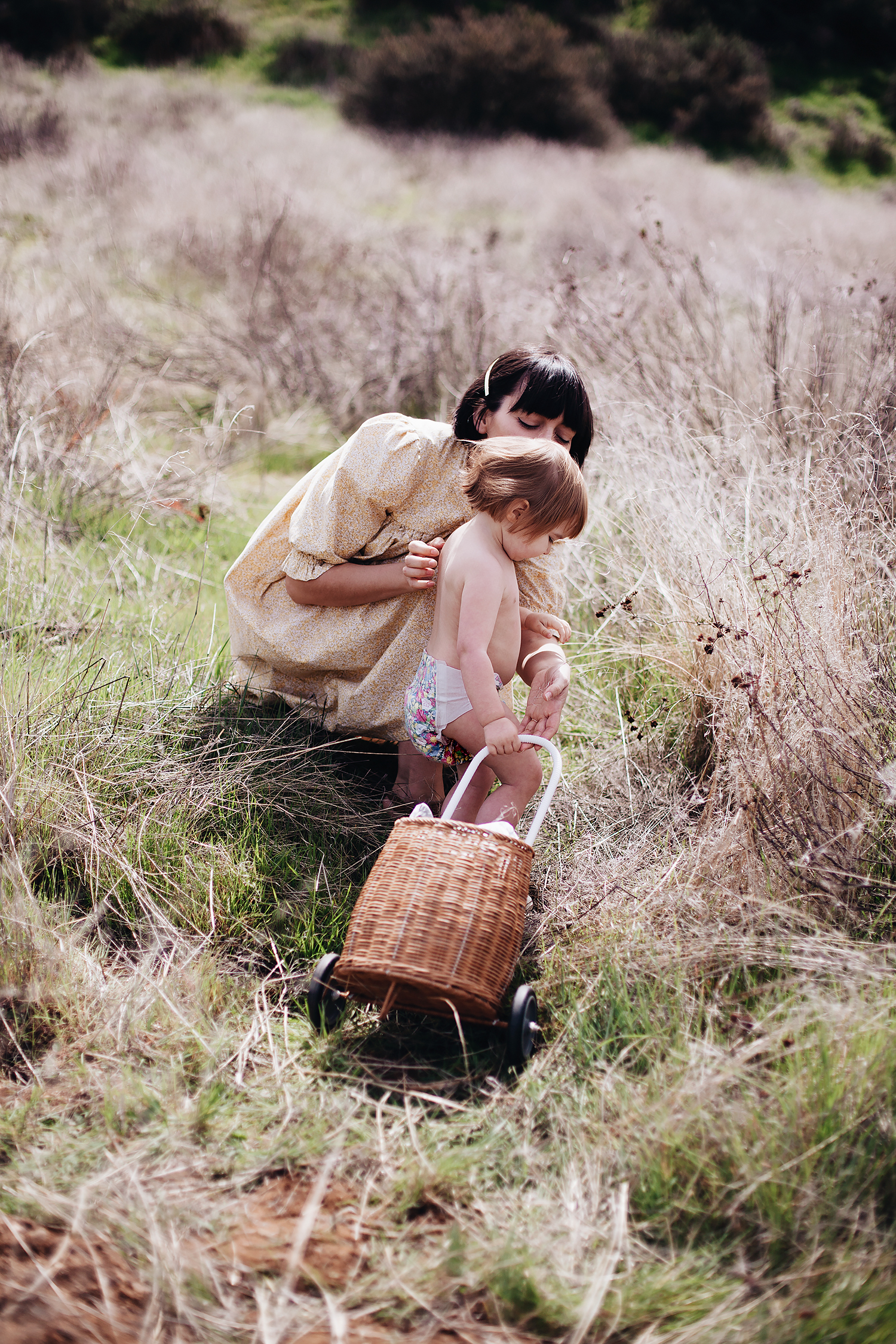
if you’ve been following along with me for the last couple of years, then you know i have a pretty short list of favorites when it comes to shopping for my kids. and one of those favorites is noble carriage. this mama-owned shop is based out of san diego and focuses on organic goods for babies and kids. we’ve partnered together a number of times over the years and this time, we got the opportunity to photograph their latest exclusive with woven play, this adorable organic jada sunsuit in lavender (which also comes in a number of other colors and styles)! so we packed up the kids and headed out to one of our favorite parks in town to play around in the riverbed as the sun set over the hills.

it was a lot of fun for me because i really enjoy photography and photo editing, but i don’t always get to do a ton of the former myself anymore. always a good reminder that i can still do it when the occasion arrises, even if it’s just shooting photos of my kids playing. heck, i might even get one of these photos framed for the house!


photographed:
noble carriage exclusive woven play organic jada sunsuit in lavender
tortoise and the hare white hair clip pair
scandic gypsy little gypsy mules in summer tan
noble organic utility suit in indigo (on adam)


public goods launches food!

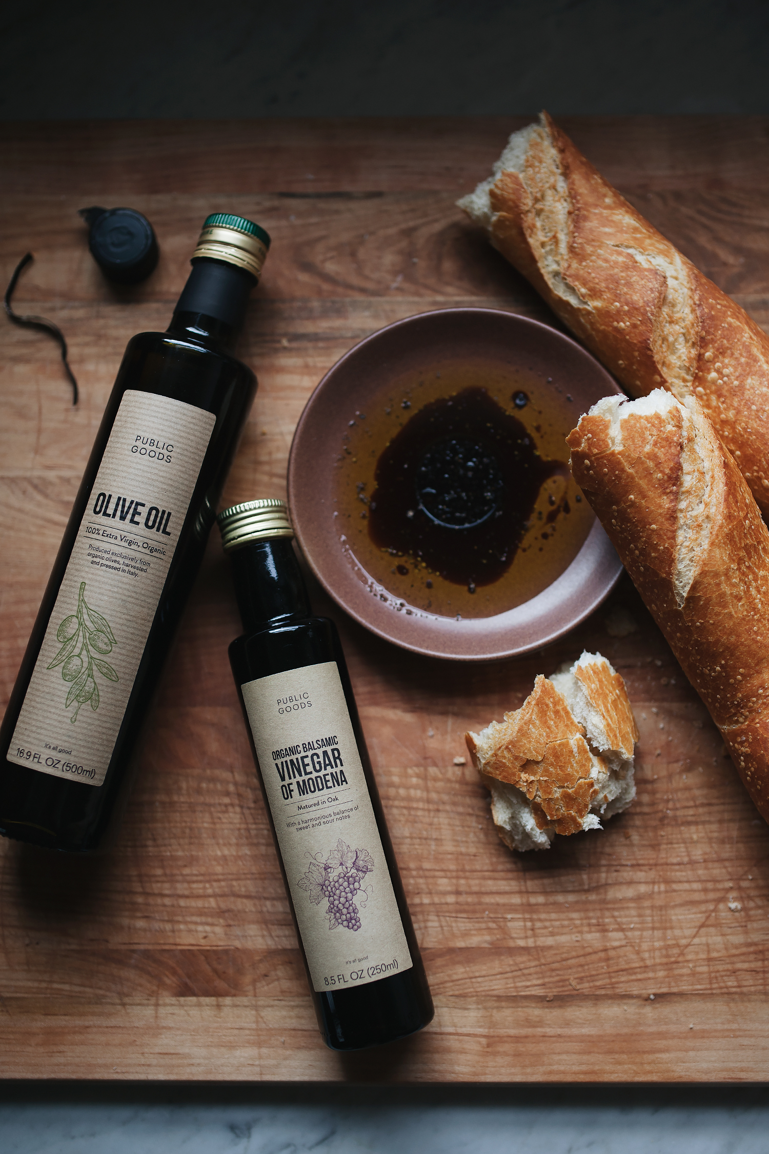
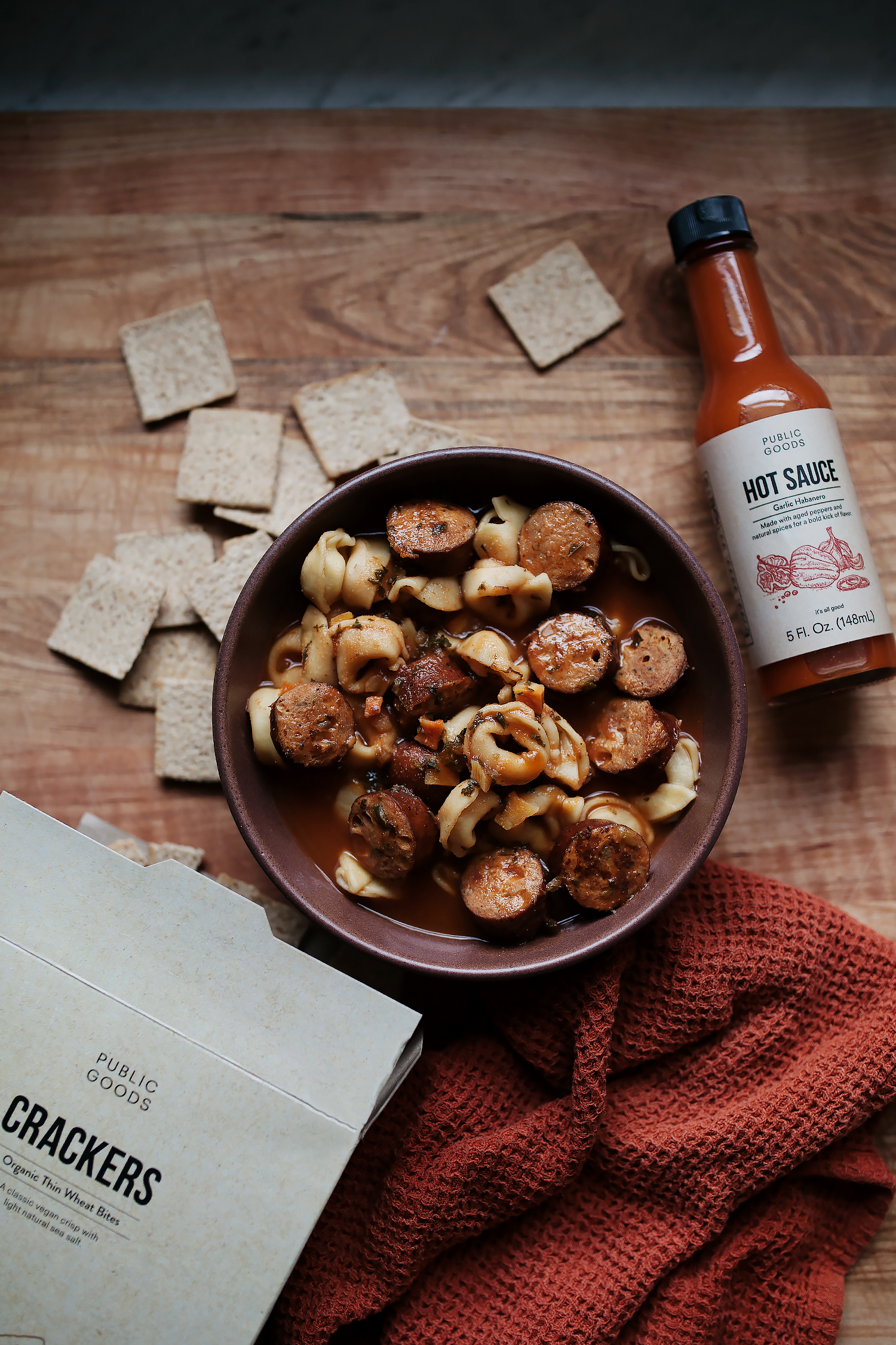
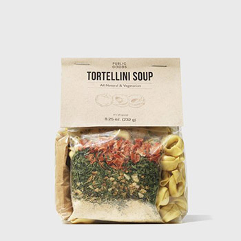
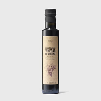
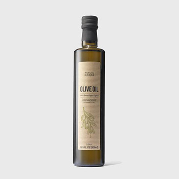
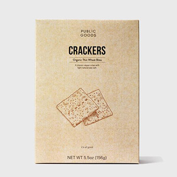
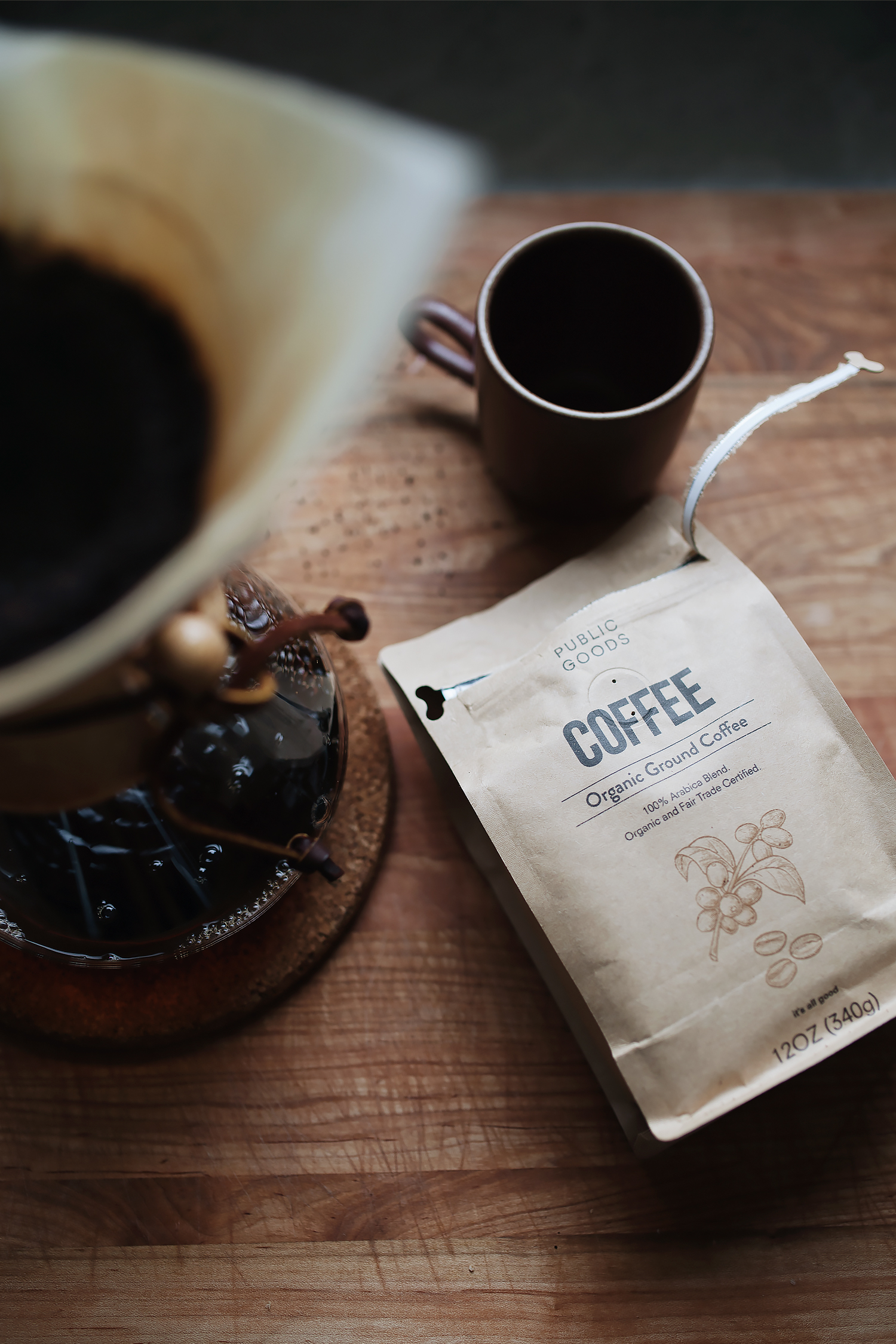
you’ve already heard me sing praises about public goods. so you won’t be surprised that i’m back today because i’m super excited about their latest foray into (drum roll, please…) FOOD! so far, 2019 is definitely the year of the house for me, which has been especially challenging thus far because i still can’t share the results of our big renovation project! but i can show some of what’s been cooking… literally, in the kitchen. we got our first sampling of some of the new public goods food offerings just in time for the rainiest of weekends. rather than run out to the store, i reached into the cabinets for the basics: a crusty loaf of bread dipped in organic olive oil and vinegar, a flavorful tortellini soup made with chunks of italian sausage topped with hot sauce and a side of organic crackers, and a piping cup of organic coffee to top things off. just the types of items you keep in the pantry for a rainy day.

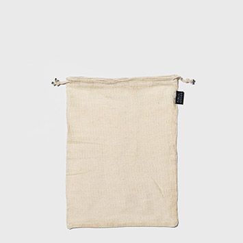
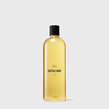
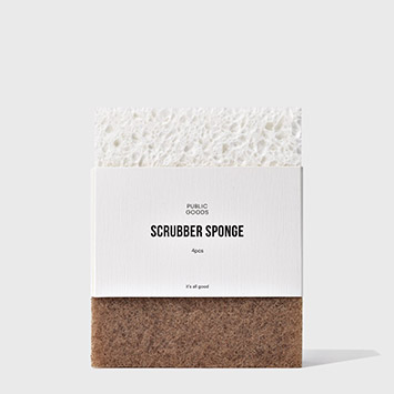
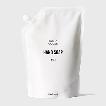
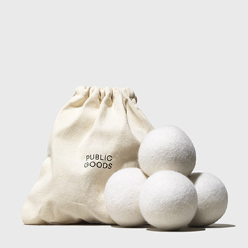
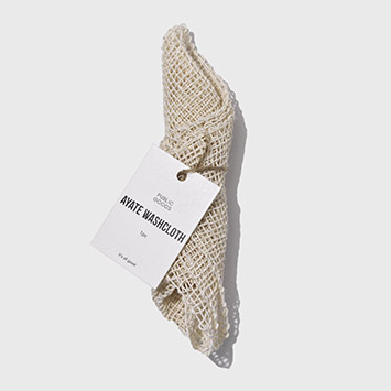
i’ve already talked a little bit about how it works, but the easiest comparison is that it’s basically like costco. you pay an annual membership fee of $59/year (starting with a 30-day free trial so you can decide whether or not you like it), and have access to the all of the goods at direct-to-consumer prices. i was skeptical at first because i’m always skeptical of anything that requires a membership, but what really sold me was their home goods like reusable cotton mesh produce bags, eco-friendly detergents and cleaners, wool dryer balls, etc. but their latest addition of (mostly) organic foods is just as exciting! it’s so expensive to nab these types of pantry items, so i’m always interested in where i can catch a deal.


use code CALIVINTAGE for a free tote bag with your public goods order!

or use this link to sign up and get $20 off your first order!


a new year’s refresh with public goods (and a discount!)

it’s january, everyone is watching tidying up with marie kondo on netflix, and i’ve made one too many jokes about konmari-ing myself within one inch of existence over here. but seriously, the abundance of stuff that comes into our house during the holiday season is enough to make my head spin. i’ve been sorting and organizing and donating as much as i can, just trying to get things to a simpler place so that we’re not all swimming in a sea of junk.

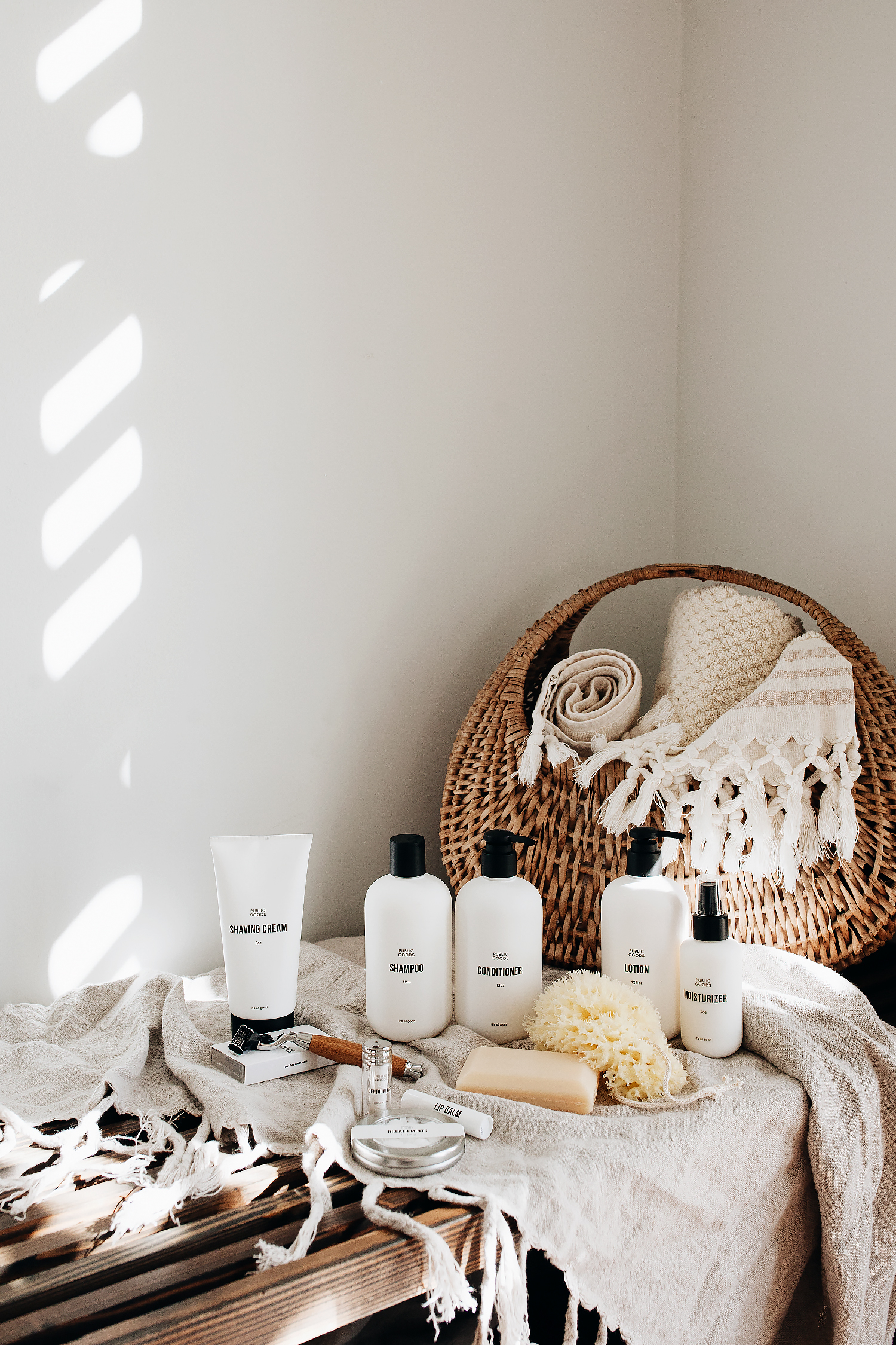
and you wanna know something that always sparks joy for me? pretty packaging. there, i said it haha. but it’s not just about pretty packaging! i really am into substance, and i want both in equal measure. i was introduced to public goods a few months ago, and am head-over-heels for not only the simple design, but their eco-conscious, budget-friendly selection.

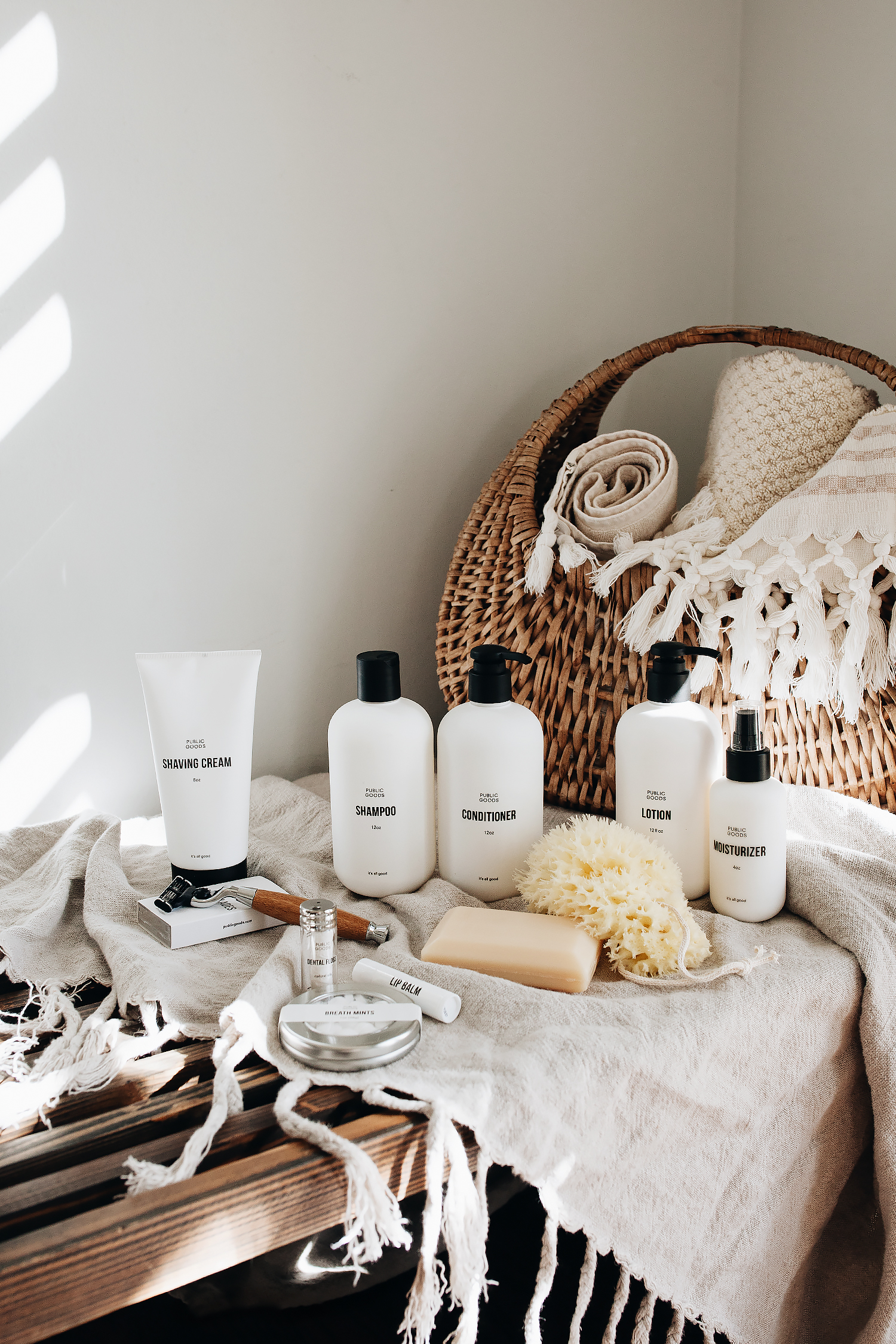
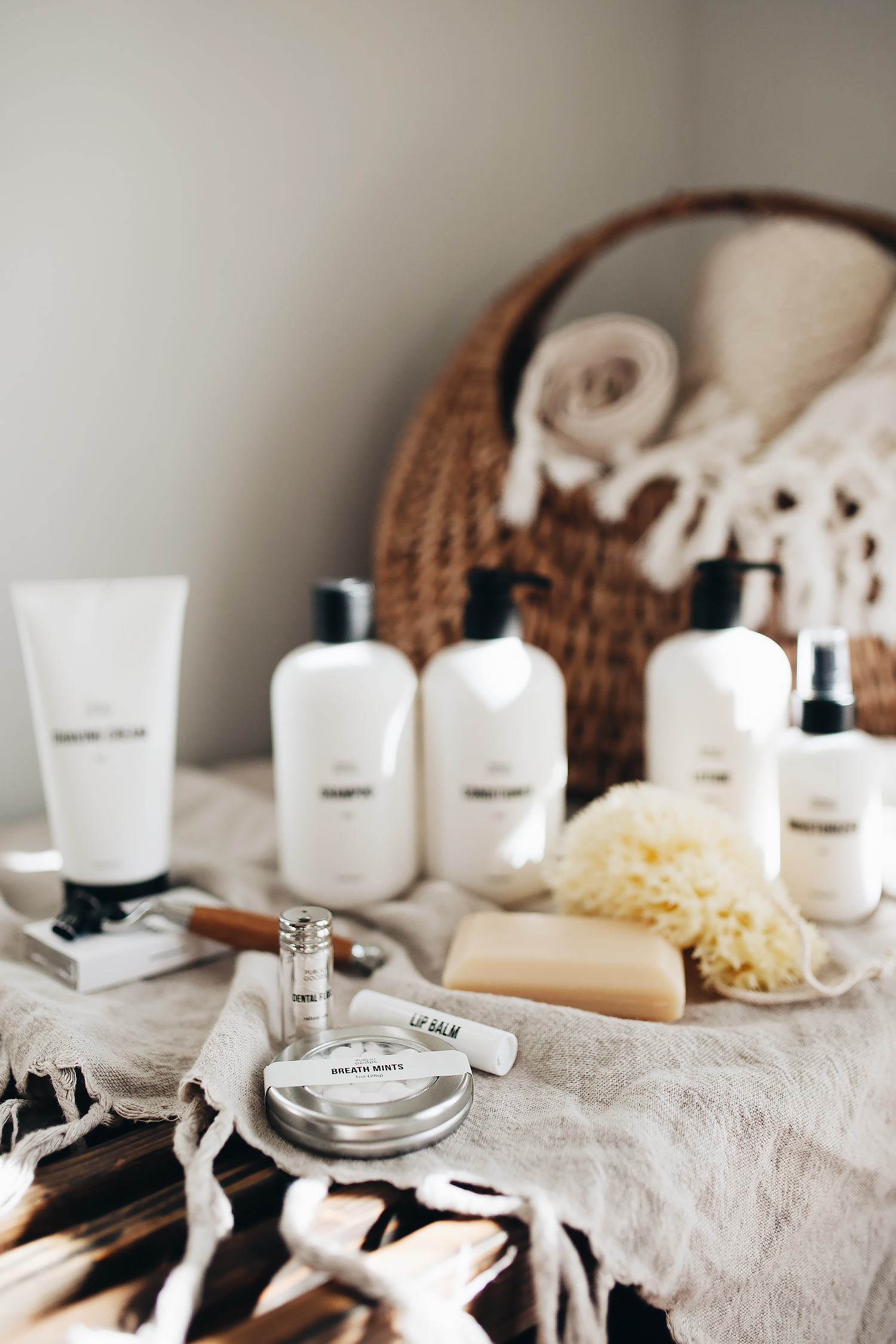
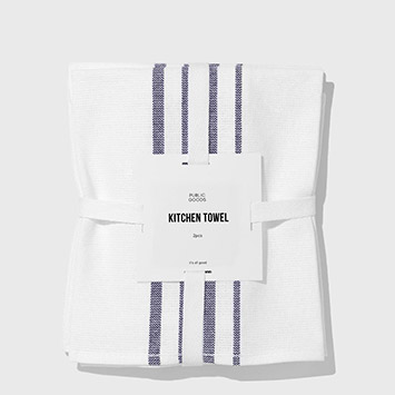
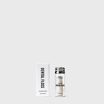
they sent me this beautiful sampler of body and skincare products including the cutest refillable glass dental floss dispenser, a classic wood-handled razor, and a little tin of mints for my handbag. these drew me in, but what really kept me was their selection of things like reusable produce bags, eco-friendly cleaners, biodegradable trash bags… they even have hand and bath towels!

the way it works is that it’s a direct-to-consumer subscription service, so with an annual membership (think: costco) you’re able to shop for whatever you need in both personal and home goods without any of the usual retail markups. the products have safe ingredients and clean packaging, perfect for your minimalist home goals in 2019.


use this link to get $20 off your first purchase from public goods, or use code CALIVINTAGE for a free tote bag with your first purchase!


new year’s eve entertaining (with bed, bath, and beyond)!

i know that new year’s eve is often celebrated with over-the-top glitz and glamour– and partying into the wee hours of the morning. but for as long as i can remember, my new year’s eve tradition has been a lot more casual and low key. i mean, i love a good party, but after all of the festivities of the holiday season, i’m usually ready to just relax and unwind with a few close friends and family members. one last warm and cozy gathering before we refresh our palettes and look forward to new beginnings.

and speaking of new beginnings, i don’t know that i’ve mentioned it much, but we just got through a pretty major home renovation a couple of months ago and have yet to show it off! we have some time until the big reveal (more details on that to come), so we’ve been taking it easy and slowly refreshing the decor throughout the house in anticipation of the big day. one of our main goals in renovating the house was to be able to do more entertaining. a lot of my family lives here in town, and we really like having our doors open for family dinners, play dates, impromptu bbqs. so when bed bath & beyond asked me to share some of my tips for new year’s eve entertaining, i was all over it. i’ve basically spent the past 3 years in our house just planning out how to use this space once we were able to invite guests over, even if it is just a casual affair!

my bed bath & beyond NYE checklist:


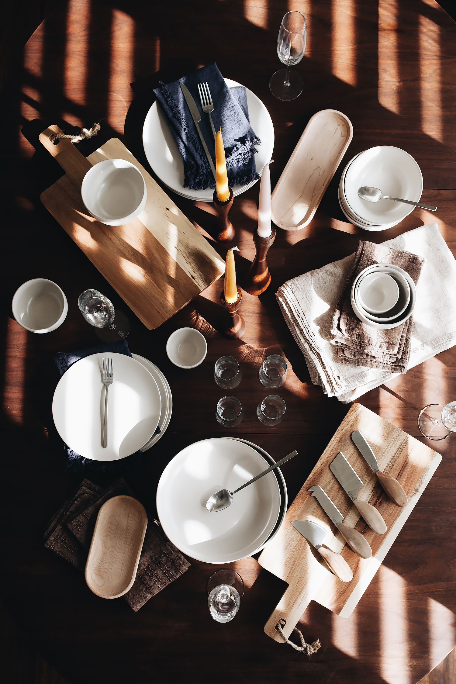
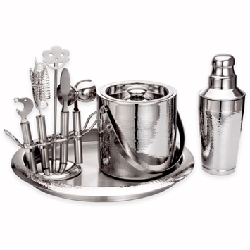
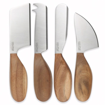
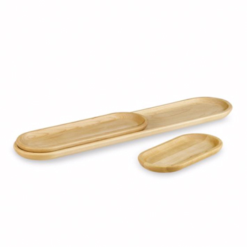
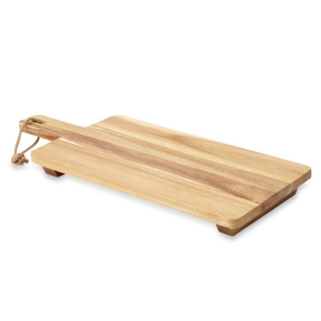
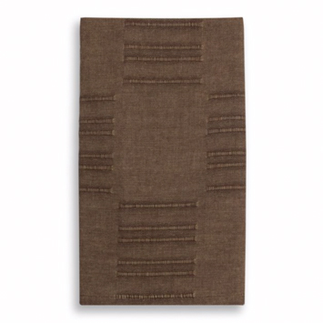
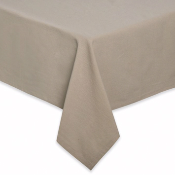
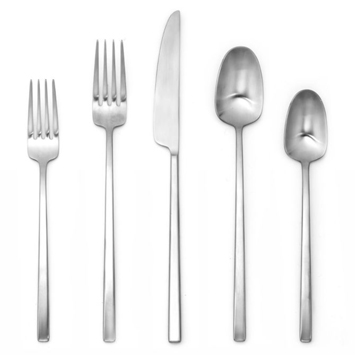
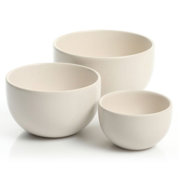
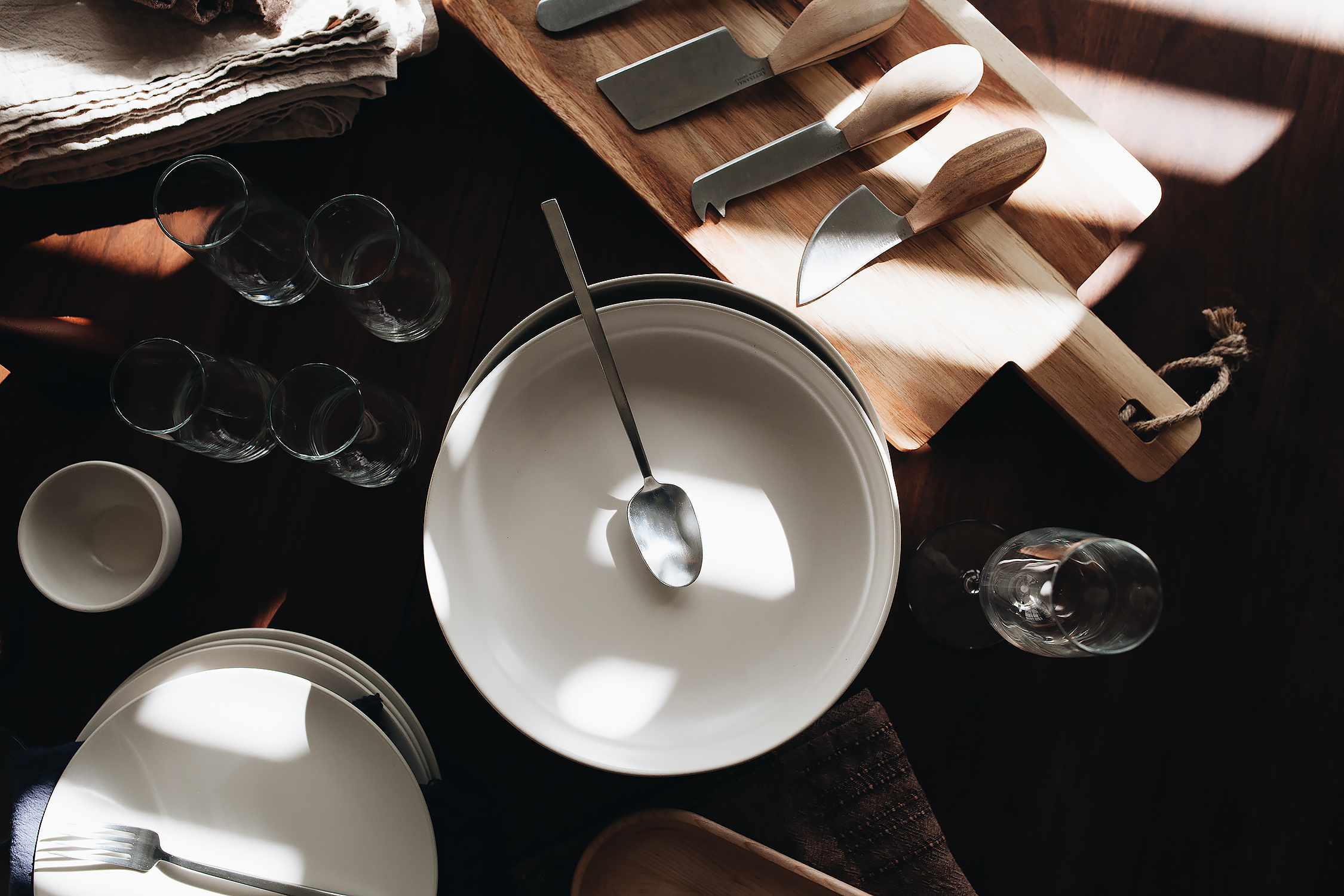
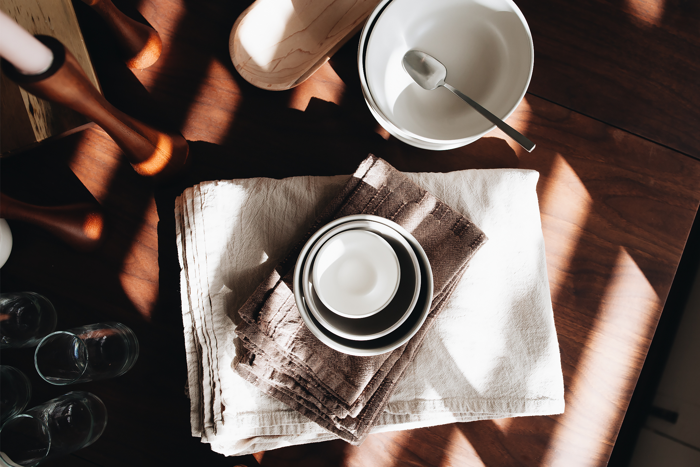
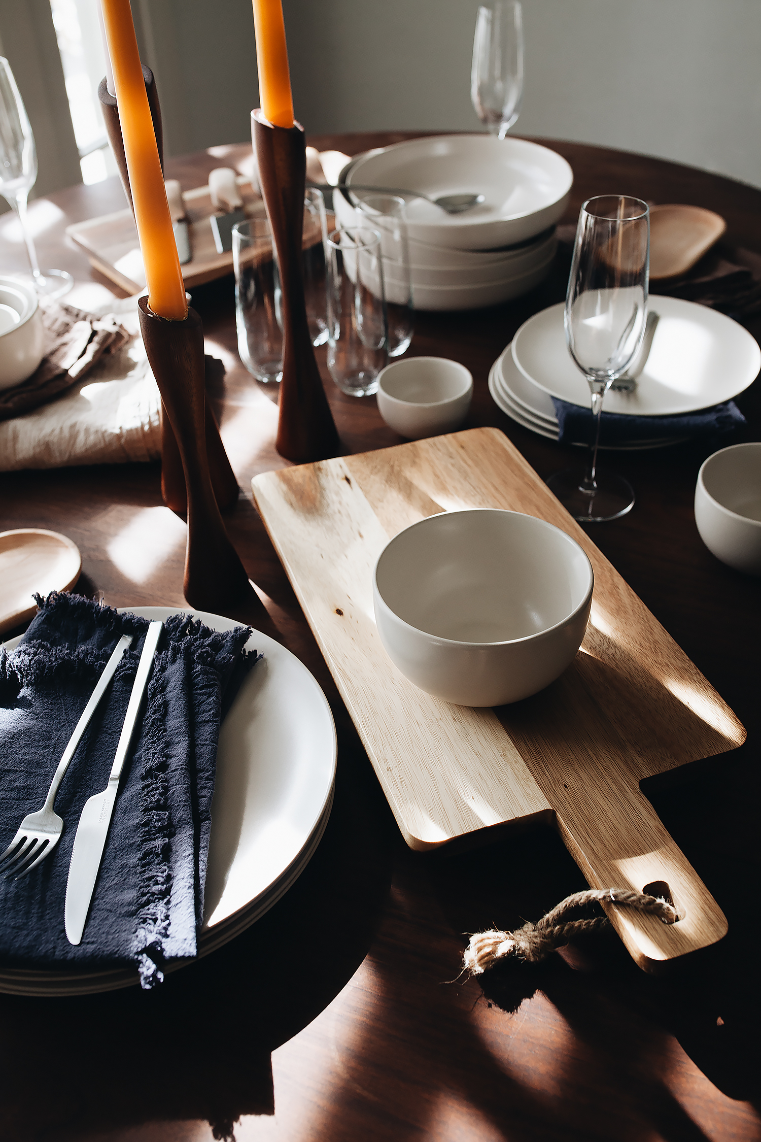
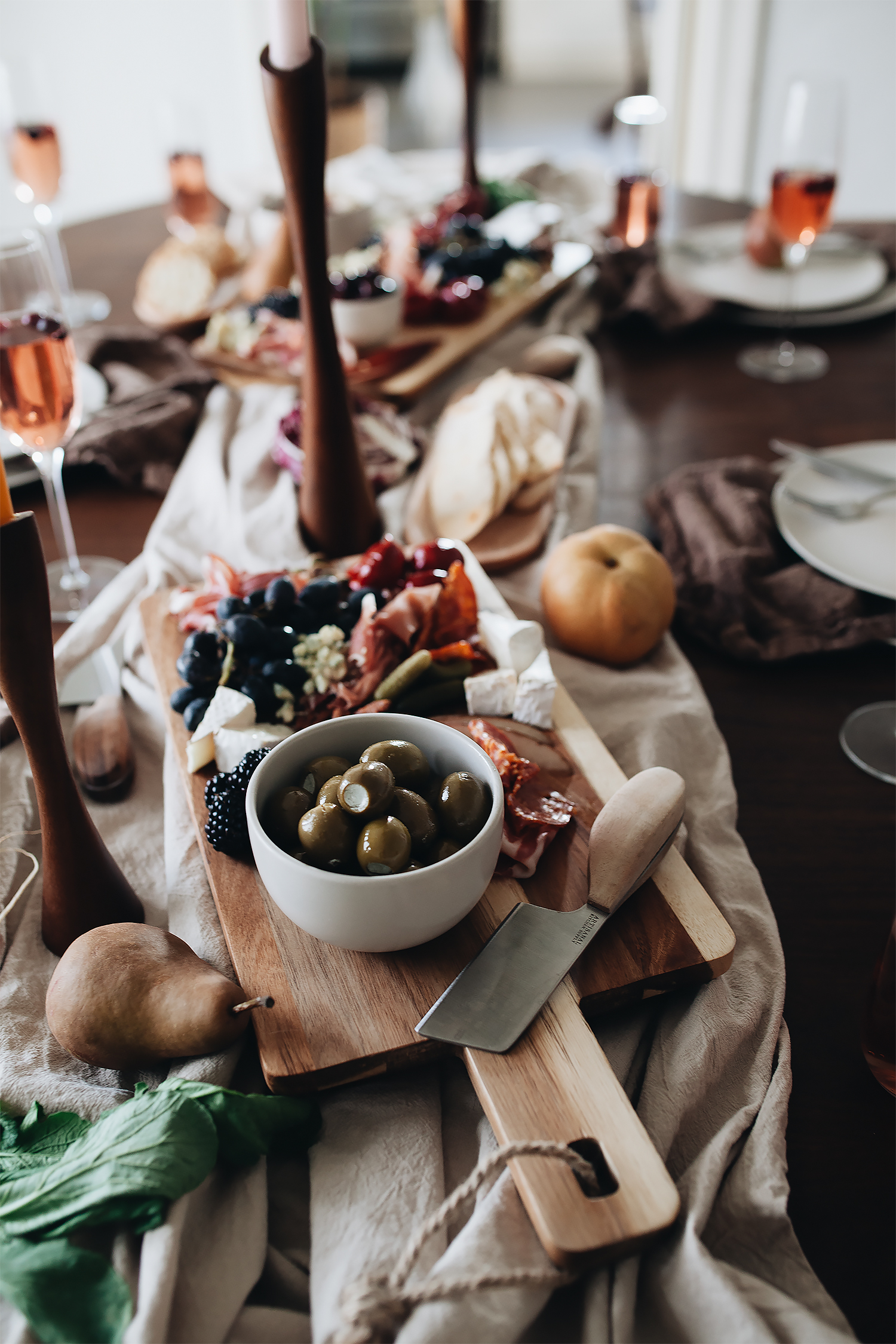
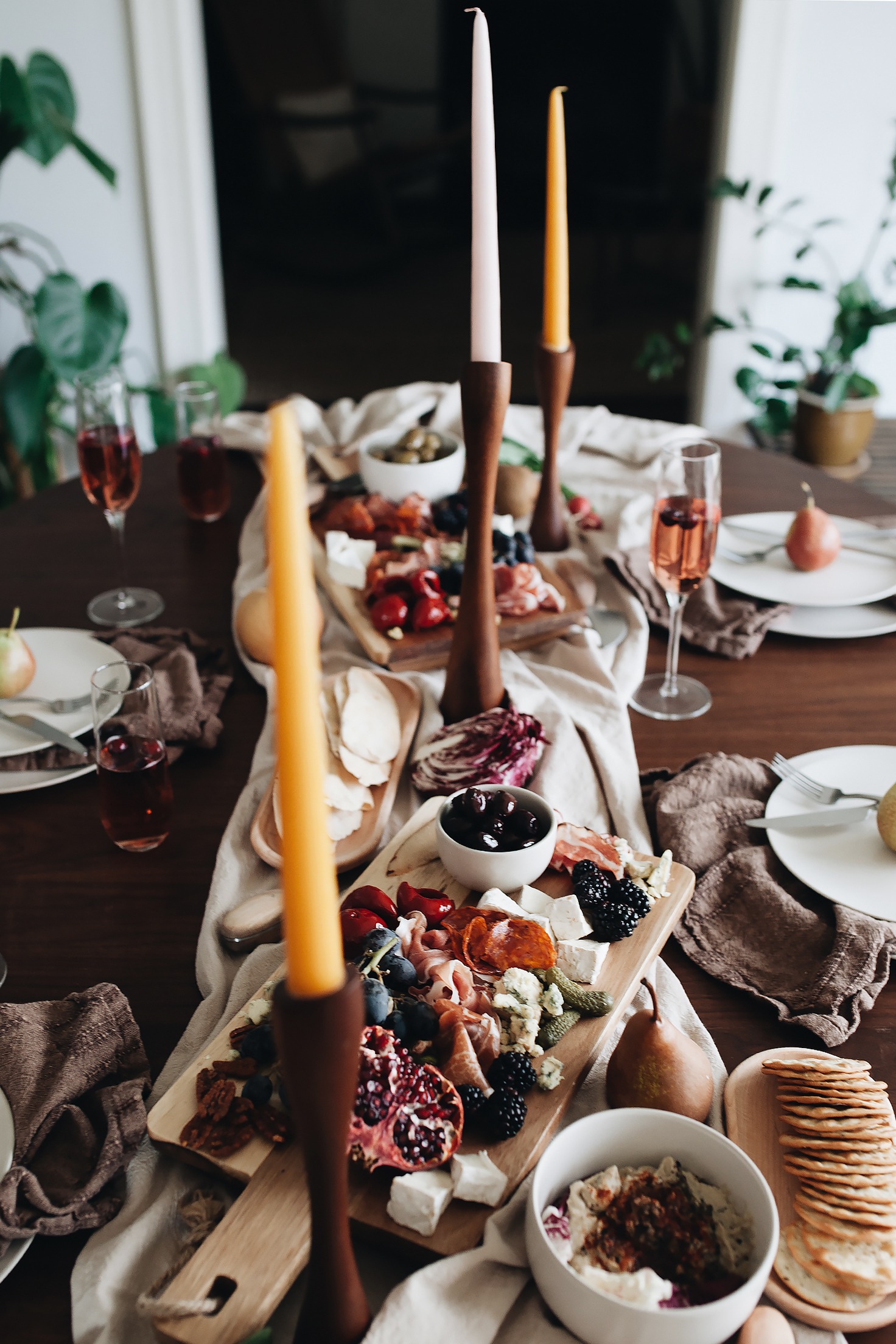
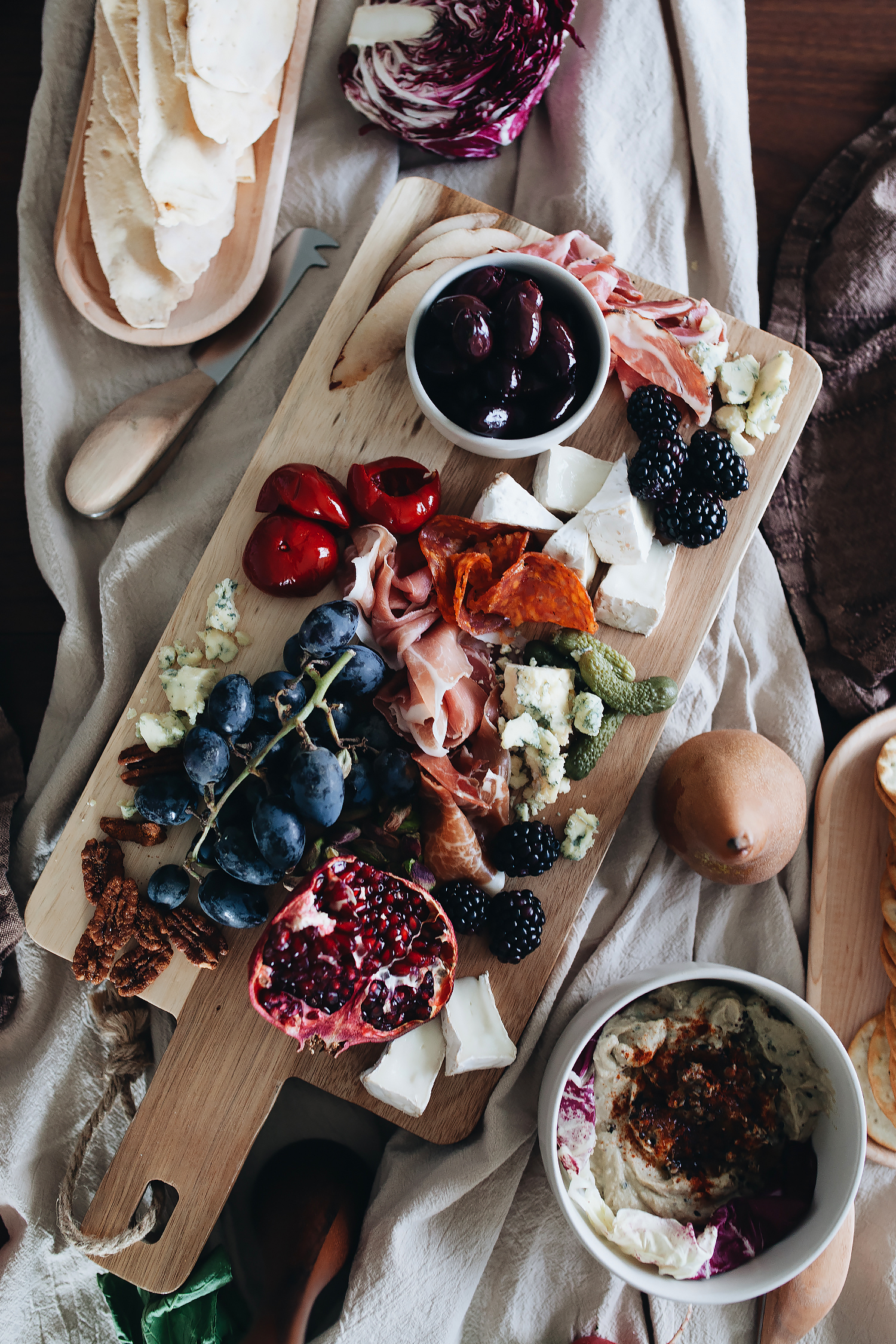
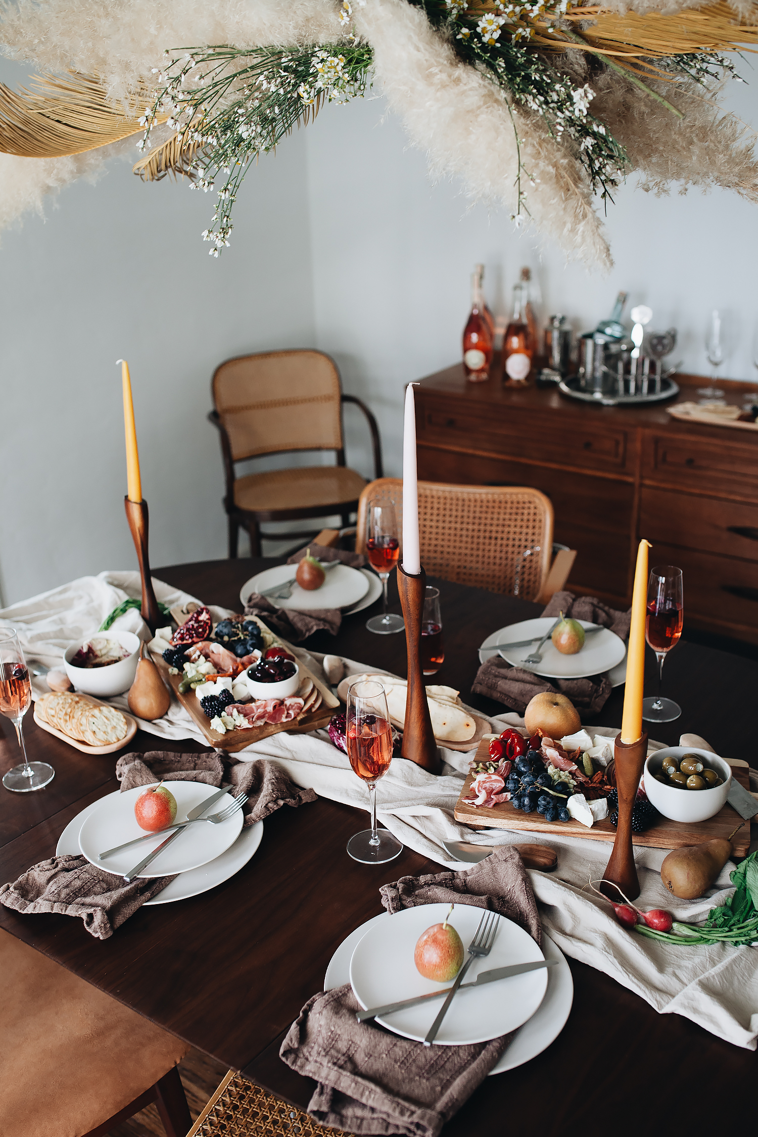
like i said, i’ve been scheming all of the things i need for entertaining for quite a while, so i felt like a kid in a candy store shopping around at bed bath & beyond. for our new year’s eve gathering, i knew i wanted something that was totally decadent, yet still comfortable and casual. it took a lot of restraint on my part, but i opted to go super neutral with the table settings because i knew that i wanted to add lots of color with bright red peppers, deeply hued pomegranates, glossy black olives, rich cheeses, and fatty meats. i even added vodka and cranberry to the champagne! so for the tableware itself, i decided to stick with neutral colors and luxurious textures: perfectly rumpled napkins and a tablecloth fashioned into a runner, matte dinnerware and bowls, natural wood-grain peeking through the serving boards and trays. and i added a spray of foraged dry florals over the table to add a breath of fresh air to remind us of the coming new year, even when it’s gloomy and cold outside.

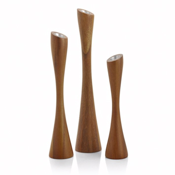
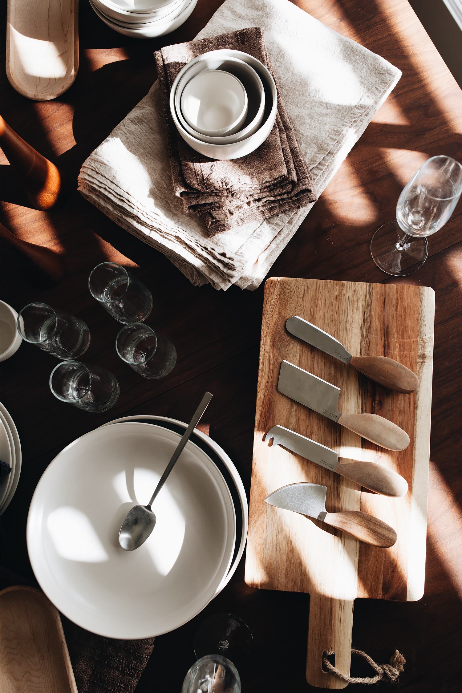
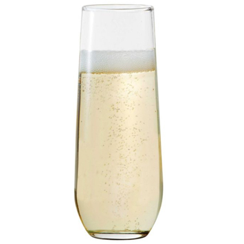
as i was shopping for all the perfect pieces, one theme that started to emerge as i started to put my list together? i really love their in-house brand, artisanal kitchen supply. it was a great starting point for me because they have a lot of very on-trend options like marble, wood, and cast iron in really beautiful complimentary color schemes. i decided to go for the linen colorway on the dinnerware and expanded from there. a quick search for cotton and linen came up with beautifully textured napkins. i went for a mix of both classic and stemless champagne flutes. and since we have a lot of mid century furniture in the house, i was even able to find a set of perfectly retro candlesticks to tie things together. i literally didn’t have to step foot into any other shop (besides the grocery store) and my place is now totally holiday ready. if you need your own starting point, they have tons of holiday shops, which include hanukkah, christmas, even halloween all in one destination so you can sleigh the holidays.


this post was sponsored by bed bath & beyond. all content is by calivintage.

super halloween

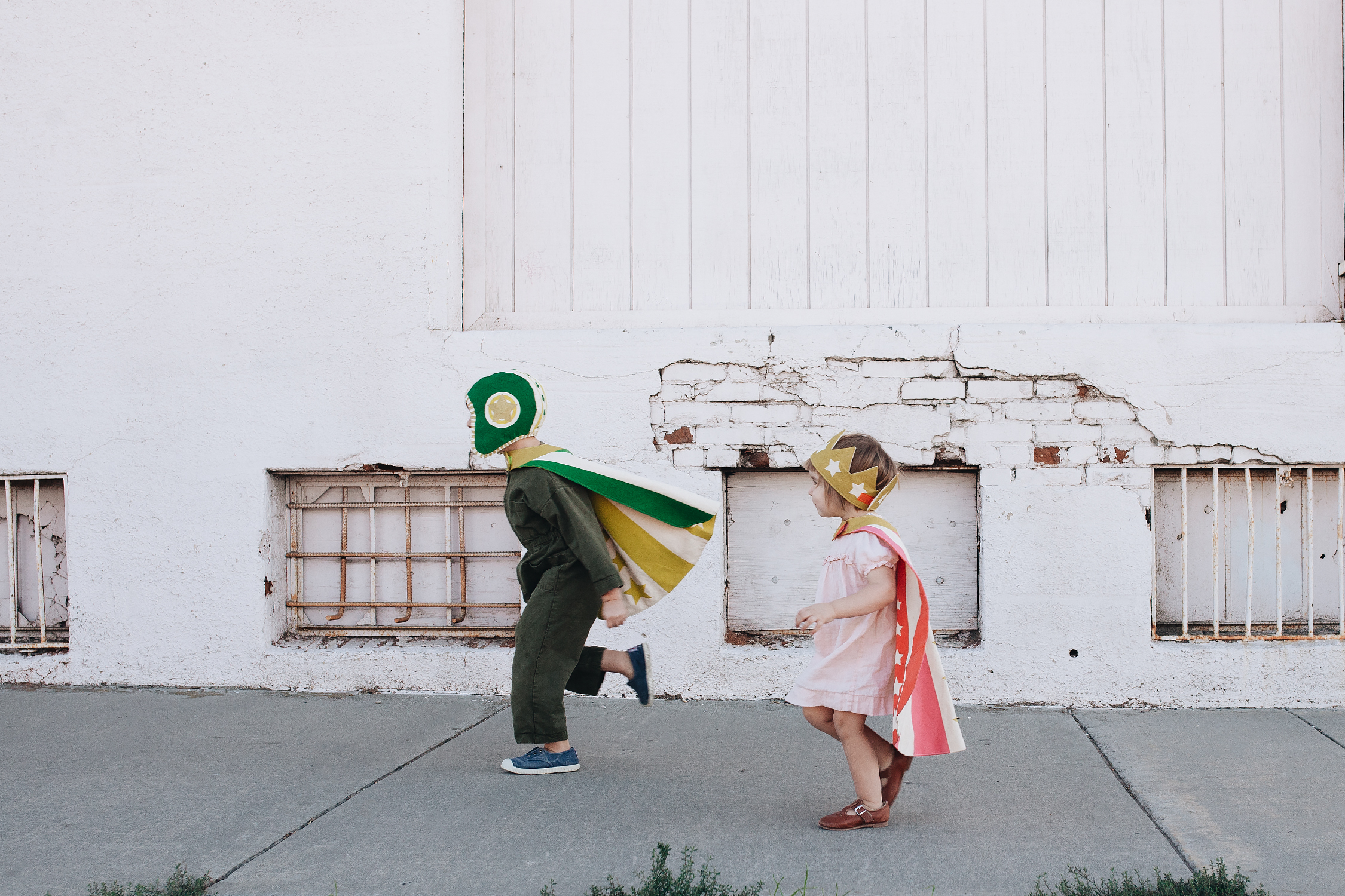
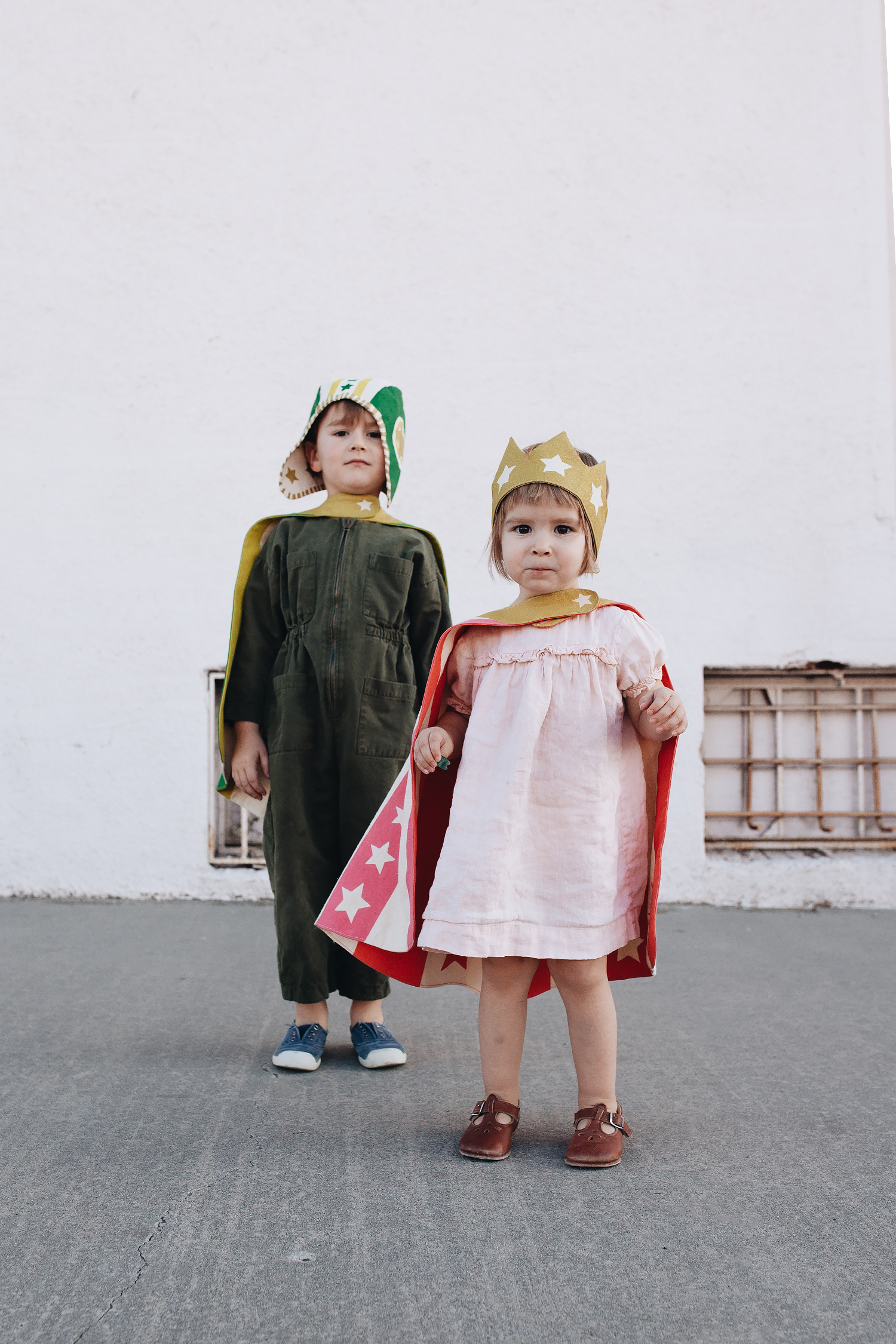
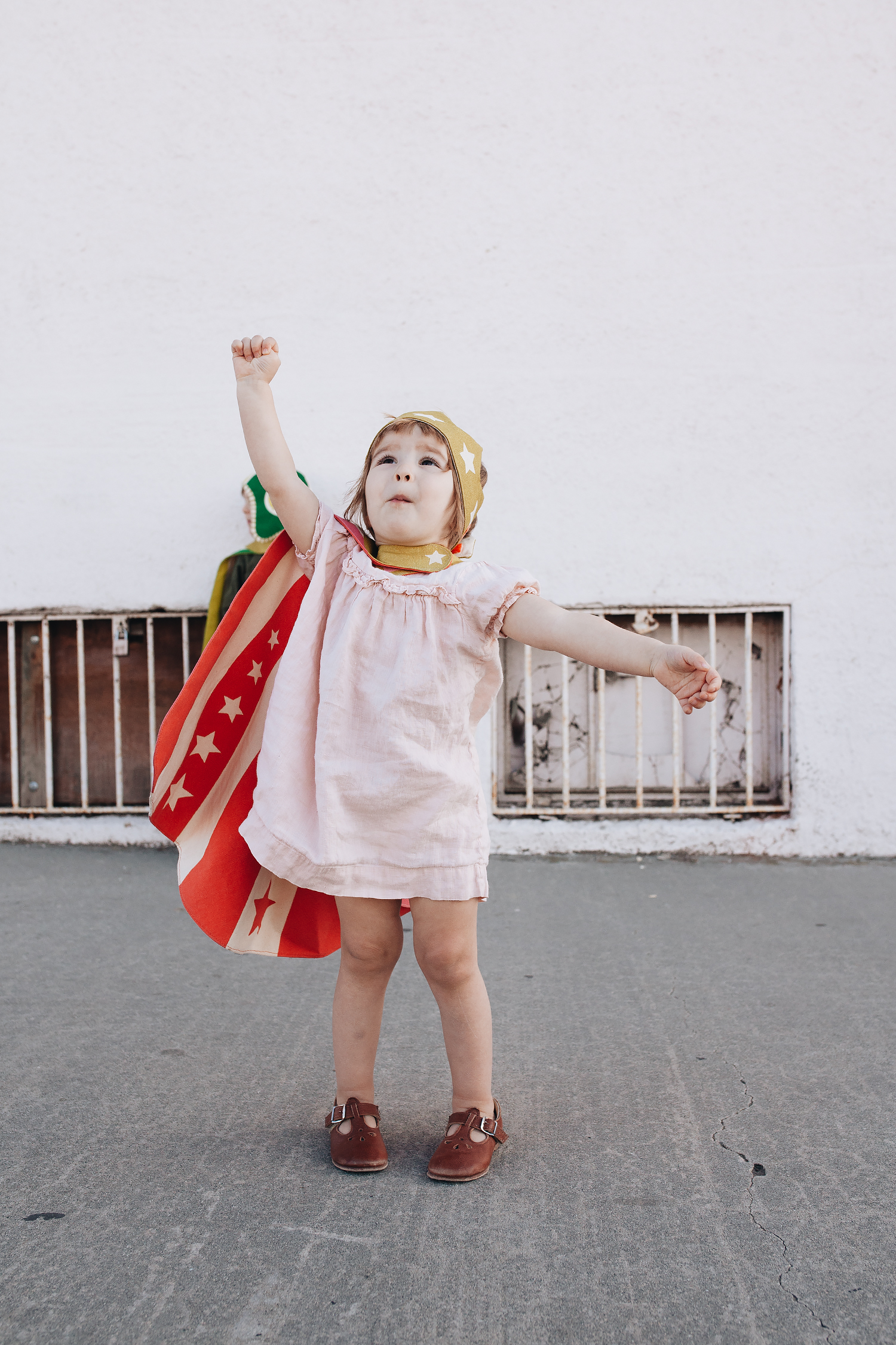
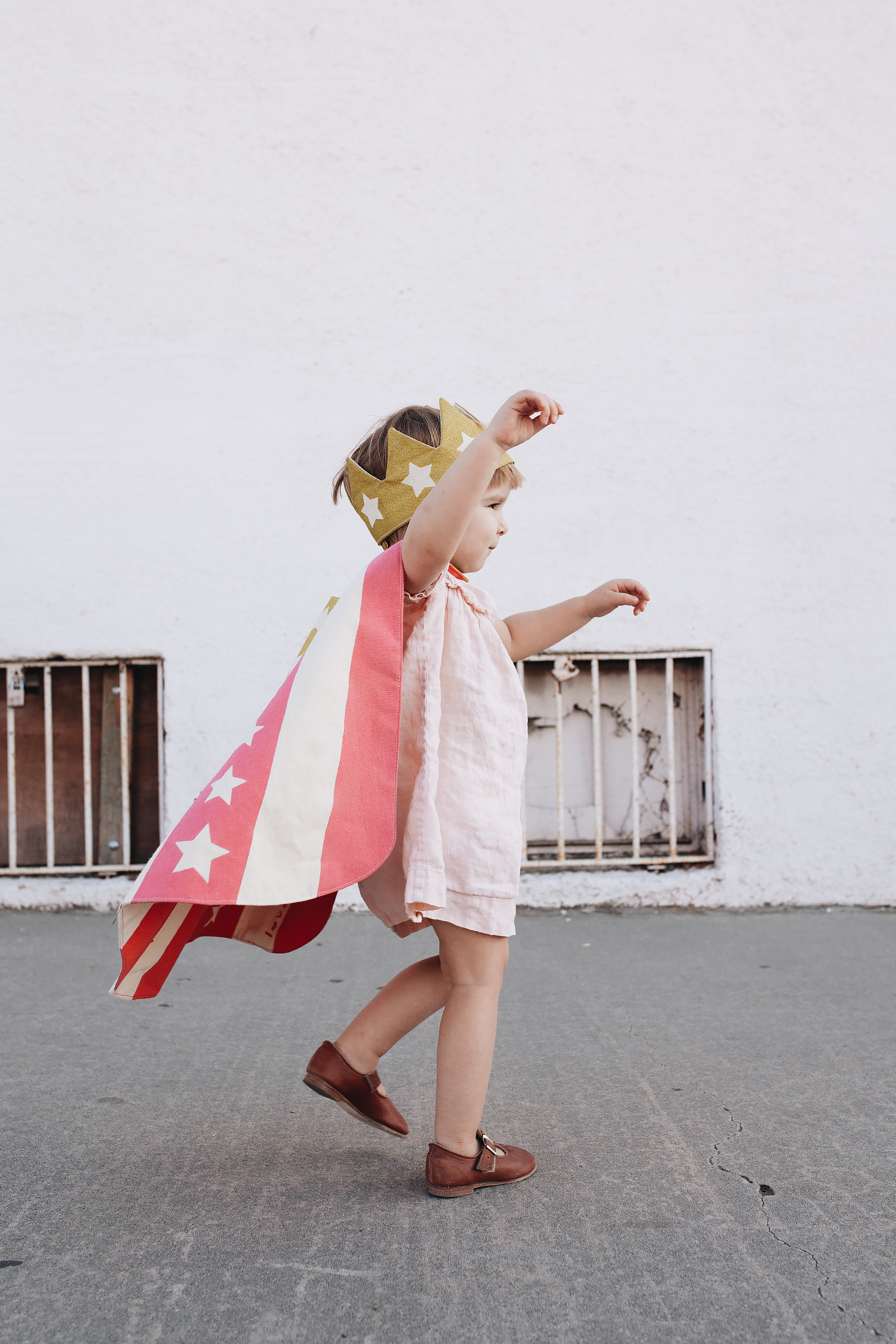
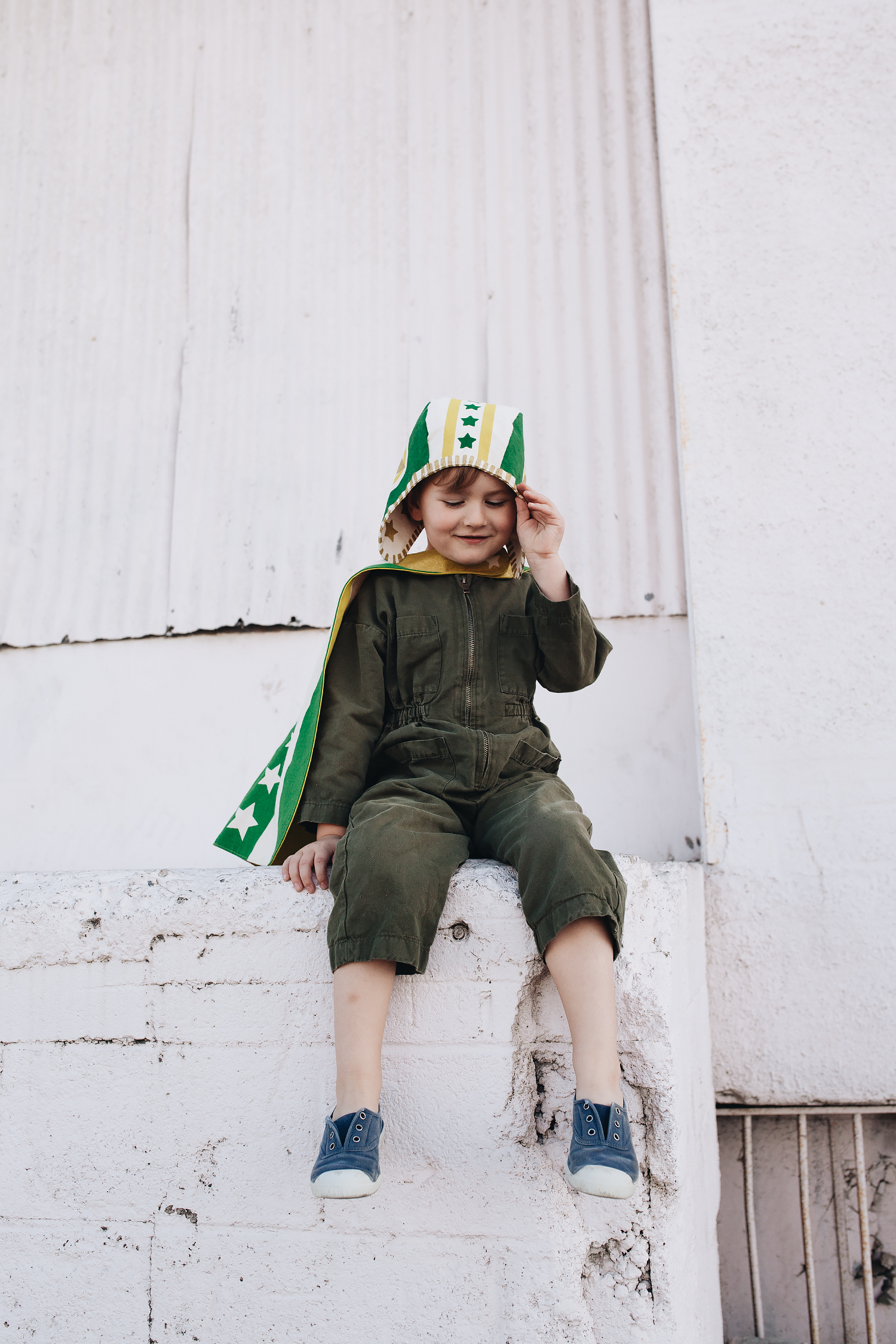
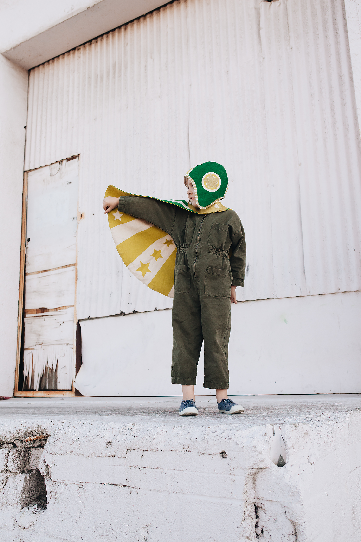
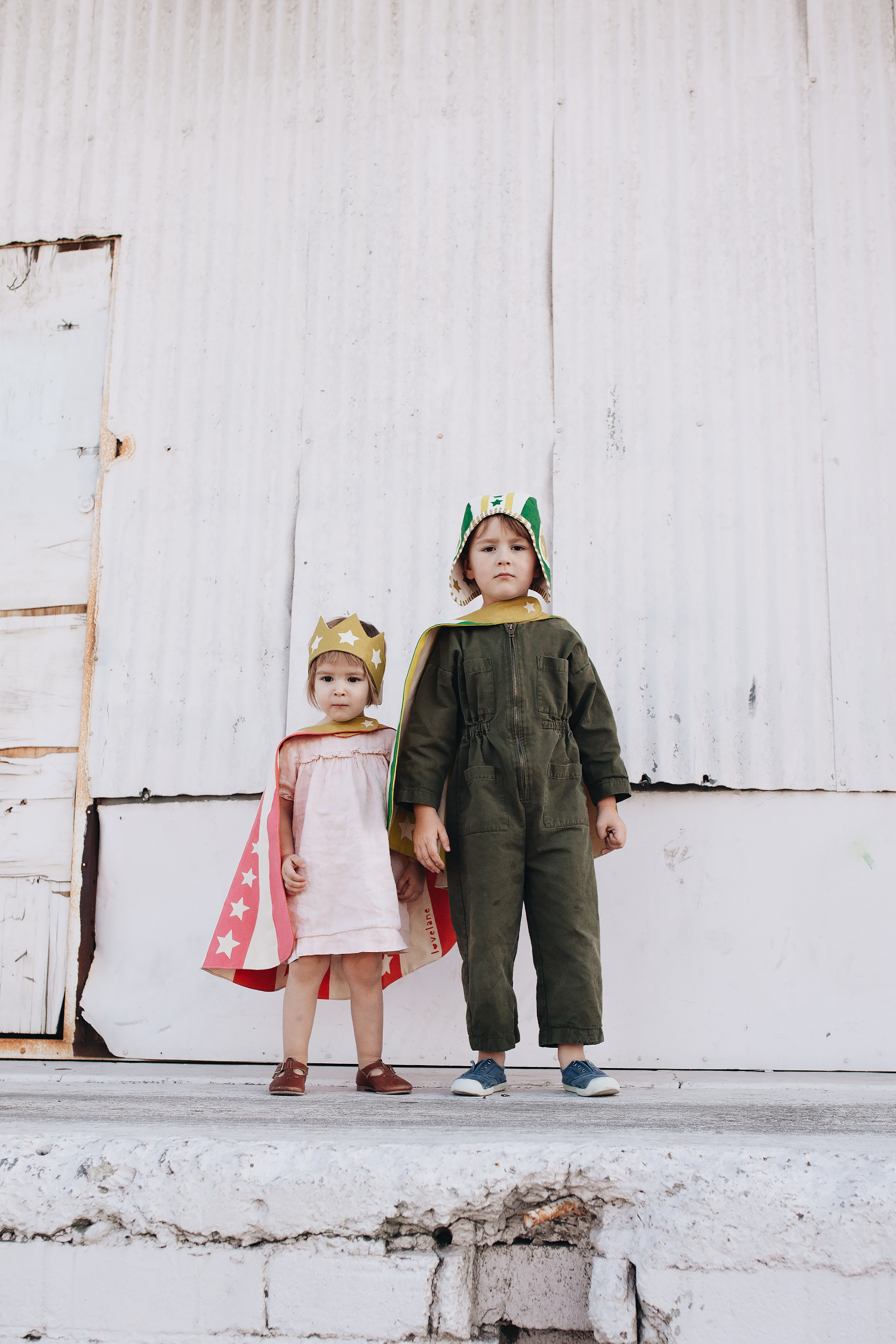
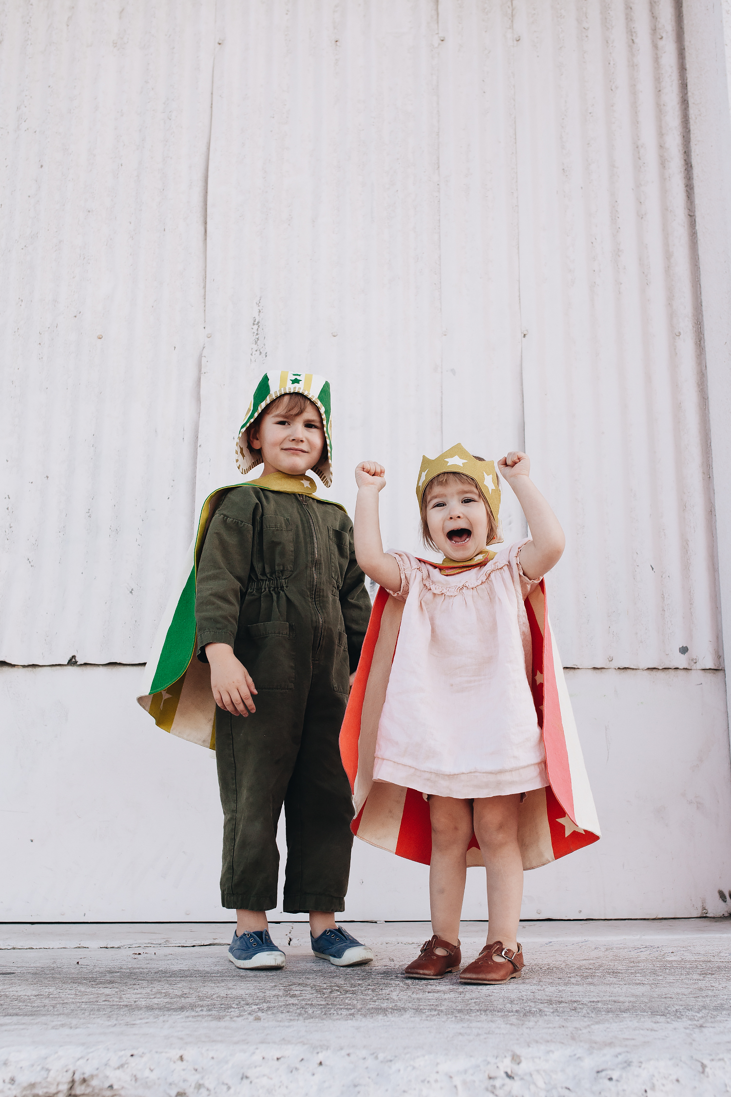
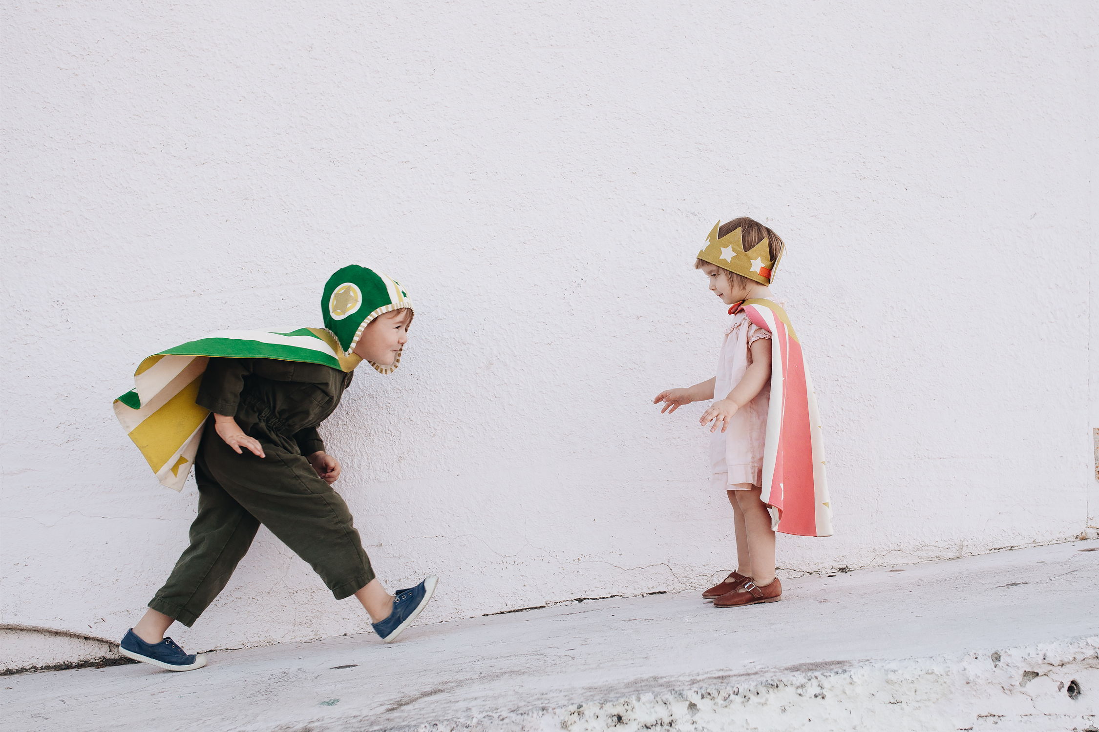
before i had kids, i didn’t have any preconceived notions about what holidays we’d celebrate or what traditions we’d adopt. but ever since adam was born, i’ve always really enjoyed the process of picking a costume, making it, and doing a little photo shoot. it’s the one time of year that i’ve consistently taken photos, so i can go back and look at what we’ve done year after year. this was the first time i broke my tradition of making their costumes from scratch, but i was really struggling with the idea of making something that might fall apart by the end of the night and ultimately end up in the trash. last year, i got them both matching black pajamas from primary as the base for simple bat costumes, which turned out to be really nice for reusing again and again. so this year, we went with the same concept and got these adorable hats and capes from lovelane designs that they could wear with their regular clothes. they’re made from a really sturdy cotton canvas, so the kids can wear them, wash them, and play in them any time of the year. they’re fun for open-ended imaginative play, and the brand sells other fun accessories so you can swap them out.

in fact, i’m planning on getting them a wooden trunk to fill with more fun “costumes” for play. when i was little, my mom would pick up fun accessories like opera-length gloves and vintage hats that she found at thrift stores and estate sales, and we spent hours playing with them until they became threadbare. i wonder if that had anything to do with my current penchant for “dressing up”…?


adam is wearing:
lovelane green moto set
soor ploom rosie coveralls (this color is from a past season)
cienta shoes

edith is wearing:
lovelane pink cape + gold crown set
petits villains victoire puff sleeve dress
mabo t-strap leather shoes


the olive festival

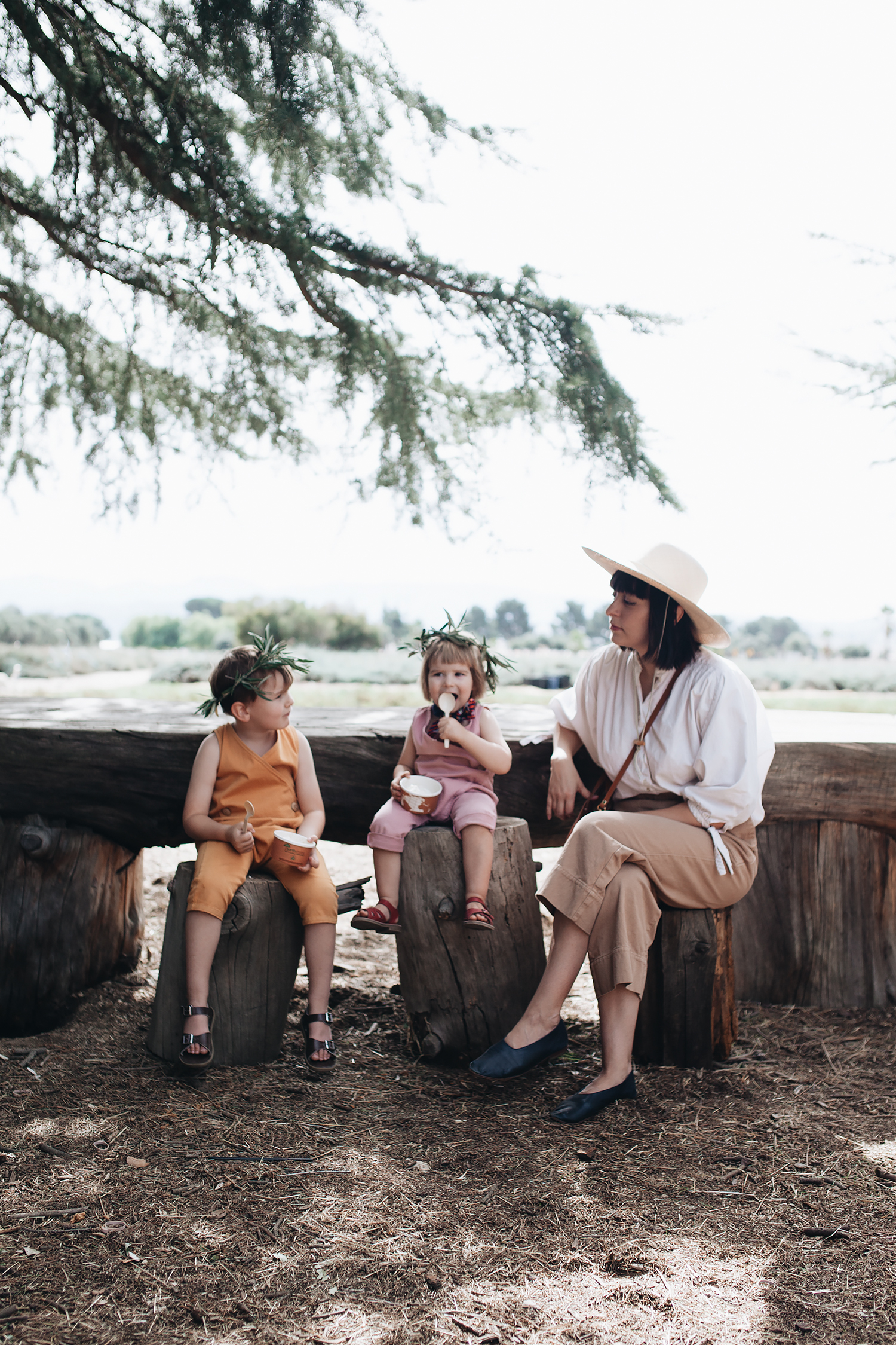
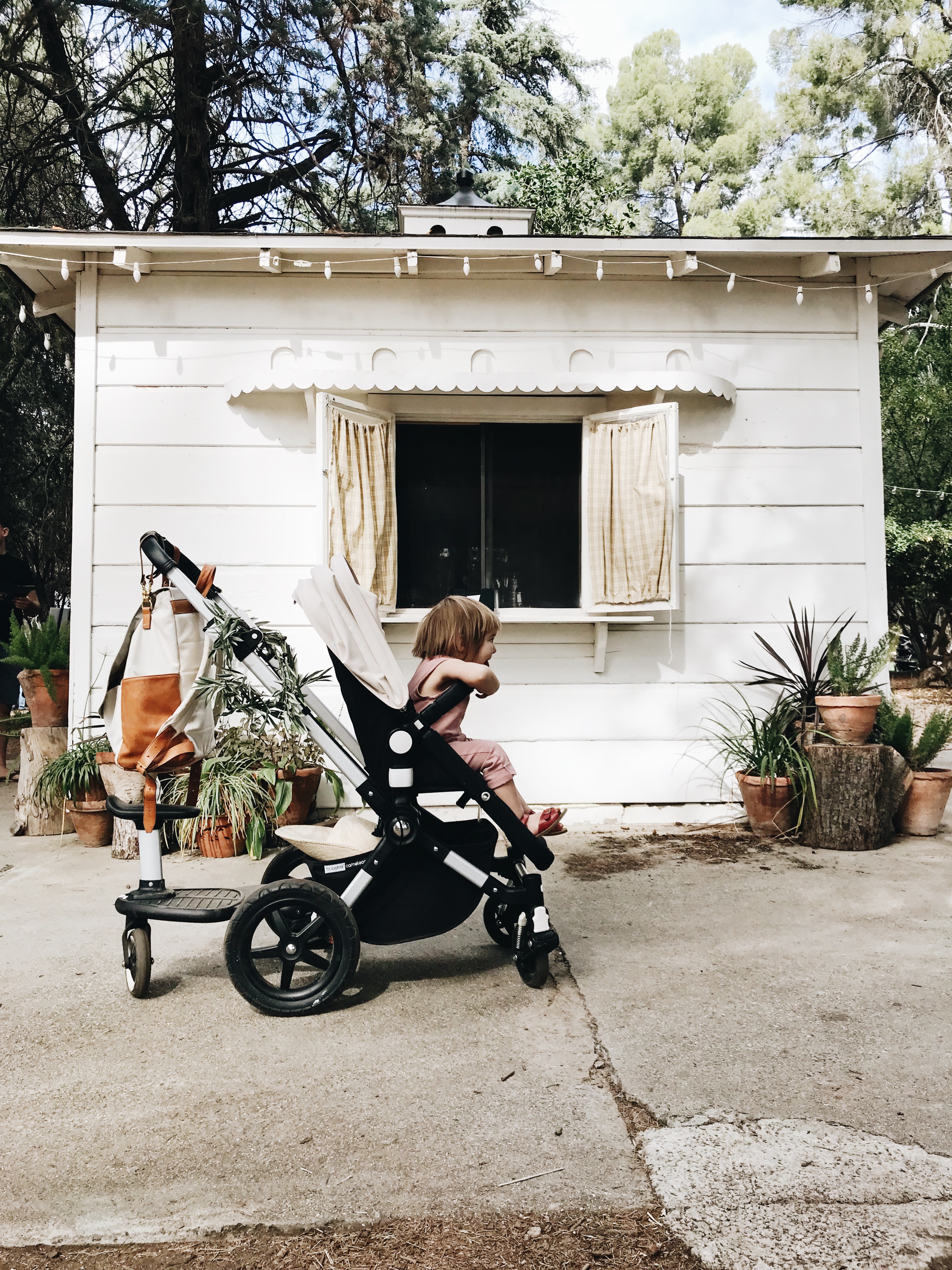
over the weekend, we headed out to highland springs ranch & inn in cherry valley for their annual olive festival. we started going there after we moved back to redlands a few years ago, and it’s become one of our favorite “hidden gems” in the area. i very rarely even bring a camera when we go out, and i hardly ever manage to sneak my way into a photo with the kids. usually because i’m the one snapping quick snapshots on my iphone between juggling things like the stroller and the diaper bag, or handing out snacks and managing tantrums. going out with the kids can sometimes feel like running a marathon, but if i remember to slow things down just a little bit, if i stop trying to see and do everything, then we manage to have a pretty good time. and i can even stop to get a few pictures to add to our photo album.

but anyway, back to the olive festival! if you live in the area, it’s definitely worth checking out highland springs ranch & inn. they have several different festivals and events throughout the year, most notably, the lavender festival in the spring. but they also have a cultured food festival in addition to things like burger wednesdays at the restaurant or just shopping at the organic galleries on the weekends, if you want a mellow spot to hang out. in fact, i really should do a more well-rounded guide to everything they have to offer… but for now, a few more snapshots of our weekend.


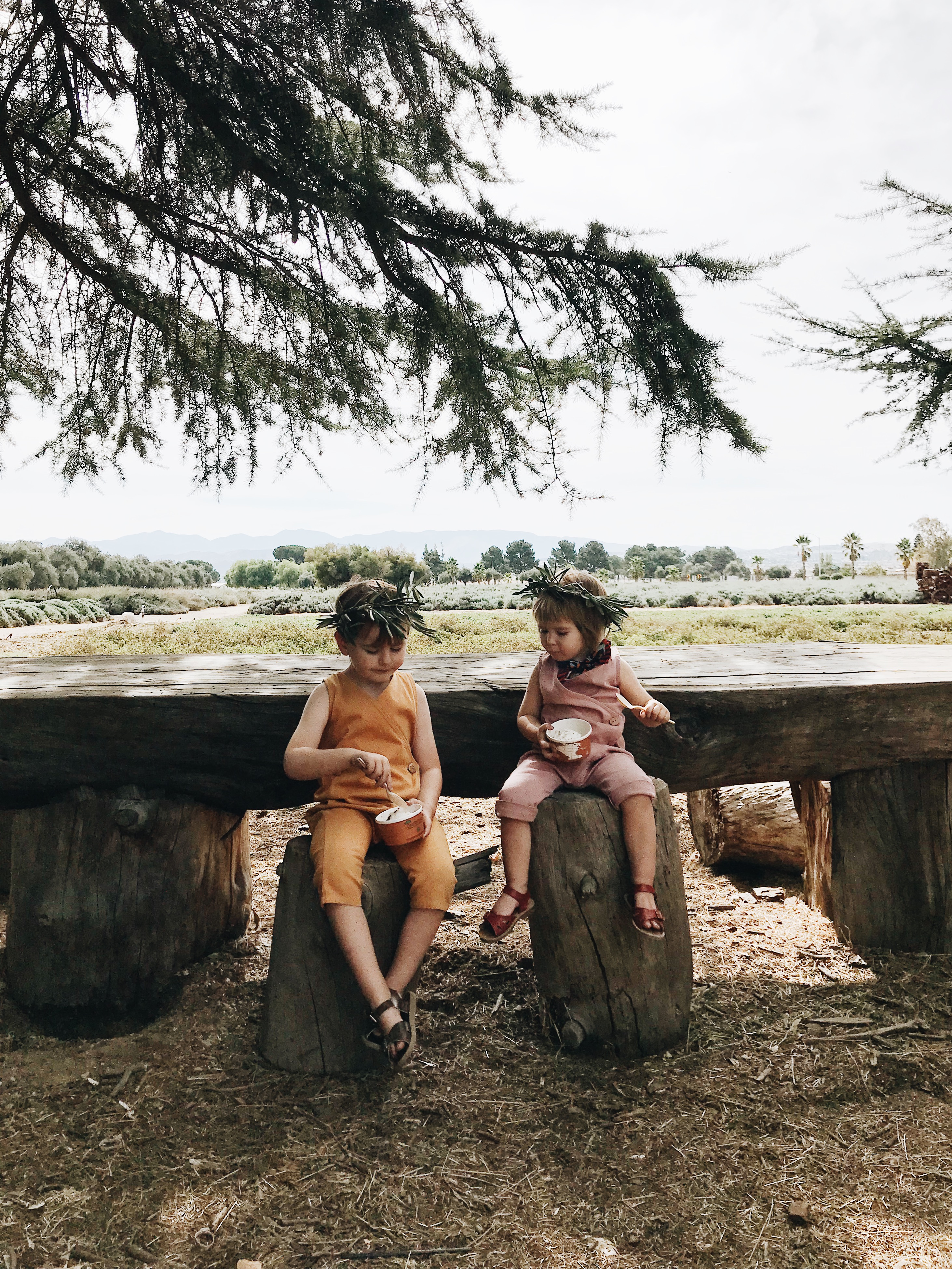
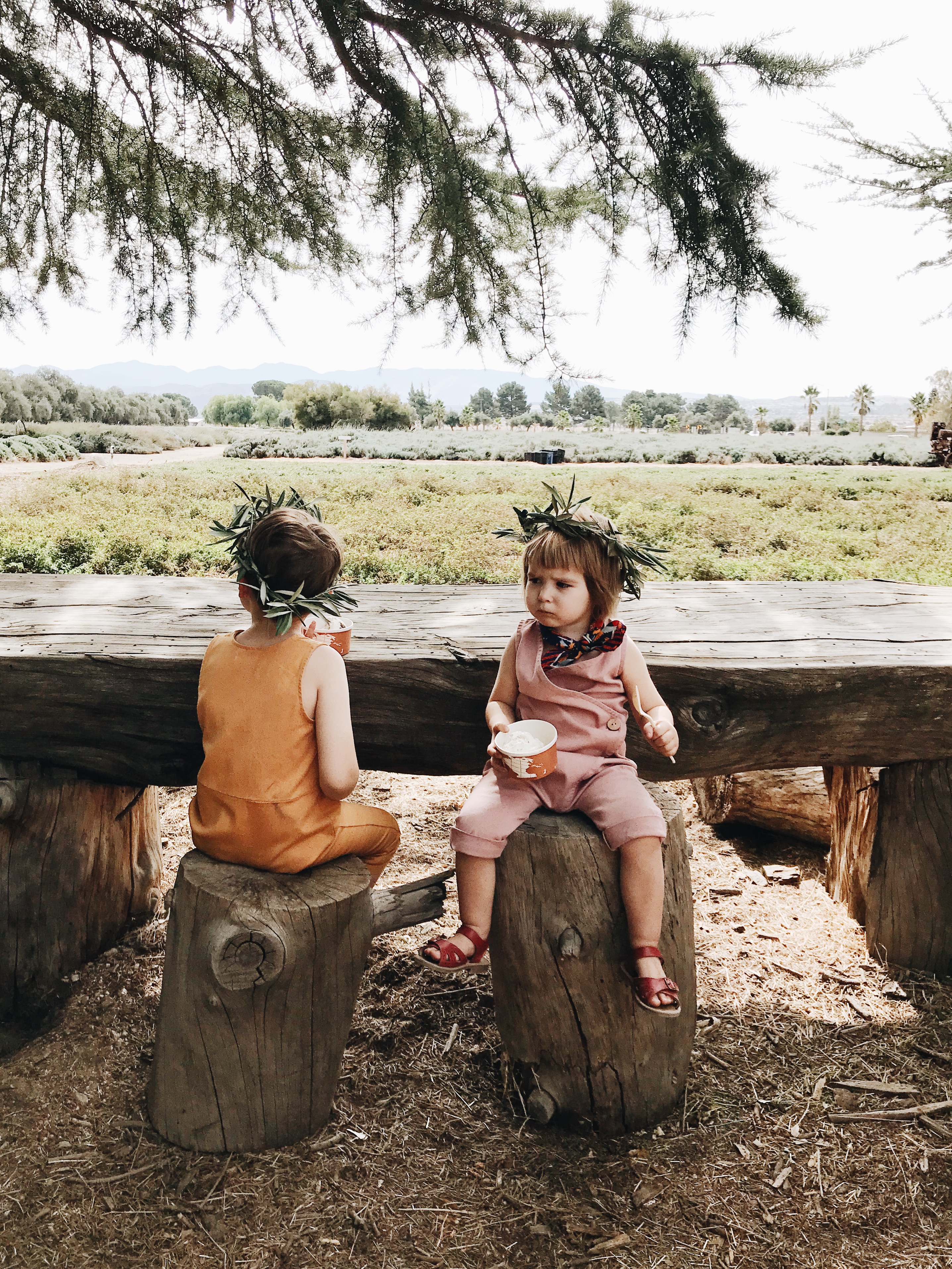
eating olive oil vanilla bean ice cream with a view of the lavender fields.


my trusty gear: a bugaboo stroller and leader co. diaper backpack.


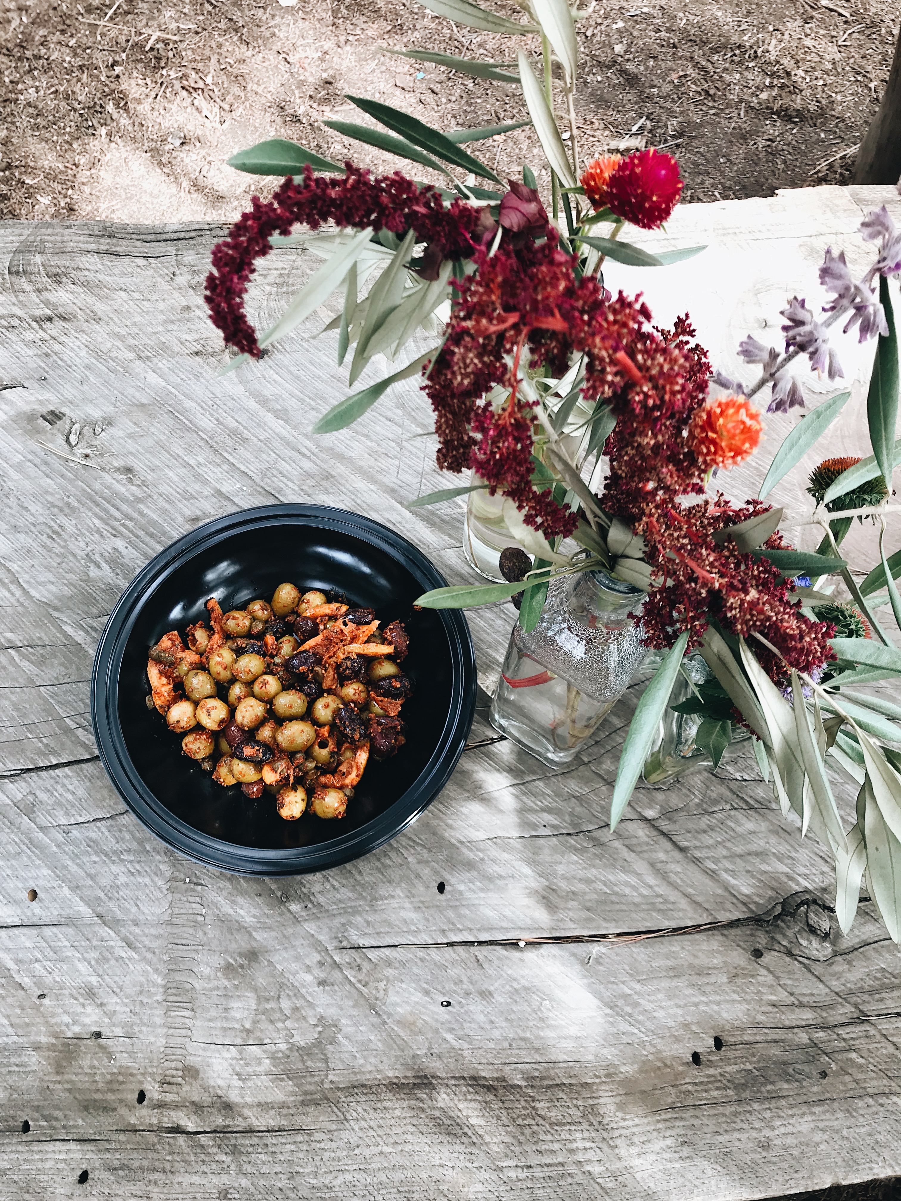
why yes, i ate a giant bowl of olives for lunch.


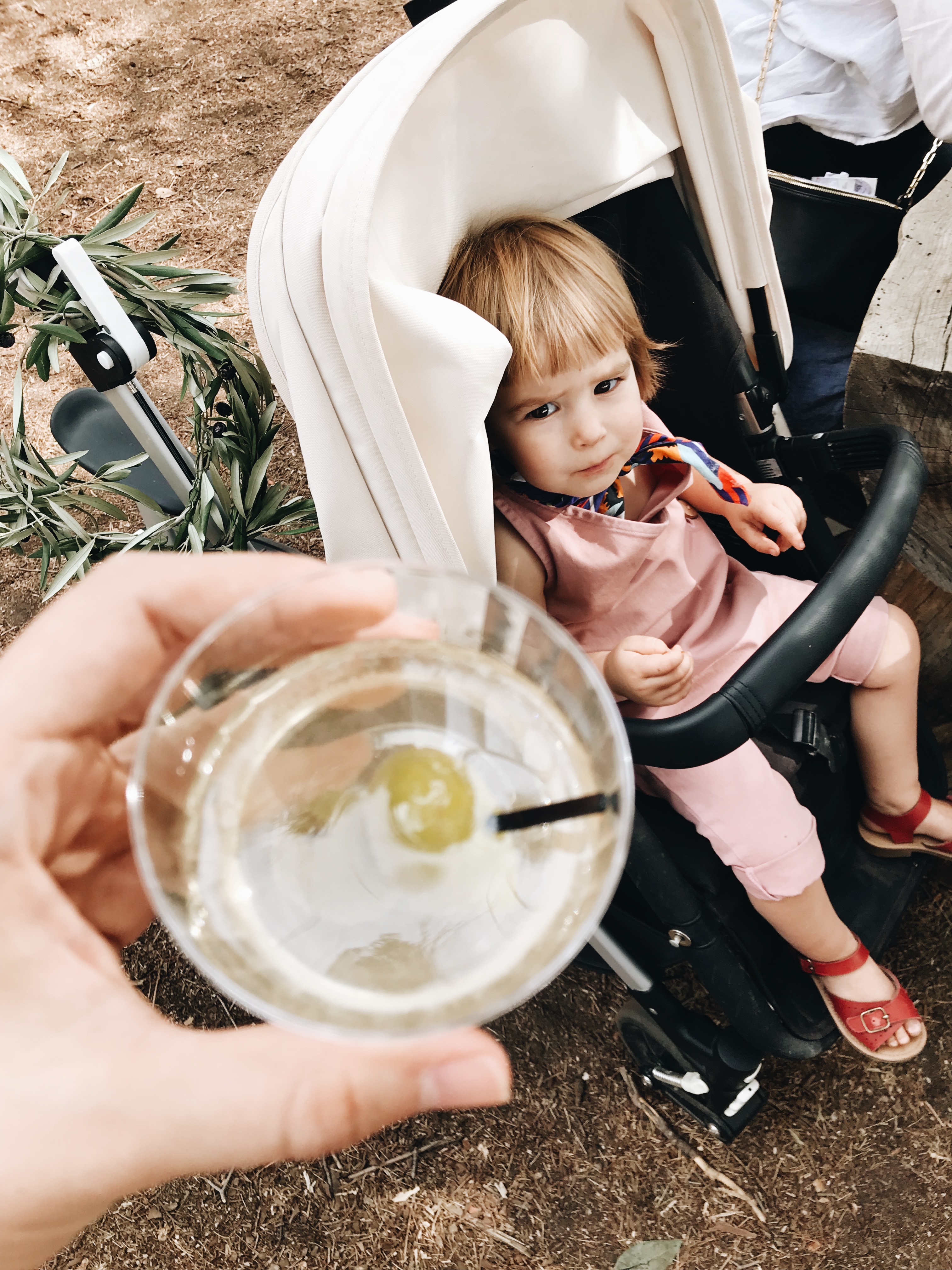
edie is judging me for ordering a dirty martini, but it’s the *olive* festival, you guys. i had to do it.


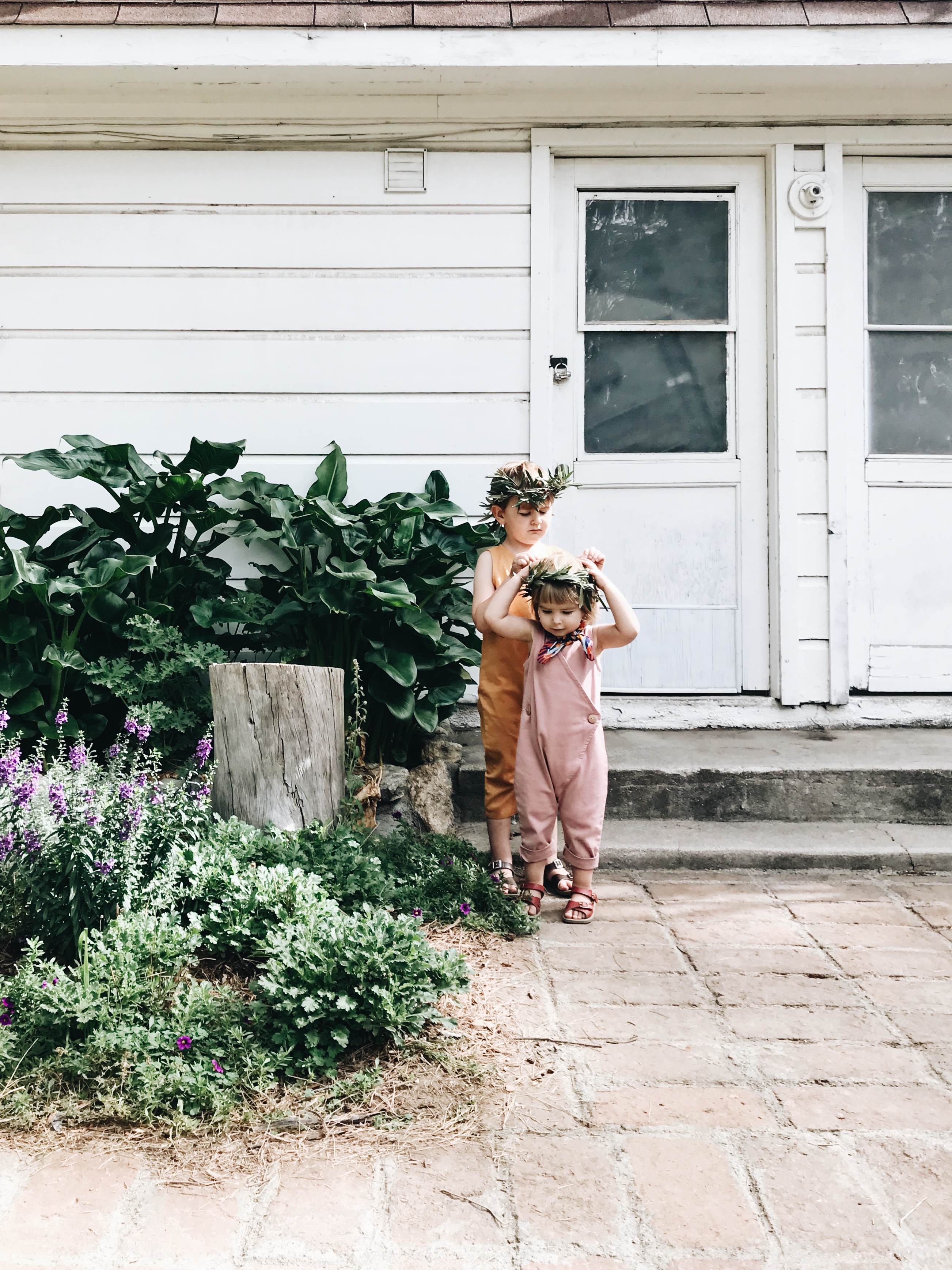
they have a lot of kids crafts, including these olive leaf crowns. not pictured: the inordinate amount of time spent in the bounce houses.

a toddler room sneak peek with framebridge x penguin books

i know i’ve shared the kids’ room a couple of times before, but the fun part about their room is that it’s constantly growing and changing right alongside them. the last time you saw this space, edie still had a crib and a changing table. but can you believe that she’s about to be two years old? and that adam has a big boy bed now? it happens so fast ugh!

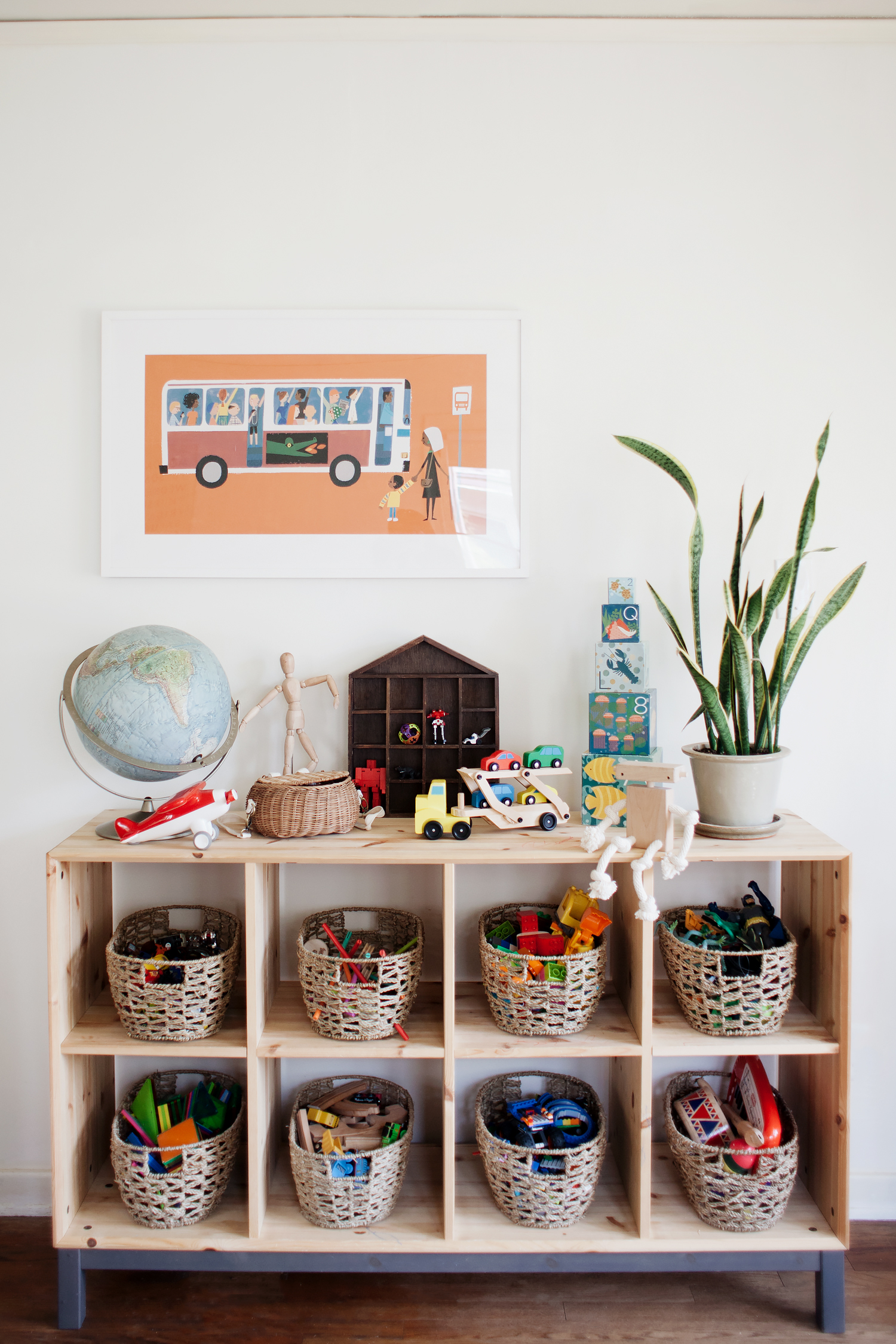
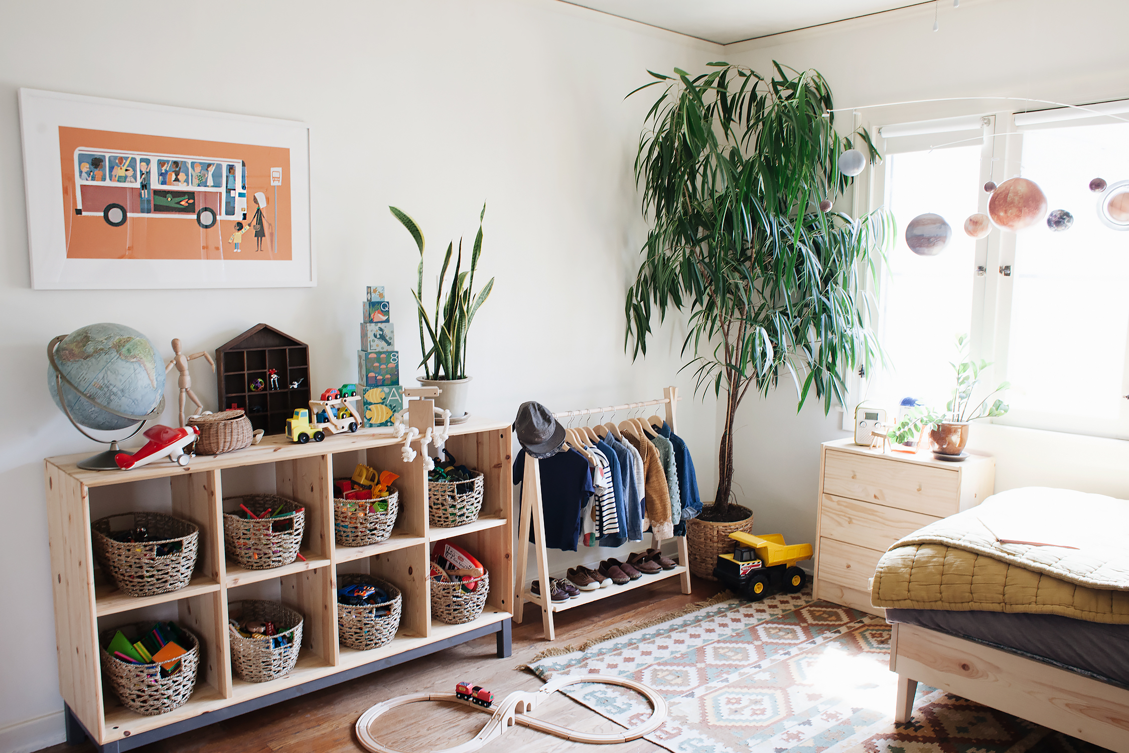
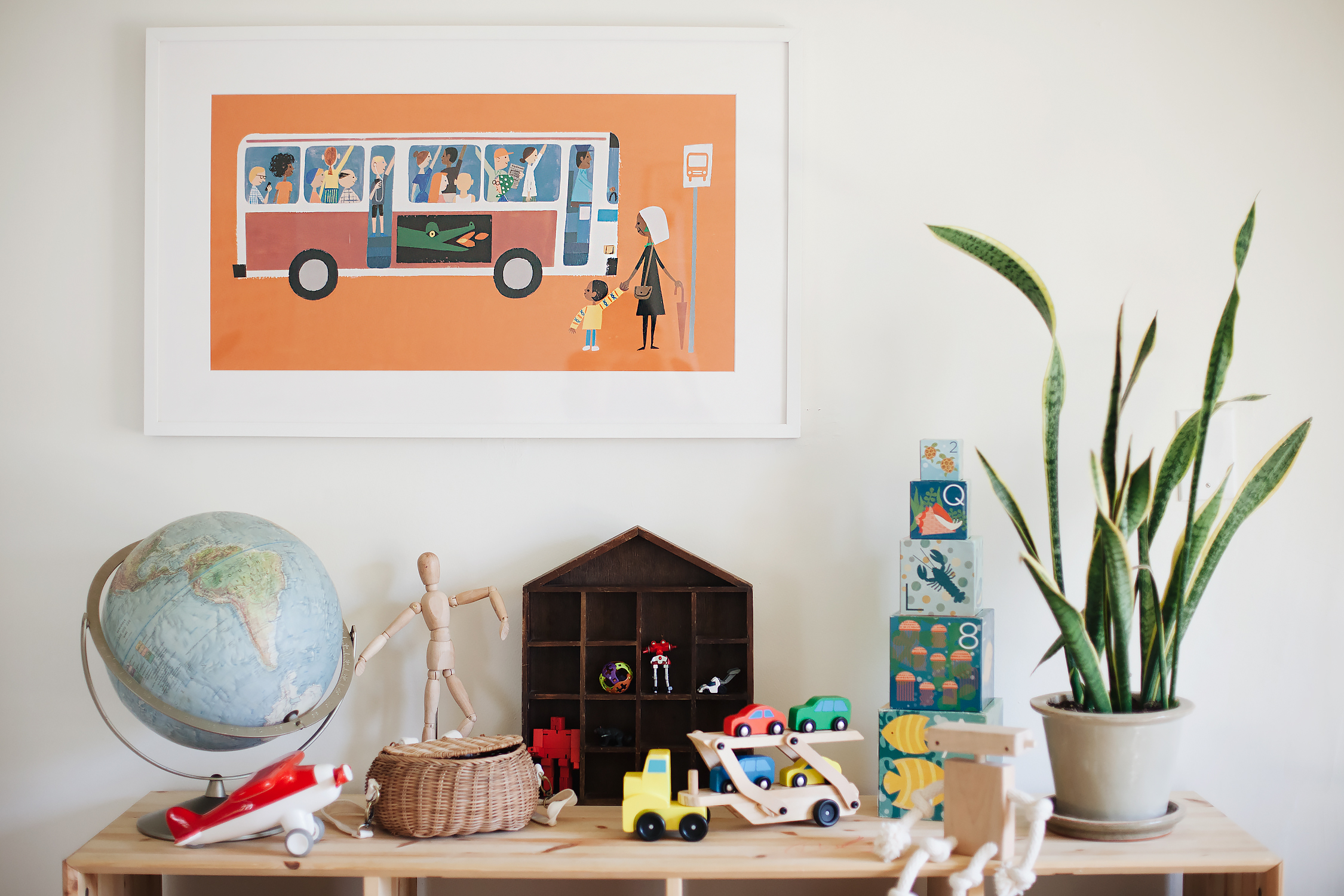
so as you can imagine, we’ve made a lot of changes over the past many months, and i’m gearing up to do a big reveal of how their shared space has changed. but today, i wanted to give you a little sneak peek courtesy of our friends at framebridge. they recently launched the penguin print house collection featuring a selection of limited edition prints from some of their most beloved books. we picked this beautiful last stop on market street print, illustrated by matt de la peÁ±a. it’s one of only 200 prints made, and comes with a certificate of authenticity. but of course, if this print isn’t your cup of tea, they have a ton more to choose from, so you should really check it out. and stay tuned because i’ll be sharing photos of the rest of the room so soon. and i’ll be talking about the ways that i was inspired by the montessori method, too!


outfit: recently

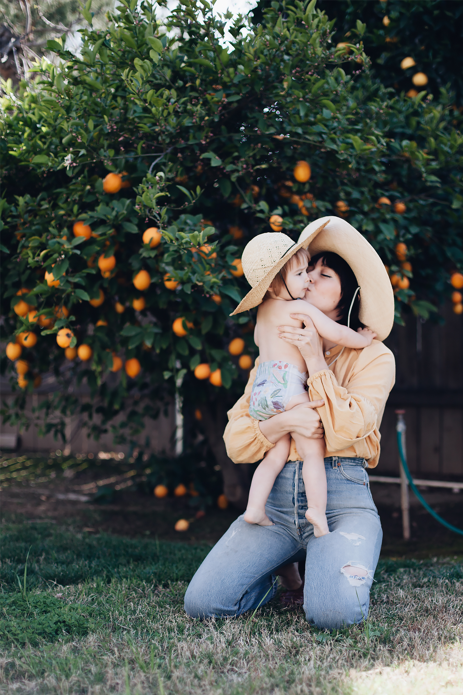
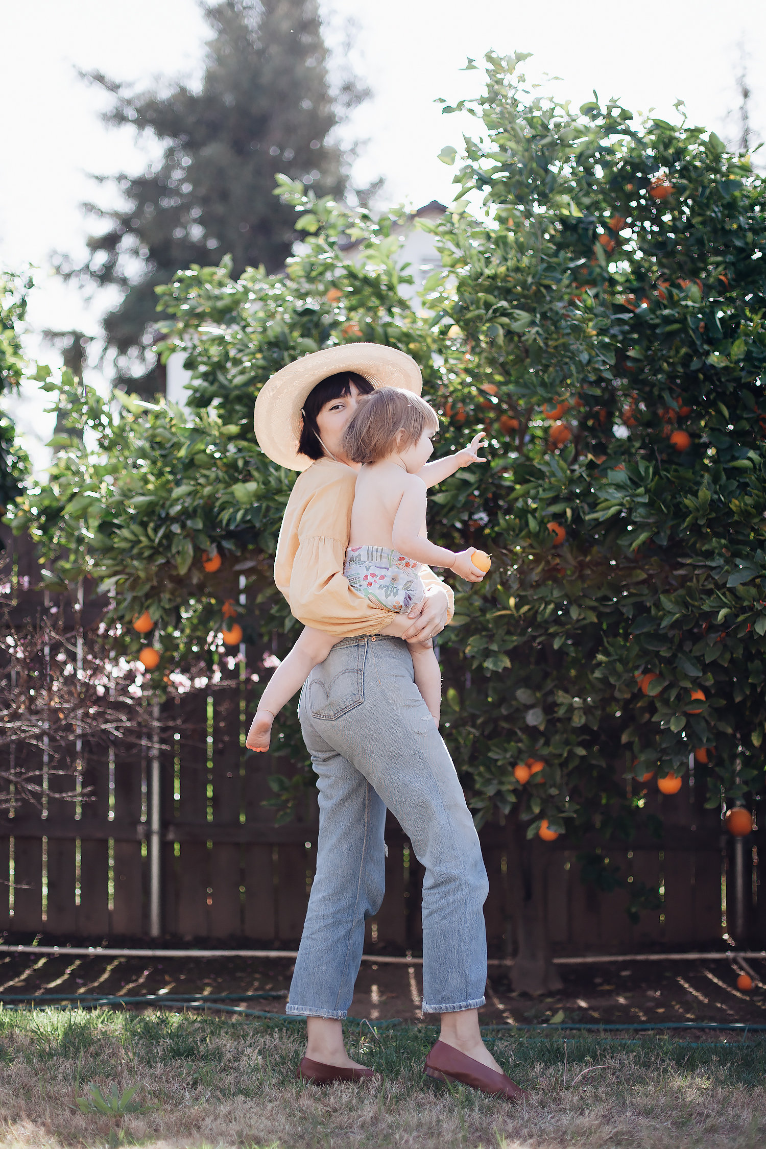
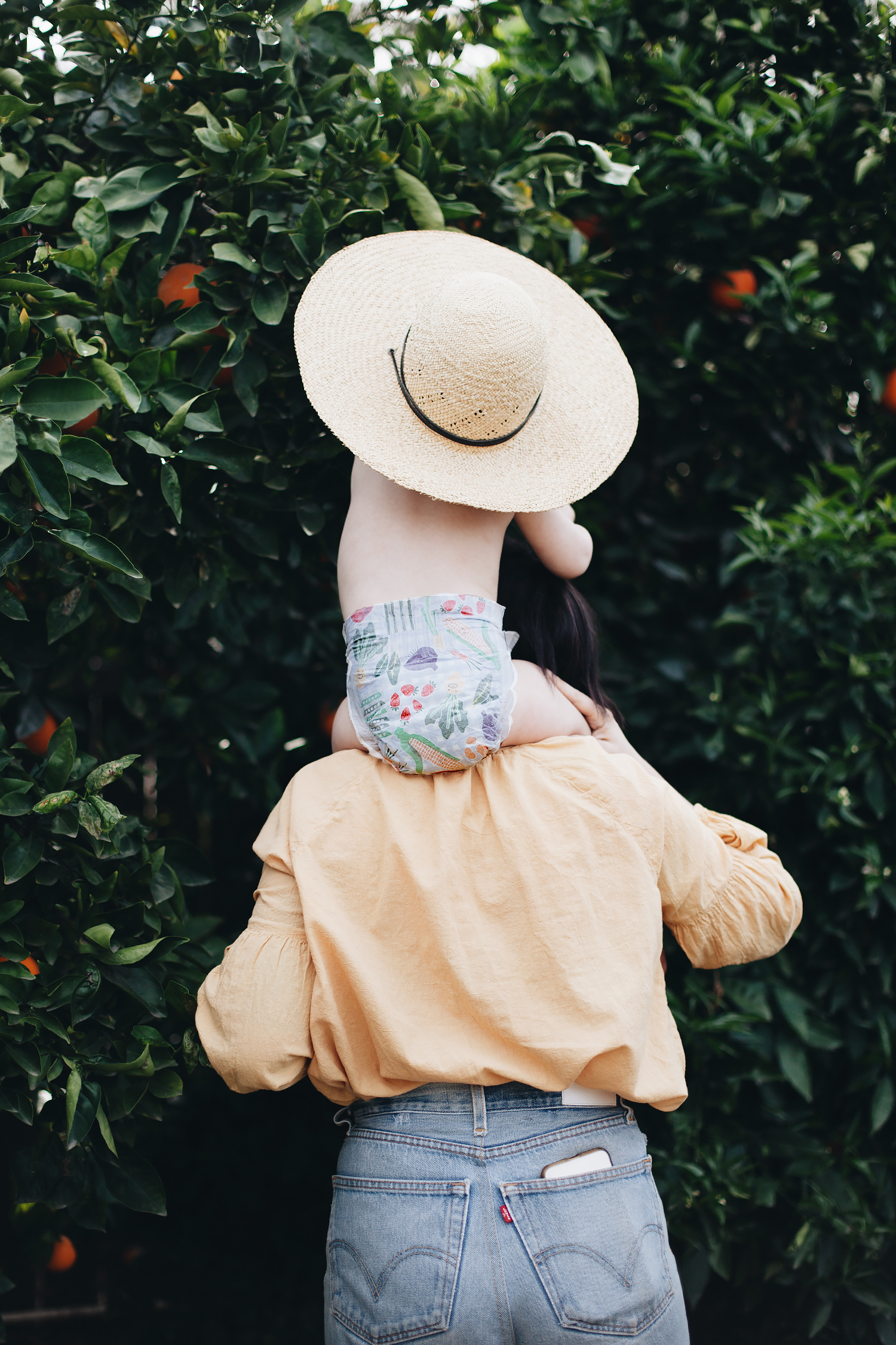
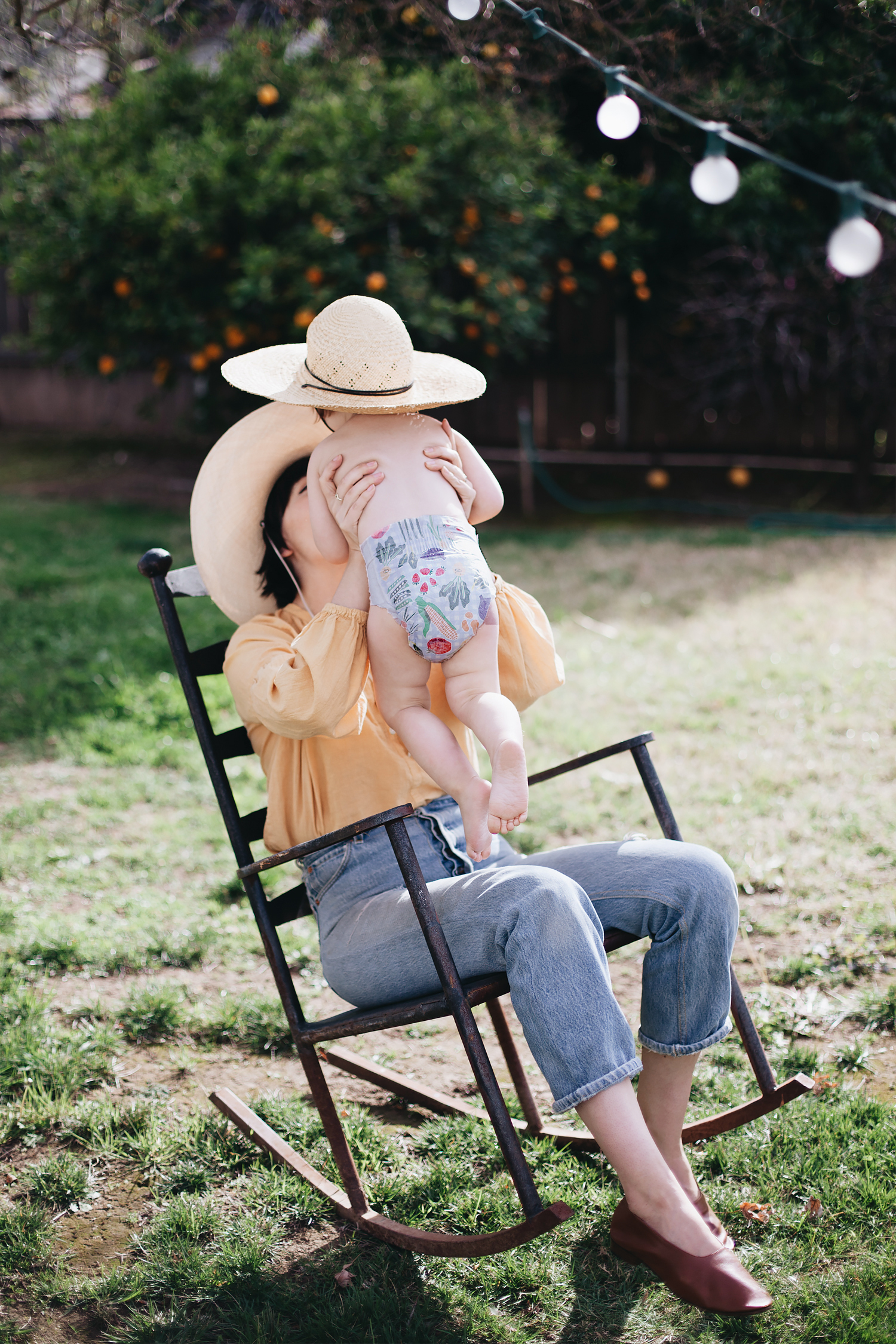
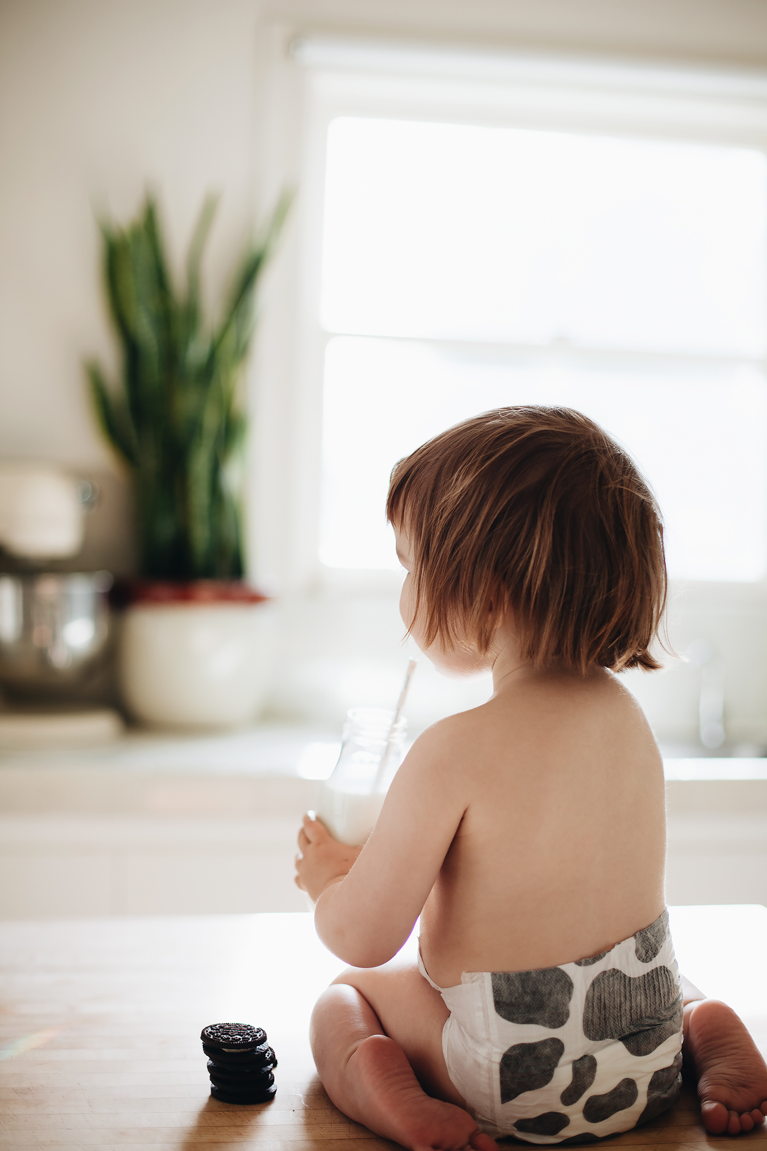
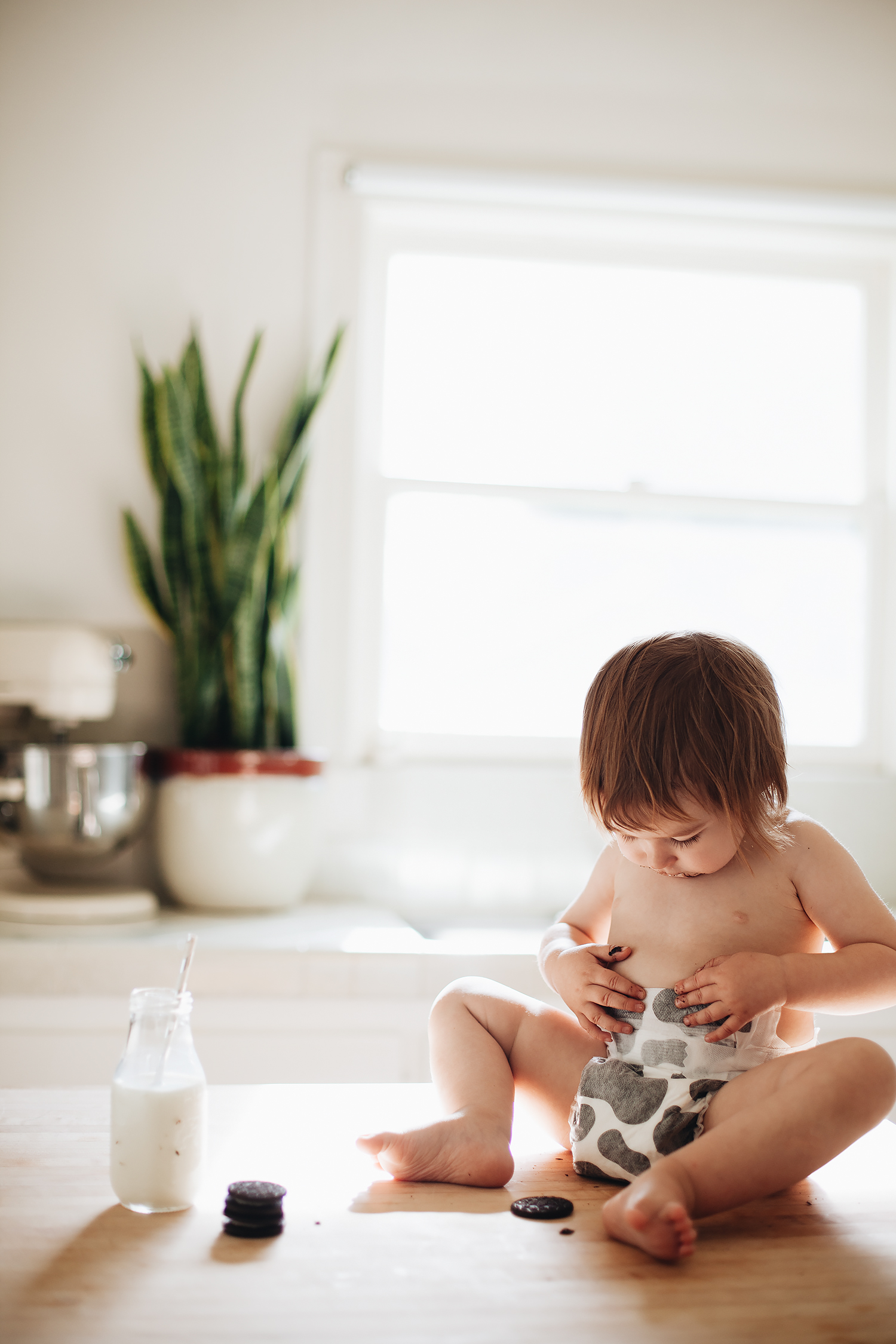
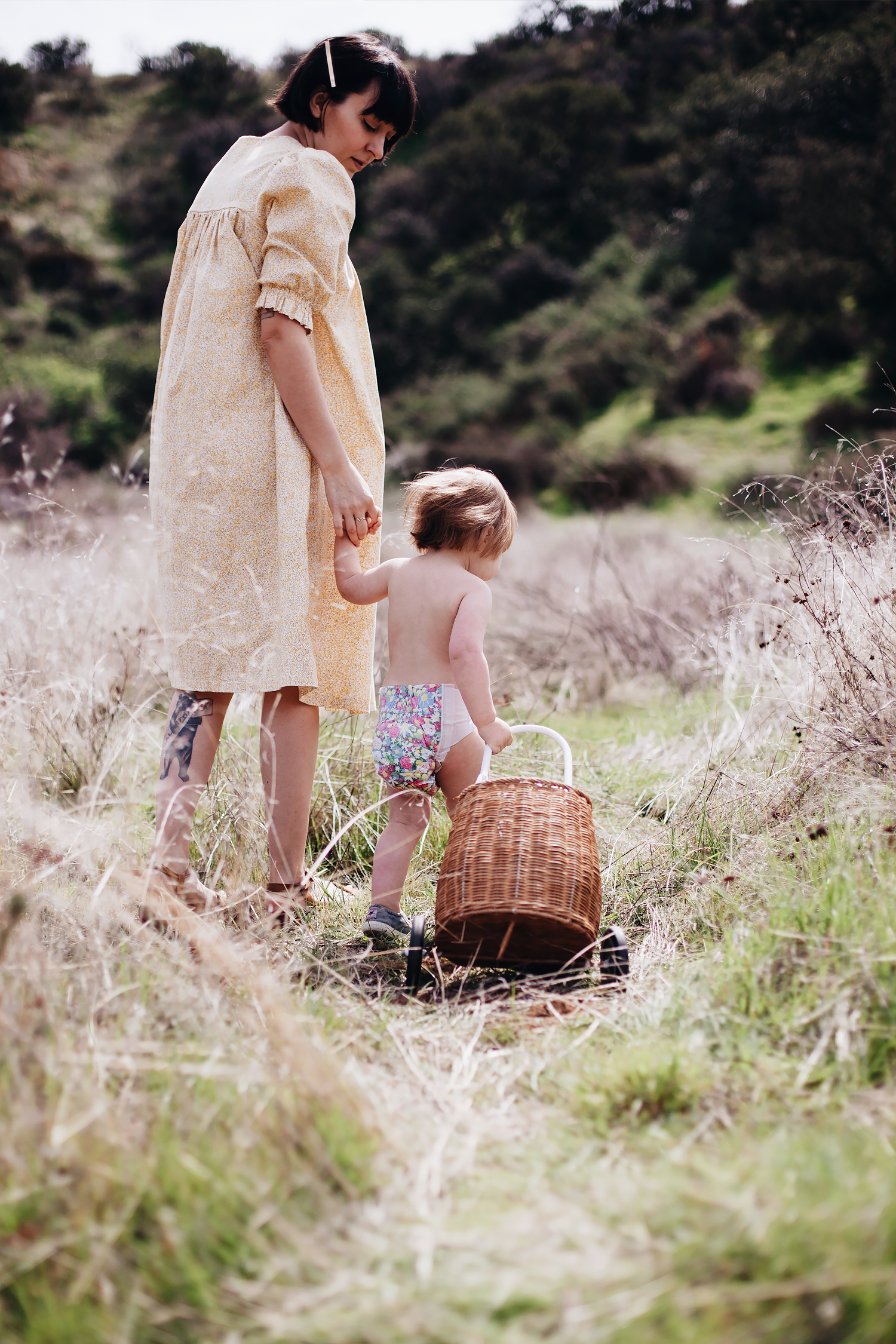
i recently had the pleasure of working with honest on a social media campaign. i only needed to get a couple of photos, but i guess i was feeling a little sentimental shooting with my baby who is about to be two, because we ended up doing three different shoots over the course of two days! sure, we were shooting diapers, but the photos mean so much more to me than just that!

when adam was little, i felt this intense need to document every single moment in photos. i had the luxury of being able to pull out my professional camera whenever the mood struck, so i have a ridiculous archive of pictures. but when edie was born, let’s just say that things got a little more chaotic. each moment was still just as special, but i realized that i didn’t need to document every single milestone for me to enjoy it– or even remember it. and honestly, it just isn’t as easy to pull out a camera as it used to be. i still find myself pulling out my iphone to grab quick snapshots to share in group texts with family members, but i don’t do all of those elaborate shoots i did with adam. so i think i had a lot of fun with this project because it gave me a chance to get some photos with edie all on her own.

this blog post isn’t sponsored, but the photos were shot in partnership with honest for sponsored content on some of my social media channels. if you’re interested, here is a link to the new limited-edition spring prints.


home: a campaign cameo

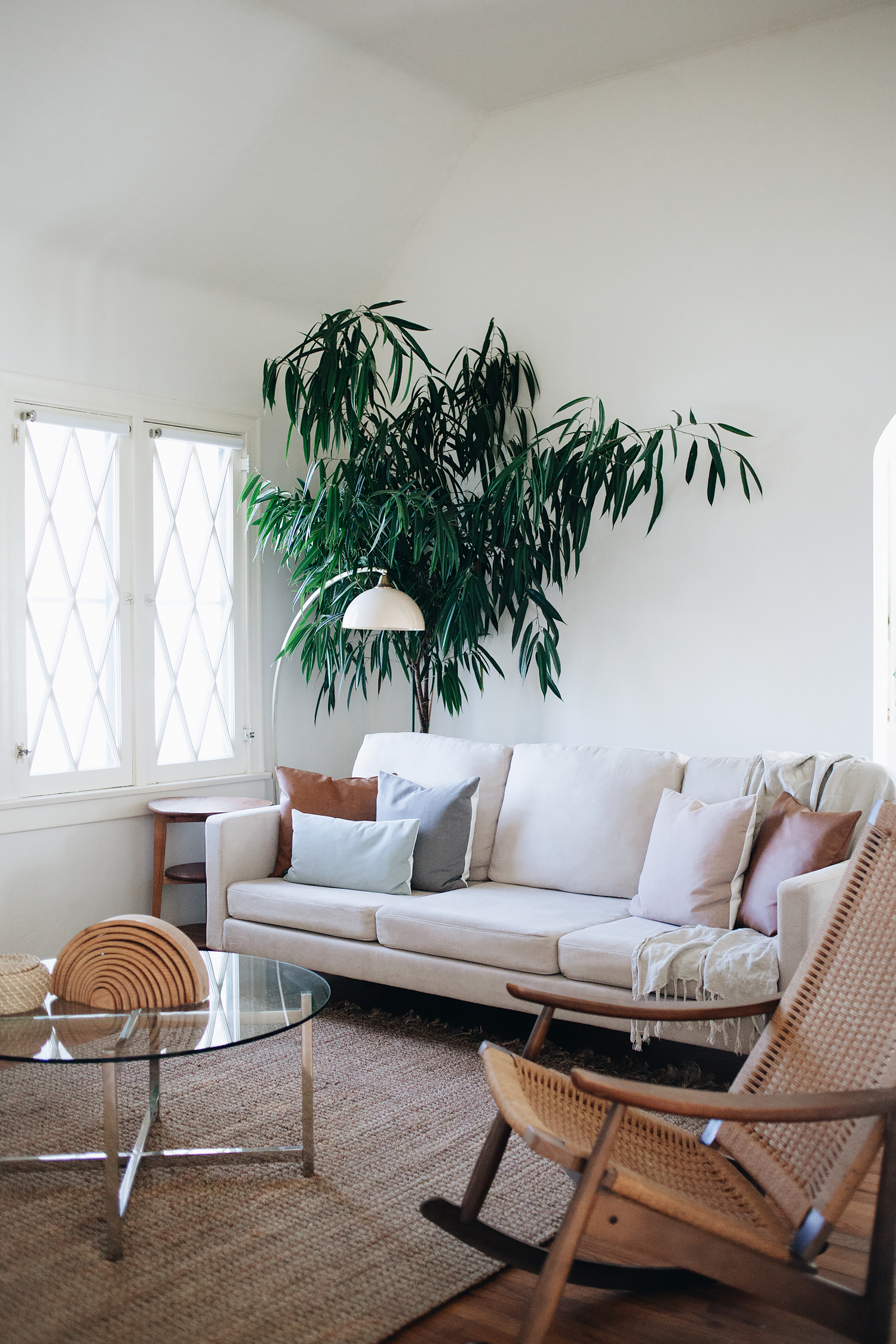
two little home updates today, both having to do with our pals at campaign! they make the lovely sofa that we currently have in our living room, which i can’t recommend enough! seriously, if you haven’t checked out the brand, then you really should! originally designed so that it could be shipped flat and constructed at home, making it an easy option when you inevitably move from apartment to apartment as a city dweller, the steel frame also happens to be virtually indestructible while also allowing you to switch out the covers for easy washing– or completely changing the look of your sofa without having to buy a new one. i may no longer live in a big city, but as a mom to a toddler and a fast-growing little boy, these features have become more appealing to me than ever before.

so of course, i was beyond excited when they asked if we’d be interested in making a little cameo in a video for the brand. they showed up just before we decorated from christmas a few months back, and the talented vanessa mona set up her lens to get some footage. and it’s a perfect example of how we’ve been swapping out colors depending on the mood. you can see the sunset yellow color in the video, which we complimented with a kilim rug. and above is the current post-holiday set up. i decided to go super neutral and opted for some super comfy throw pillows from their new collection. from the left: vegan leather arcata, vegan leather novato, vegan leather ojai, and vegan leather madera.

https://www.youtube.com/watch?v=A94tR7jaB3E

1 2 3 29