the frame

you may remember a few weeks back, we started the process of redecorating our living room. the whole space got a fresh coat of paint and i started simple with a fireplace makeover. but one thing i forgot to mention is that we completely removed our old television from above the mantle because we just couldn’t figure out a way to make it work in our tiny living room. don’t get me wrong, i like to watch tv as much as the next person, but i don’t really like the way it takes up so much space and has a tendency to become this dominating presence in the room. add in the fact that we don’t have a ton of wall space– and tastefully decorating a functional living room for the family has become a really tricky endeavor.

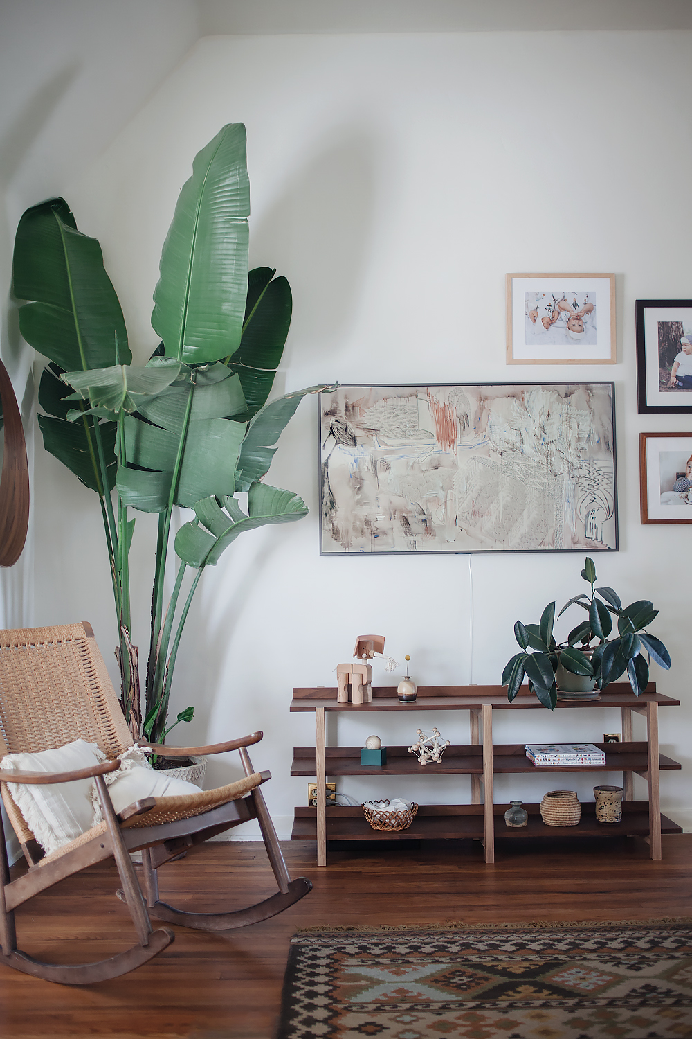
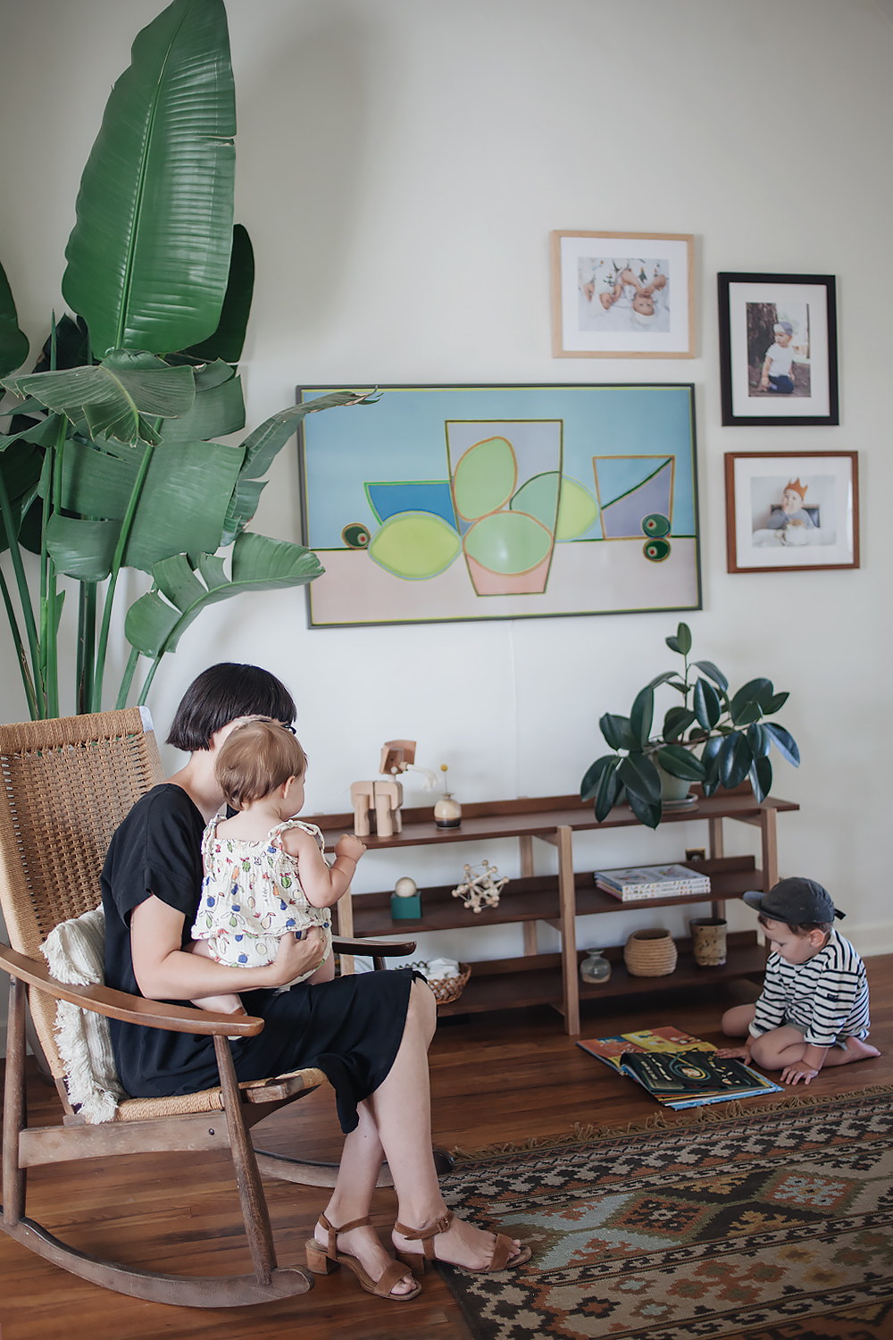
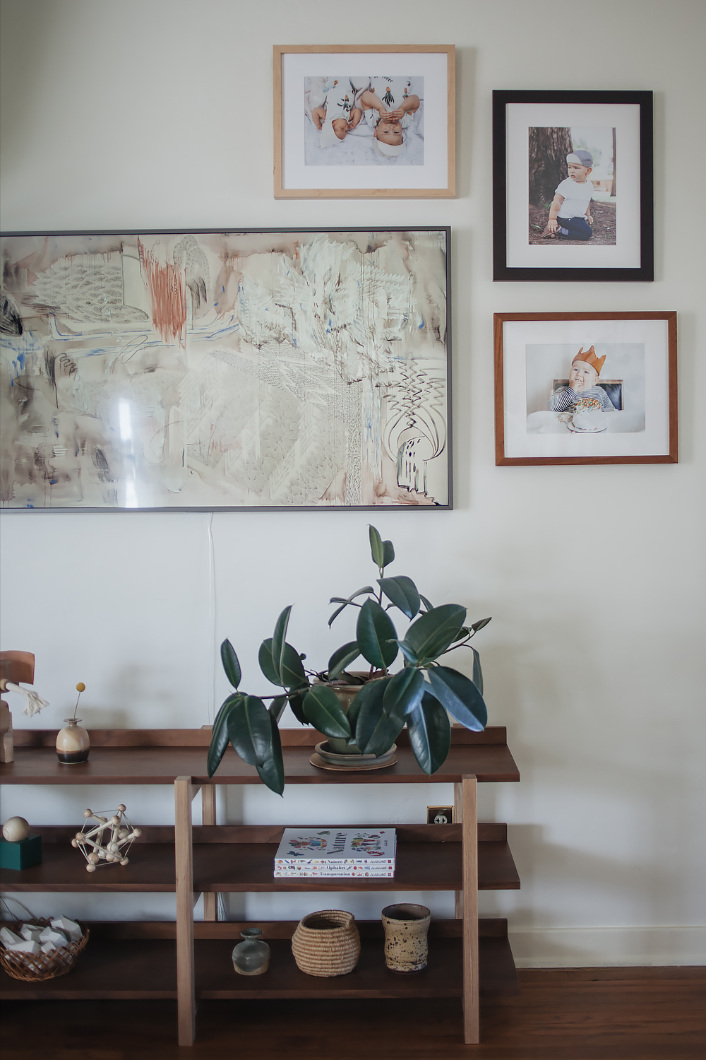
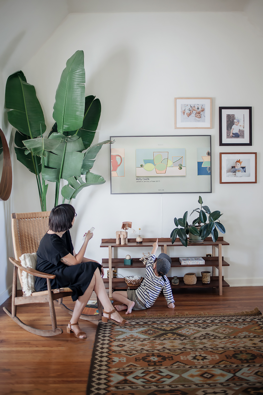
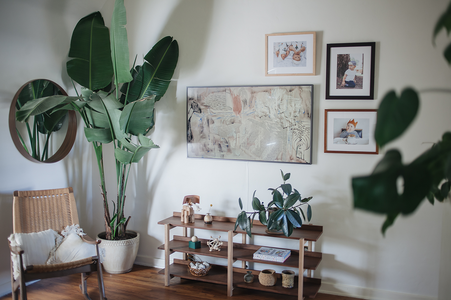
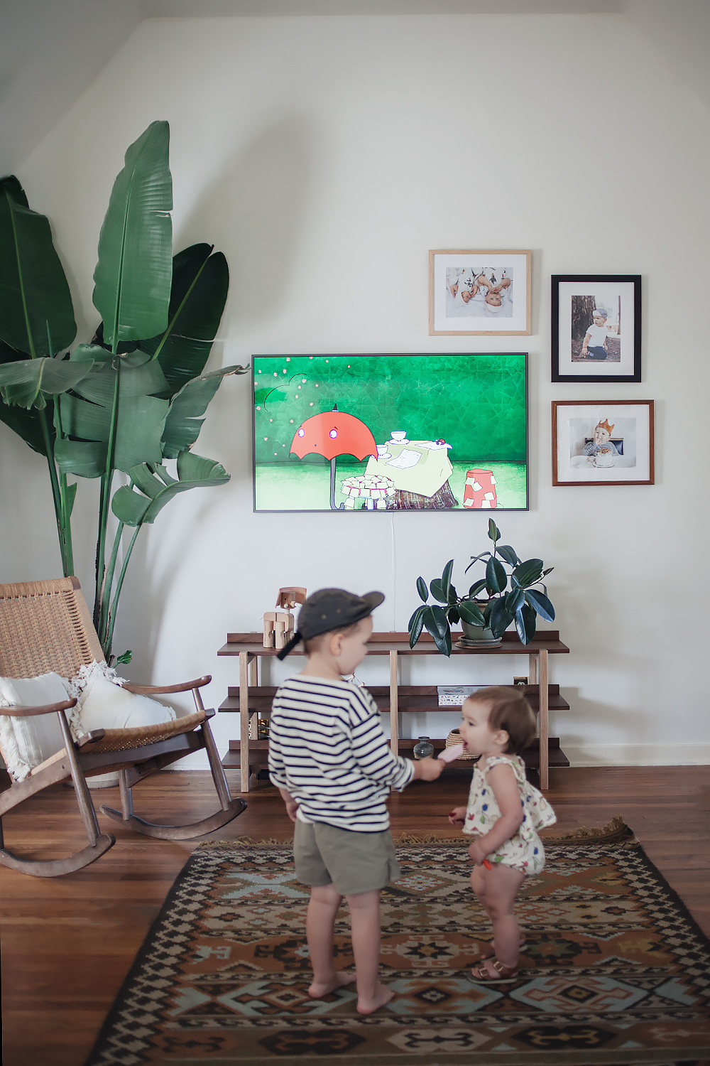
enter samsung’s latest collaboration with designer yves bÁ©har– the frame. we received this innovative new tv in collaboration with samsung, and i didn’t even know what i was missing before it arrived! you may remember that previously, this wall served as a sort of makeshift foyer (see here and here). our current patio/mudroom is out of commission due to renovations (which is an entirely different story that i’ll have to save for another day!), so we’ve been sacrificing a big part of our living room as a place to store our shoes and drop off the mail. it was cutting the room in half and was creating a lot of wasted space in an already cramped area of the house. after changing things up, i can honestly say that without the frame, there is literally no other way we could have made a television work in here so gracefully.

true to it’s slogan, it is literally the most beautiful tv you’ve never seen. if i hadn’t taken these photos myself, at first glance, i don’t even think i would have known it was a television. the beauty is in the super sleek design coupled with the no gap wall mount so that it hangs flush with the wall alongside all of your favorite framed photos or artwork. the invisible connection is virtually undetectable and eliminates the usual mess of cables so that it truly looks like framed art on display. when you’re not watching your favorite shows, you can leave it in ‘art mode,’ allowing you to select your favorite art from a gallery of 100 professionally curated pieces of art. or you can upload your favorite family photos, it’s up to you. if the black frame isn’t your thing, you can also customize it with three additional bezel options in light wood, walnut, or white metal.

the design is really what sold me because it’s allowed me to ‘hide’ the television in plain view and put it in a place that helps to keep the living room cohesive and functional at the same time, which has totally opened up the possibilities when it comes to the rest of the decor as we continue working on the space. but if you’re more into the technical specs, then you’ll be impressed to know that it is a 4k hdpro tv with four times more pixels than full hd. and it’s no small thing coming in both 55″ and 65″ sizes. it’s like having an art gallery and a secret home theater all wrapped up into one tiny living room. who knew a tv could do so much?

go check out the frame for yourself!

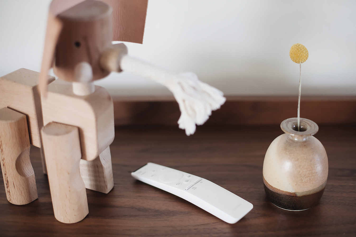
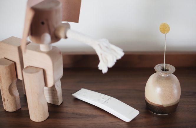
other details: framebridge frames, vintage rocking chair found on apartment therapy marketplace, cb2 stax shelf, monroe workshop toy elephant, vintage baskets, good thing mini container in forest, manhattan toy skwish, areaware balancing blocks, vintage throw pillows, kosas home indoor/outdoor rug (sold out, but this one is similar)
this post was created in collaboration with samsung.



a fireplace before & after with true value

calivintage - a fireplace before & after with true value

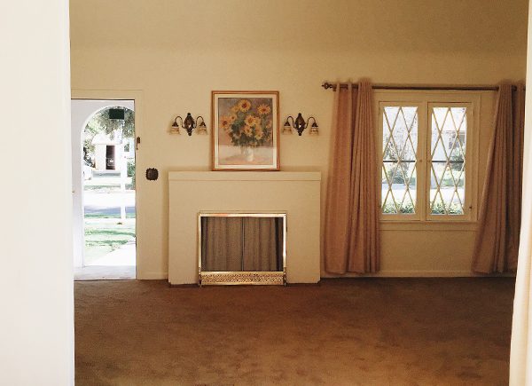
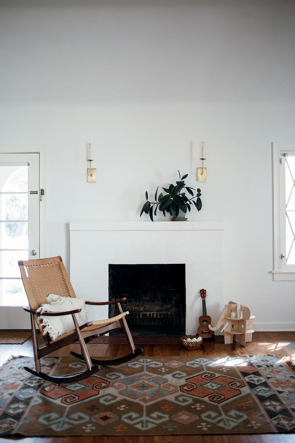
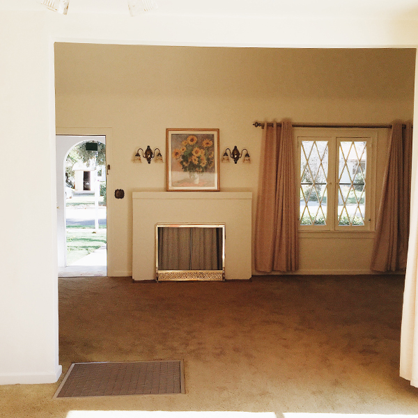
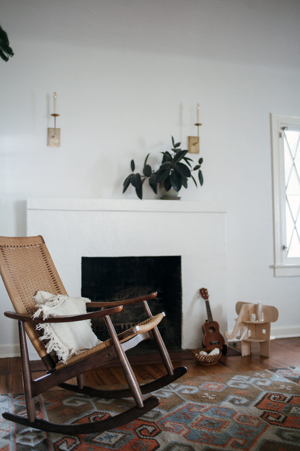
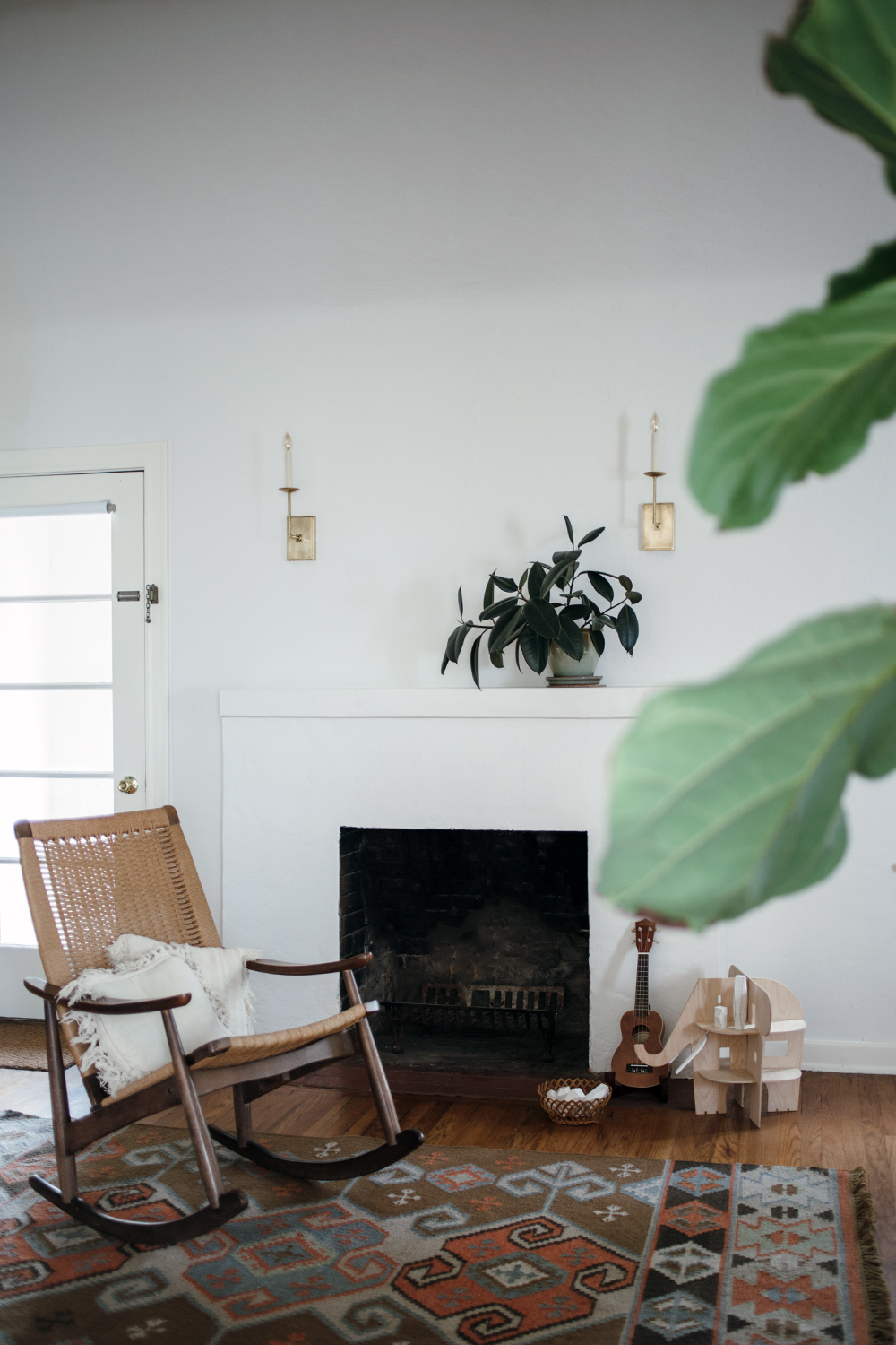
another little space in our house is coming together! i never say a project is “finished” because there are always improvements to be made, but i’m feeling pretty good about this transformation. if you take a quick scroll past the text, you’ll see what i mean. that photo down there is what it looked like the day we moved in. dirty brown carpet, heavy drapes, cheesy sconces, hotel room artwork. the fireplace was boarded up with a really hideous screen leaning up against it. when it was on the market, i’m sure some people took one look at this living room and turned right around, but i knew that it was just a matter of cosmetics. all it really took was a couple of days work. we peeled away that dirty carpet to reveal the original 1920s hardwood floors, we switched out the light fixtures, added our own decor, and slapped on a fresh coat of paint.

and today i’ve teamed up with true value to share my experience choosing the perfect shades of white for your home. but before i go too far on the subject, i do need to preface this by saying that it is nearly impossible to photograph white and get an accurate depiction. i tried to get as close of an approximation as possible with these photos, but the only way for you to truly see what these colors look like is to get some samples and paint your walls! it even took me a few different tries mixing different shades of white to land on something that i really loved. so if you’re on the hunt, i’ve done a little bit of the legwork for you.

the walls are my absolute favorite shade of white. it is the true value easy care ultra premium flat interior in swiss coffee. the color was actually first recommended to me by my house painter and it is a standard shade that it available though many different brands. but it is still a standout choice and my personal favorite for my home. it’s a really great neutral white that isn’t too stark and clinical or too dark and yellow. it gives you that perfect scandinavian vibe– a nice soft white that serves as a clean backdrop for your decor. if you’ve ever had trouble with whites looking too blue or too dingy, then this color will be like a breath of fresh air.

it’s not as noticeable in the photos, but for the trim, i went with a slightly warmer shade of white– true value easy care ultra premium satin interior in sand dollar. i was going for more of a traditional look with this choice because i think it goes well with my 1920s home. i like it because it’s a nice creamy vanilla shade that helps to give just a little bit of dimension and depth without jumping out at you or competing with the decor. it just looks like it belongs. i actually had to go through quite a few different shades to land on this one, so i’ll share what i learned: look at the undertones of the shade you’re using! i was just plucking colors from the samples that i thought looked nice. but when i got home, they were either too pink or too yellow. i finally figured out that you can actually look at the undertones of the color formula as a guide to help you find a complimentary color. i took a look at the neutral undertones of swiss coffee and it helped steer me in the direction of the right shade to warm things up just a tad.

then it was just a matter of painting! this was the first time i’ve tried true value paints and i was really impressed with how viscous the formulas are. the ultra premium line just came out, and it is a paint and primer in one, so you can literally just slap on a coat or two and you’re done.

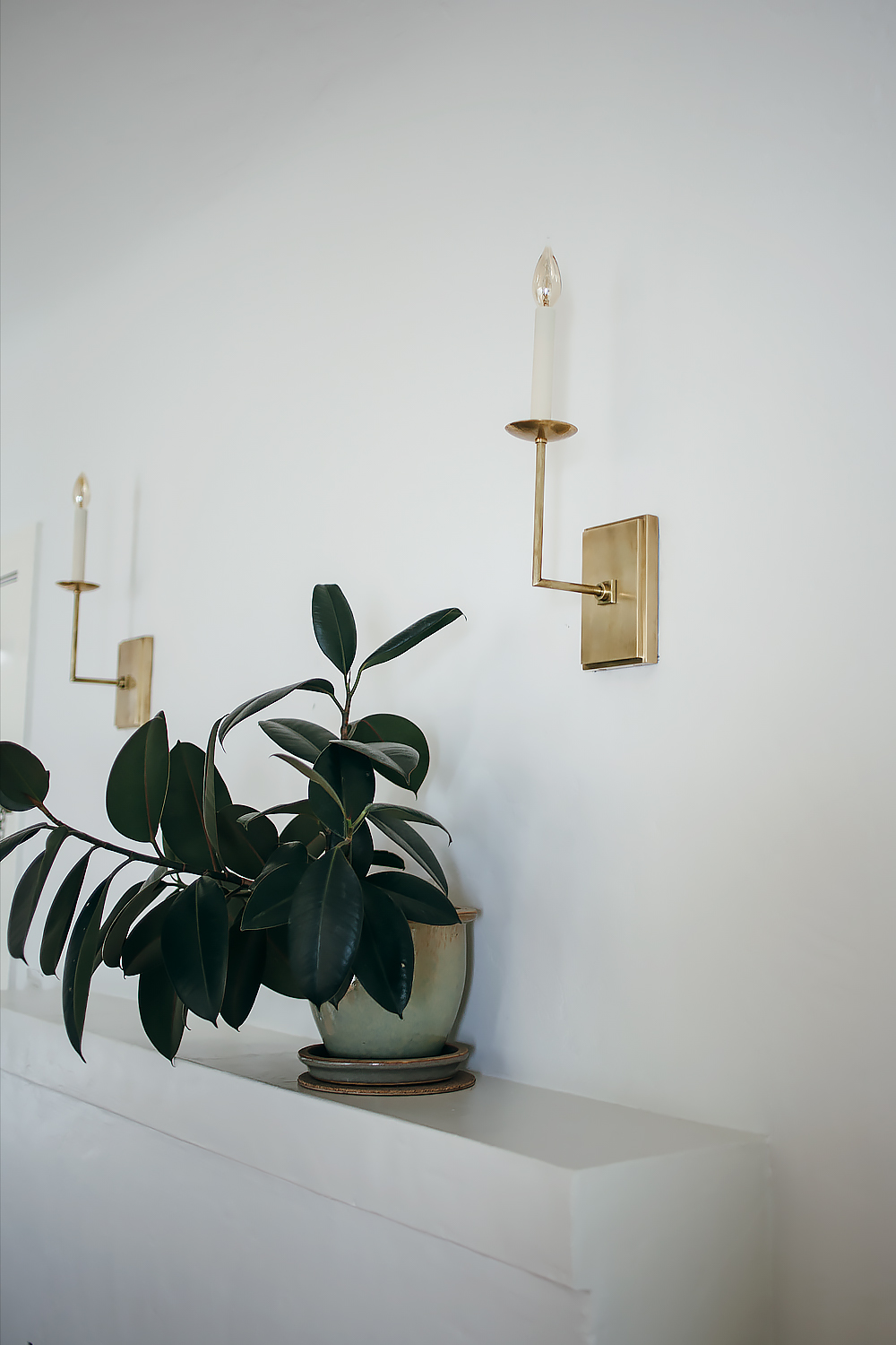
details: true value easy care ultra premium flat interior in swiss coffee on the walls and satin interior in sand dollar on the trim, visual comfort right angle sconces in hand rubbed antique brass, rock & pebble ele villa, areawear balancing blocks, vintage rocking chair and throw pillows, kosas home cosuma indoor outdoor kilim rug

calivintage - a fireplace before & after with true value

This is a sponsored conversation written by me on behalf of True Value. The opinions and text are all mine.

a dining room refresh with cb2 x framebridge

calivintage - cb2 x framebridge

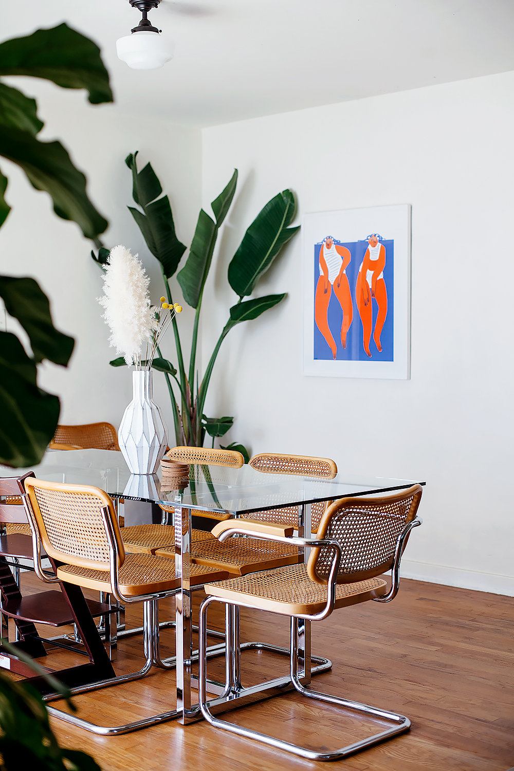
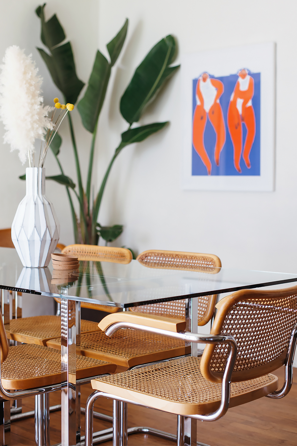
this is not the first time i’m sharing a glimpse of our dining room, but it is the first time that i feel good about it haha! we’ve officially been living in our house for two years, but it wasn’t until a couple of weeks ago that we finally pulled together the dining room. for the longest time, i had a pretty cool mid-century dining set that my mom found at the thrift store for $80. it served us well, but it was really rough around the edges. it was this very dark stain with a shiny almost plastic table top. the chairs started falling apart– while people were sitting in them. i replaced them with these vintage cesca chairs that i found on craigslist, but then we had this whole mismatched situation going on because i could not commit to a new table. no, it was not the end of the world, but it feels really good to finally put together this space in a way that i like. i toyed around with a lot of different ideas for how i wanted it to look, but ultimately decided to keep things really really simple because the table and chairs make a statement on their own. and all i really wanted was a big graphic print up on the wall to complete the look.

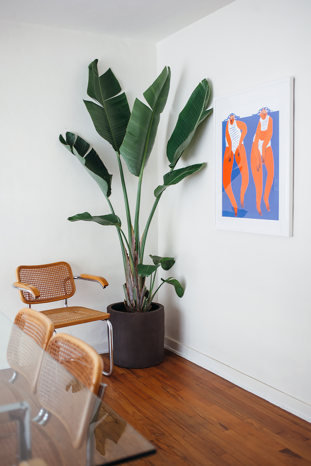
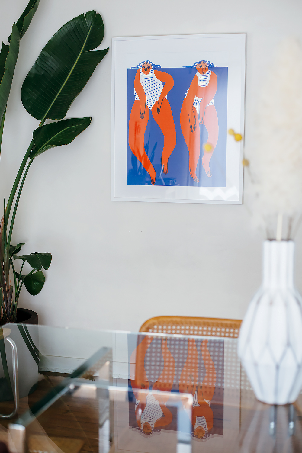
so as fate would have it, my friends at framebridge asked me if i’d be interested in picking a print from their newest print gallery collab with cb2. together they curated a really great selection of prints by up-and-coming artists, all of which are now available on the site. i chose this print titled “keep swimming” by new york-based artist amber vittoria. i really like the bold colors and exaggerated shapes for my dining room, and the theme is perfect for the spring and summer months. and of course, the frame was handcrafted here in the united states by framebridge.

i’ll share some more photos to show the rest of the room soon, but was so excited that i had to at least give you a peek of how things are shaping up in here. i’m also very excited about our stokke tripp trapp chairs, and i really love the way they blend in with the vintage chairs. but i’ll save that for another day!

shop the cb2 x framebridge print gallery

keep swimming print courtesy of cb2 x framebridge
cb2 silverado chrome dining table
vintage cesca chairs designed by marcel breuer
planter found at home goods
stokke tripp trapp chair

calivintage - cb2 x framebridge


calivintage on apartment therapy

calivintage picks her apartment therapy marketplace favorites

i’ve written a few articles for apartment therapy before, but today is especially exciting because the tables have turned and they wrote an article about me! i’m sharing some of my top picks from the new apartment therapy marketplace, where i scored the cute rocking chair in the photo above. it’s a sort of curated classifieds section where trusted users can buy and sell furniture and decor. so a bit like craigslist, but without all the spam! i love vintage furniture, so it’s been a great resource for me to find cool new pieces to add to the house as we continue to spruce things up around here.

cloth diapering (some of the time)

calivintage - cloth diapering

first things first! i know that cloth diapering isn’t for everyone. having had two babies, i’m well aware of the multitude of barriers that keep people from doing it. before having kids, i really thought i’d be one of those crunchy mamas with babies in cloth diapers. my mom cloth diapered me and my siblings, so i kinda just assumed i would do it, too. but as adam’s birth drew closer, i just didn’t take the plunge. i was worried that just taking care of him would be enough work. i was already overwhelmed and i didn’t want to add to the stress i was experiencing. i lived in an apartment without a washing machine. then, after he was born, i gave it half-hearted try, and of course, it didn’t work out. i thought maybe i’d eventually try again, but before i knew it, he was out of diapers.

then edie was born. i stocked up on our “eco-friendly” disposable diapers and water wipes, and didn’t even consider cloth. i did all of the other eco-conscious things with her like i did with adam. exclusive breastfeeding, babywearing, avoiding plastic, using organic textiles and products, wood toys, all that crunchy stuff. but i didn’t try cloth diapers. until i started chatting with a local friend who recently launched squeaky cheeky, a new cloth diapering service here in town. i had never heard of such a thing before, and it sparked a little glimmer of hope for us. i was especially intrigued because it was the perfect way for me to give it honest-to-goodness try without sinking-in all of the up-front costs of buying a ton of inserts, covers, supplies, etc. that’s a huge barrier because the up-front cost is kind of high when you don’t even know if it will work out for you!

the way the service works, you pay a monthly fee (similar to that of an eco-friendly monthly disposable subscription) and all of the supplies are dropped off at your doorstep. in our case, we got prefolds, covers, snappis, and cloth wipes. then each week, you leave the bag of dirty laundry out on your doorstep and they swap them out for clean supplies. we tried it for a month to see how it would go, and the verdict is in: we’re now officially cloth diapering part-time.

what we learned right off the bat, is that we couldn’t go full-time because we have too many caregivers helping with edie. that’s great for me, but not so great for cloth diapering. not everyone is comfortable learning how to use them, and you certainly can’t send a baby to most daycares in cloth diapers. so we’re using cloth diapers during the hours when i’m watching her, but we use disposables when she’s being watched by someone else. edie also sleeps through the night, and i can’t stand the idea of waking her just to clean-up a diaper, so we’re using overnight disposables so she can stay comfortable and dry without being disturbed.

another thing i learned is that i’m terrible at using pre-folds. i know with time, you get better. but there are also other options. we got to try out an all-in-one diaper, and i really like that you can pretty much change them just like you would a disposable diaper. they’re a little bit more expensive than pre-folds, but they work for us. on the flip side, i’ve now switched over to cloth wipes! i didn’t even know that they existed before, but i like them so much better. for those who aren’t familiar with how they work, you use water or bum spray first, then wipe things up with the dry cloth. wet wipes are awesome for cleaning up dirty hands and faces, or picking up small messes around the house, but i know adam hates them because they’re cold. and those wipe warmers are notorious for getting moldy and gross. so this is the perfect option if you’re ok with a bit of (admittedly gross) extra laundry.

as far as the service, i’m no longer using it because i’m able to handle the extra laundry, but i think it’s a really great option for households who want to go green, but don’t have a washing machine. and it’s an especially great gift for a new family who is on the fence about cloth diapering because it gives them a chance to try it out without making any up-front investment. i know it was a great learning experience for me.

calivintage - cloth diapering
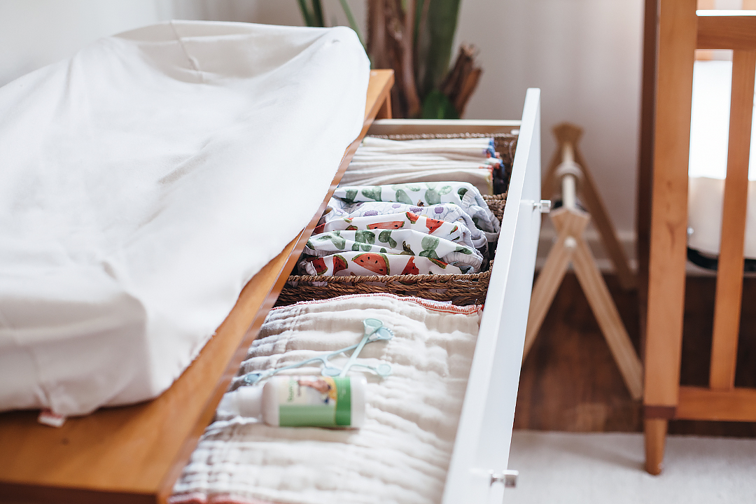
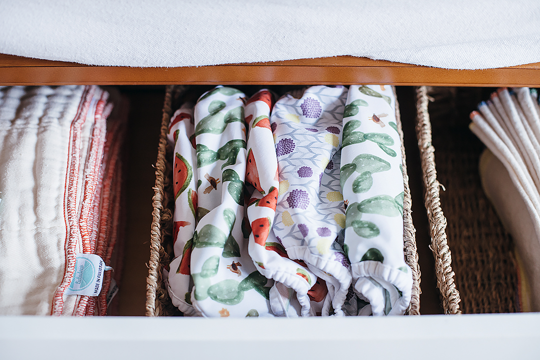
our top drawer set-up. prefolds with bum spray and clippis, covers, cloth wipes.

calivintage - cloth diapering
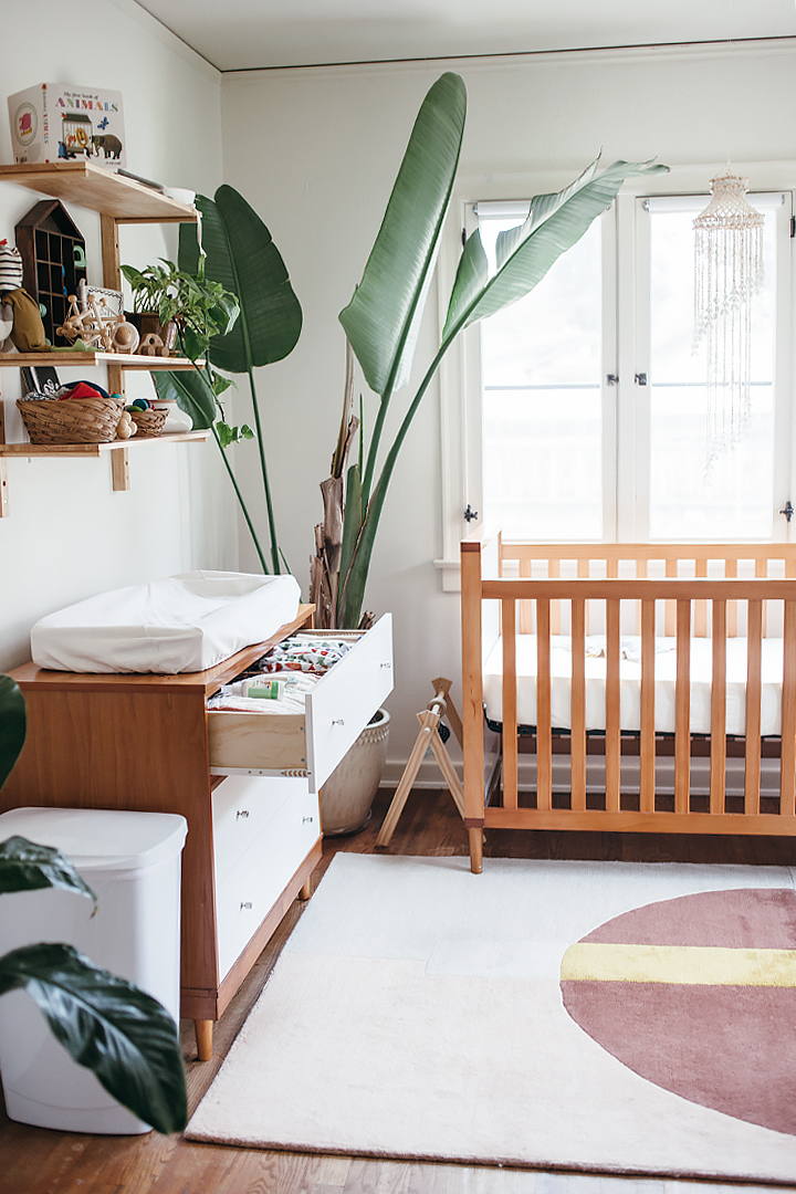
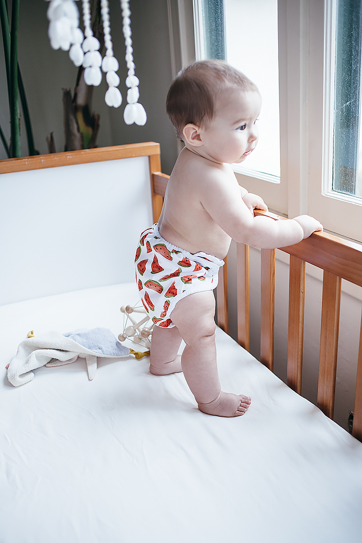
don’t worry, we lowered her crib right after taking these photos! she was 6 months in this photos, so she had literally just started standing on her own.

calivintage - cloth diapering
calivintage = cloth diapering
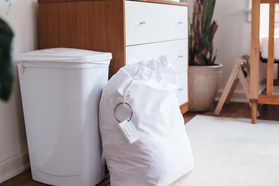
the supplies arrive in this laundry bag, and the service provides a laundry bin for the nursery.

calivintage - cloth diapering

high traffic with stainmaster

20160927_calivintage_0200

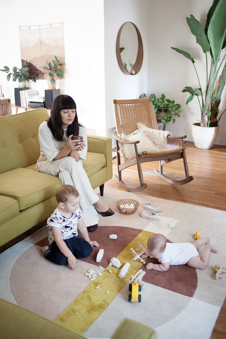
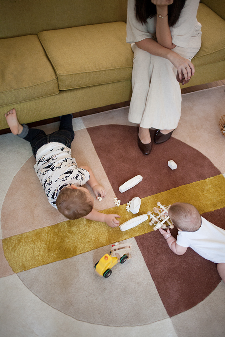
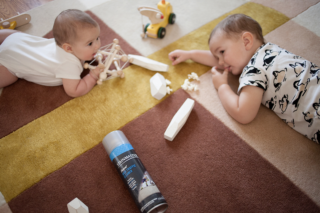
we’re just getting into the fun stage with edie! she turned 5 months old this week and is getting pretty eager to start her adventures in crawling. it will probably be another month before she’s up on all fours, but for now, she’s having a heck of a time trying! so last week, i took to the living room to make things more baby-friendly to help edie along on her adventures. because when it comes to our decor, i think of the house as a living, breathing space that changes and grows with my children. i removed the coffee table completely, and decided to get a nice plush rug for her to roll around on. i know i just got finished talking about some of my previous rug mistakes, but when i saw this plush masterpiece in light colors, i had to have it. i know it goes against all of my own advice for keeping a house with a toddler and a baby, but if ever there is a rule, i have to break it. even when it’s my own rule!

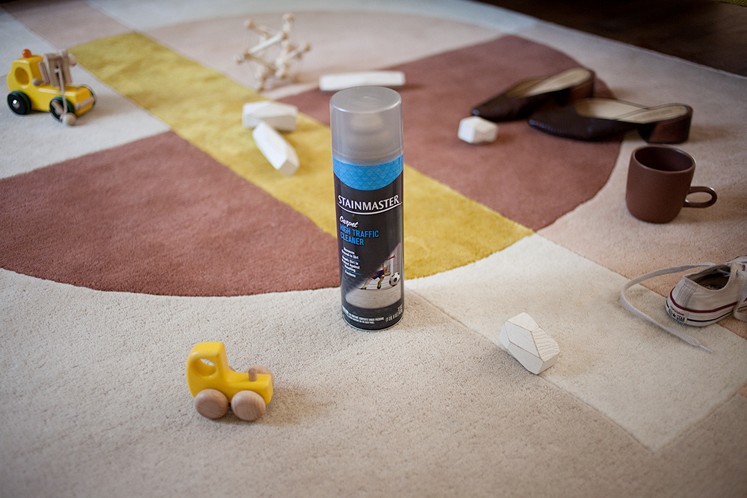
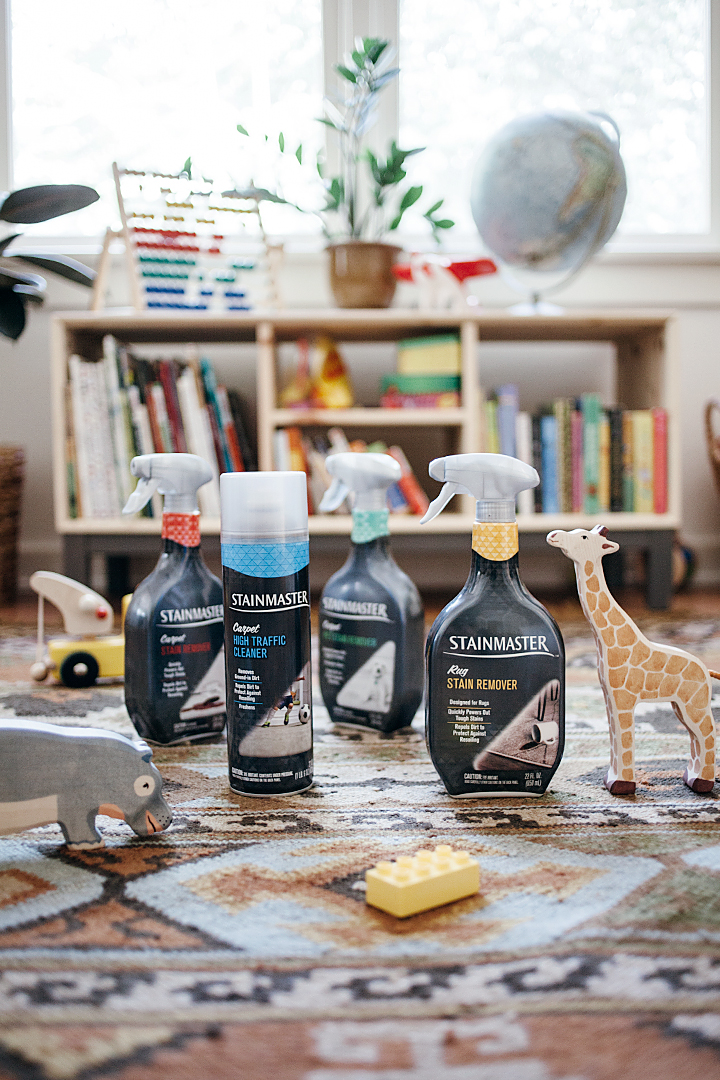
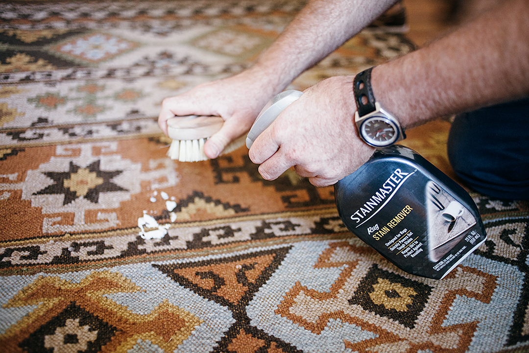
it arrived in the mail just last week and we all oohed and ahhed as i laid it down in the living room. adam started running around on it and i took off my shoes to feel the softness beneath my feet. but if you so much as look at the thing, it gets dirty, haha! the living room is a well-used space, so i know this rug is going to be experiencing some heavy traffic between adam tracking in dirt from outside, edie drooling all over the place, and a rotating cast of friends and family coming to visit the kids. thankfully, i’ve been working with my friends at stainmaster to keep my beloved rugs clean, so i pulled out my stash of stainmaster rug and carpet cleaners to see what i could do to give this rug the longest life as possible. my current favorite? the high traffic cleaner. this heavy duty foaming cleaner loosens and lifts tracked-in soil, then goes a step further by applying an invisible shield to repel dirt and protect against resoiling. all you have to do is shake the can, spray the foam from about two feet away and spread it around with a sponge or mop, then wait for the foam to dry so you can vacuum to remove loosened dirt and dry foam. i get to keep my pretty rug and the kids get to play on it without giving me a heart attack.

20160927_calivintage_0162
20160927_calivintage_0227
20160927_calivintage_0156
20160927_calivintage_0026
20160927_calivintage_0238

home improvements with the munchkin vibe gate

calivintage - munchkin vibe

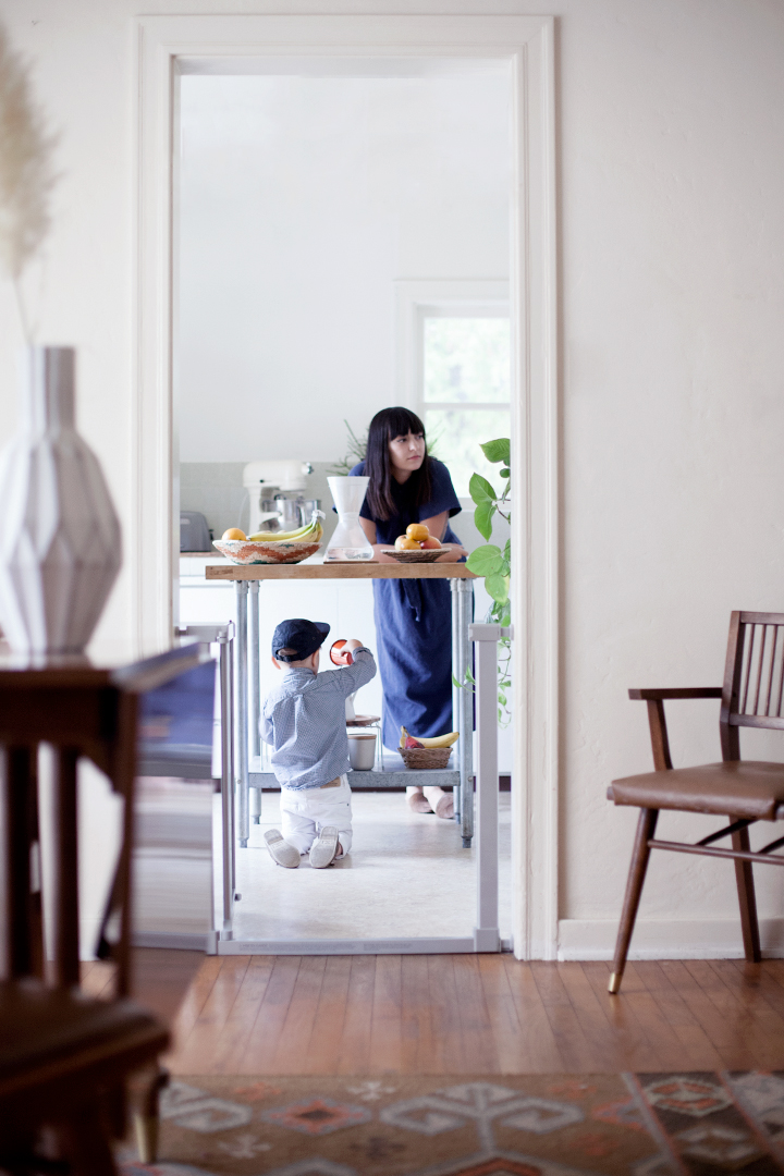
as you know, a big focus around the house lately has been in making improvements wherever we can–some large, some small. but with edie and adam to watch after, we’ve had put off some of our bigger projects until we can figure out the logistics of living through renovations. which means we’ve had to do a lot of improvising when it comes to creating a pleasant and kid-friendly space in the meantime. i’ve talked about this before, but a lot of the guiding principles in our home decor are centered around creating a montessori environment whenever possible, but as any parent will tell you, that isn’t always possible. especially when you have a half-finished kitchen that isn’t exactly toddler-proof!

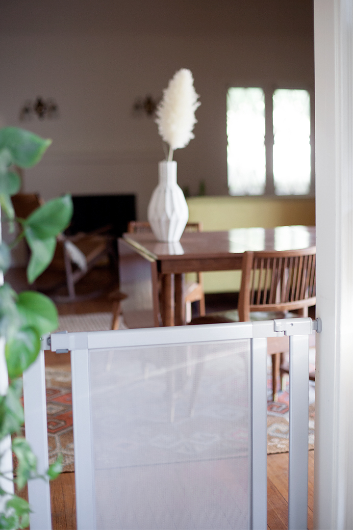
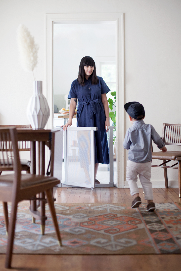
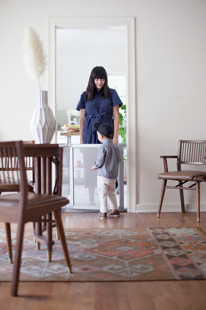
which is why we were so excited to partner with munchkin to try out the vibe gate. the idea behind the design of this sleek baby gate was to turn an everyday safety item into a beautiful addition to your home decor. and you know how much this concept speaks to me! even though we’re putting a big focus on function, it’s still really important for me to have a beautiful space that both kids and adults can enjoy together. this gate functions exactly as it should, it’s constructed out of incredibly sturdy steel and mesh with a very simple turnkey mount that literally takes a few minutes to install, and it comes in a range of 5 different colors and designs, whether you want something minimal and neutral like ours, or you want to go more bright and playful with a pink hello kitty! from the moment i opened the box, i could tell they paid attention to all of the details, from the simple packaging to the easy closing latch that clicks perfectly into place.

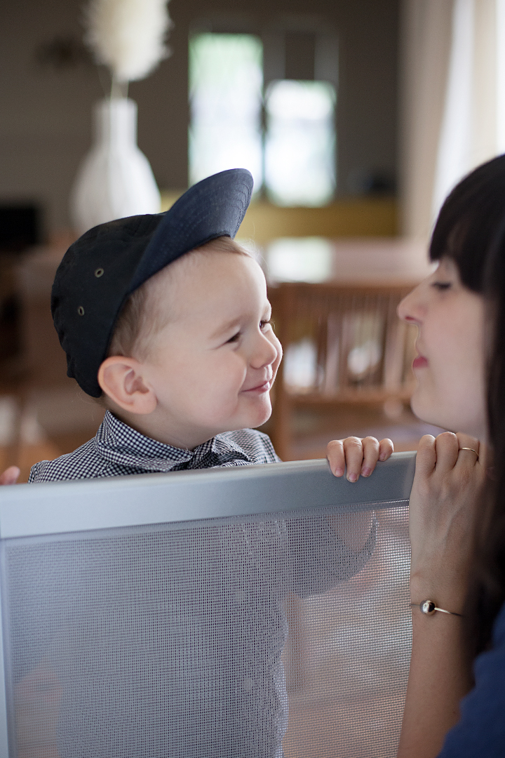
it’s taken adam a bit of getting used to, but it’s given me some peace of mind without being an eye sore. i love the way it blends in with our mid-century modern decor, and i feel so much better knowing that i don’t have to worry about my toddler sneaking in to the kitchen–or his baby sister crawling in after him!

calivintage - munchkin vibe

a nursery tour on apartment therapy!

20160815_calivintage_0033

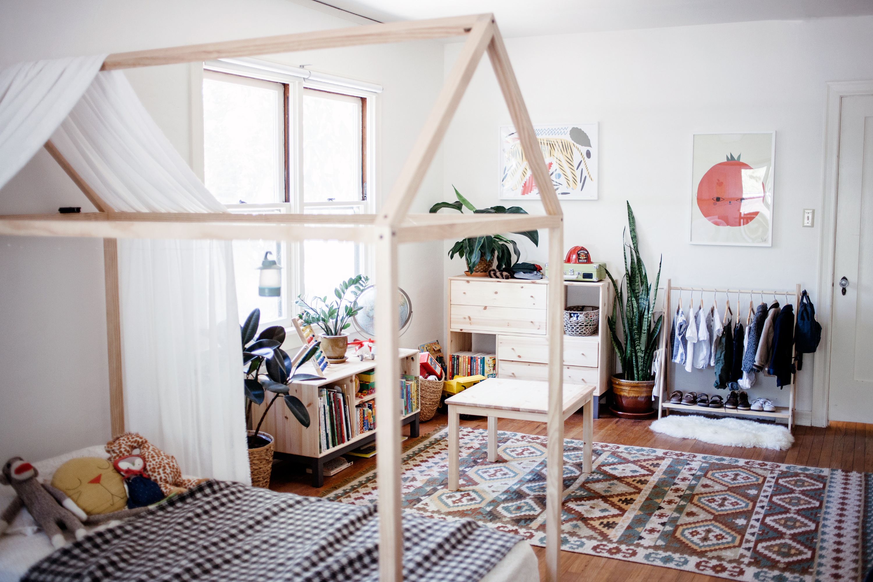
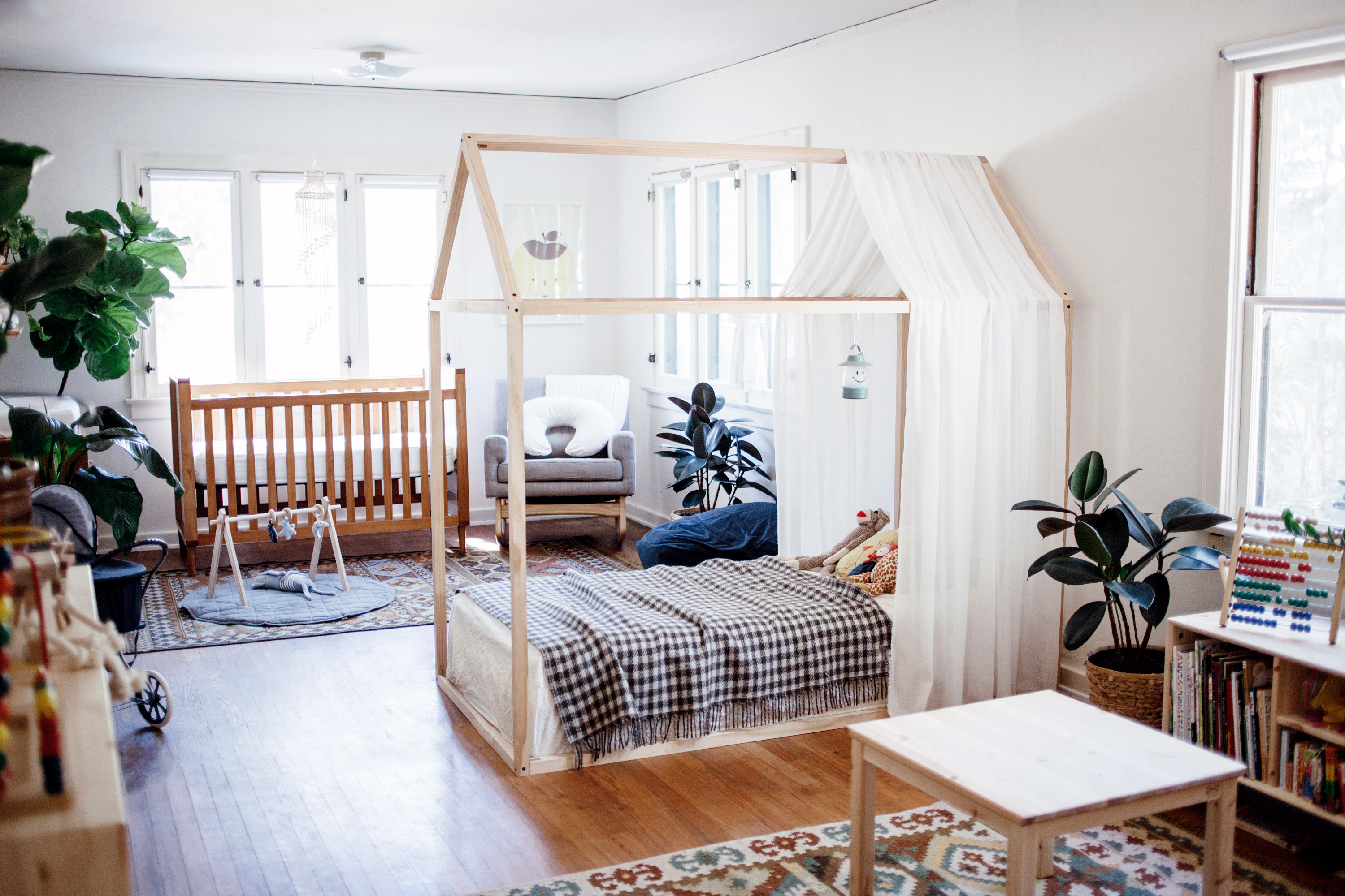
i’ve got some really exciting news to share today! first off, i recently started writing for apartment therapy! i’ve been a huge fan of the site for years, so i’m incredibly honored to be a part of the team even in a small way. and it comes at the perfect time because i’ve really become obsessed with pulling our little house together, so this is a really great outlet for all of the energy i’ve been pouring into all of our upcoming renovation projects.

which brings me to the title of this post: i was so excited when my editor asked me if i would like to share a before and after of adam and edie’s shared nursery/toddler room! i’ve been sharing more and more glimpses into the space over the past several months and while i do still plan to make some changes, this is pretty much the big reveal. i do plan to share a few more detailed posts that talk a lot more about why i chose everything in the space, but for now, you can get a look at what we’ve done. it’s funny, too, because even though i’ve been there for the whole transformation, it’s still kinda blows my mind to see the before and after shots.

20160815_calivintage_0035

don’t sweat the small stuff with stainmaster

calivintage + stainmaster carpet care

as i’m sure you know, the past couple of years have seen a lot of change around here. it’s been an adjustment getting used to life with a toddler and an infant, on top of settling into our first home together as a family. the place has really started come together decor-wise in recent months, but it hasn’t always been that way. let me tell you a little story: before adam was born, i was never really into home decor. i was into punk as a kid and as i grew older, my various apartments were mostly filled with random thrift store furniture, house plants, half-finished art projects, piles of laundry… i didn’t know a thing about lamps or rugs or accent pieces. but in those last moments before adam was born, my hormones kicked into high gear and i suddenly found myself in a nesting frenzy. i was literally rearranging furniture at 38 weeks pregnant, and in a panic because his nursery wasn’t even finished. and in my rush to get the house perfect for the baby, i made some… interesting design choices. for one, i fell in love with a very stunning (and very expensive) vintage kilim rug with a pale floral pattern. and then adam was born.

shortly after his birth, our doctor referred to him as a “happy spitter,” which was basically a polite way of saying that he was a puking machine. he didn’t have anything medically wrong with him, he wasn’t sick or suffering from reflux or anything, he just puked. a lot. within months, my entire apartment was literally covered in baby puke. and that beautiful pastel rug i was talking about? let’s just say it was a small sacrifice to pay for a happy, healthy baby. fast forward a couple of years and i’ve learned quite a few lessons about decor and housekeeping. for starters, it’s probably a good idea to choose a rug in a more forgiving color scheme and pattern, preferably something that was designed for high traffic areas and lots of messes. we swapped out our beloved vintage rug for indoor/outdoor rugs made of 100% recycled plastic bags! they look like wool, but they do a really good job of repelling dirt, so they require a lot less care than a super absorbent natural fiber. but also, there are such things as cleaners that you can use to clean up messes before they get out of hand. yeah.

enter stainmaster carpet care. we teamed up with the brand to try their line of carpet care products, which are specifically designed to treat stain-resistant, nylon, and polyester carpets and rugs like the ones we now use. they have several different formulas designed to remove tough stains while leaving behind an invisible shield to repel dirt and protect against future stains without sticky residue. those two simple solutions have totally changed the way i react to my little “mess makers” around the house. now when edie spits up or adam drops his food, i’m not stressing myself out over ruined rugs. we simply wipe it up and move one to more important things. which is exactly the type of outlook us mamas need to keep sane and enjoy these precious moments with our little ones before they’re all grown up! oh, and it doesn’t hurt when dad pitches-in and helps us clean our messes, too!

calivintage + stainmaster carpet care

dining decor

calivintage - dining decor

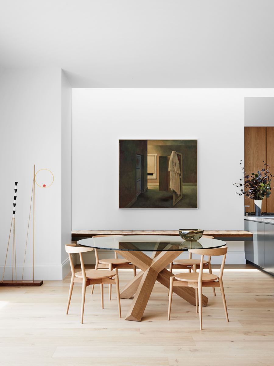
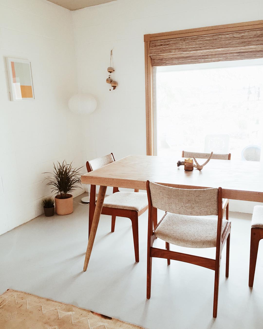
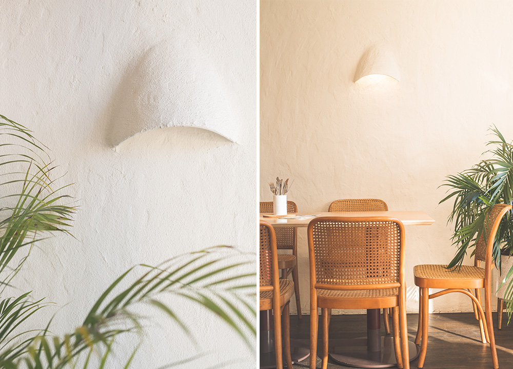
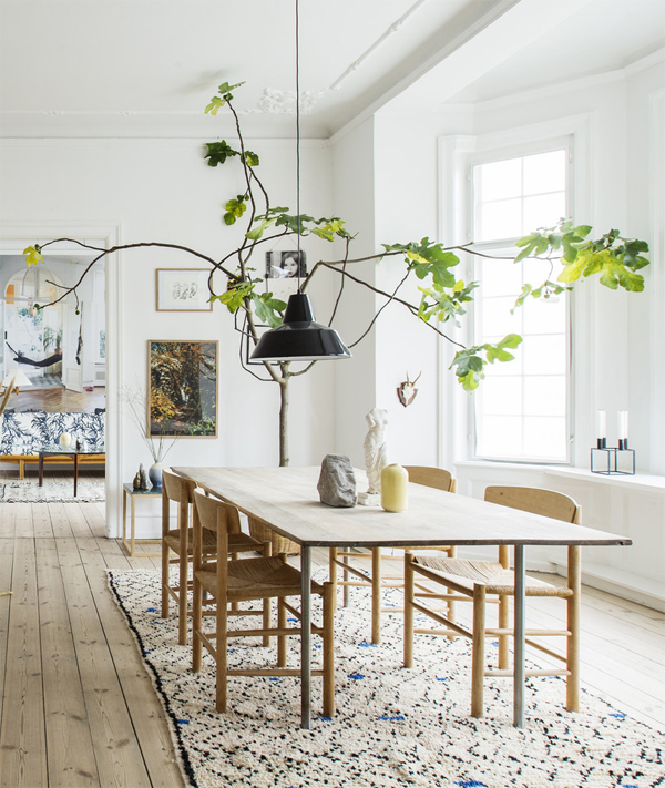
we’ve been living in our little vintage home for over a year now, and while many of the rooms have really started to take shape (with some fun renovations underway, more on that later), there is one room in the house that has been sorely neglected: the dining room. it’s a really pleasant space with sliding doors opening out onto a large patio, but there is literally just an old table with rickety chairs, a very bare bar cart, and my stereo system that i haven’t even bothered to hook up. when the entire house was in disarray, i didn’t even notice it, but now that things are coming together, it’s starting to look more sad by the minute! so of course, i’ve taken to pinterest in search of some good ideas for how to pull the space together.

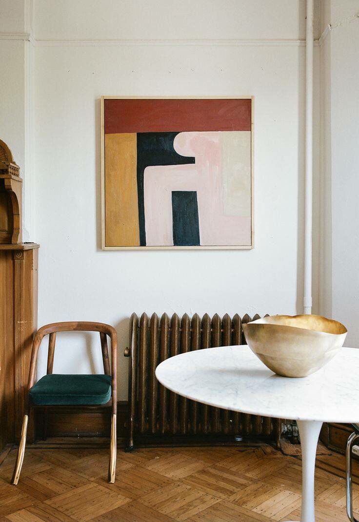
and as you can see by some of my favorite photos, i’m staring to get a pretty clear picture of what i’m looking for. minimalist, slightly artsy, with bentwood chairs, and a few large statement pieces. which is pretty much the direction i want to go in for most of the house, but i’m not trying to get too far ahead of myself! now the challenge is just trying to find some good furniture at the right price. you can find any of these as reproductions on sites like design within reach if you’re ready to spend a pretty penny. or you can scour thrift stores and flea markets if you are lucky enough to have hours and hours of free time at your disposal. or you can sit around waiting for a magic fairy to delivery them to your doorstep, right?

above: tom dixon.

calivintage - dining decor
melbourne house by robson rak via design addicts.

calivintage - dining decor
ledansla.

calivintage - dining decor
malia grace mau.

calivintage - dining decor
eat burger by amber road design.

calivintage - dining decor
another ballroom.

calivintage - dining decor
am designs.