outfit: tomboy style with levi’s

calivintage_0716

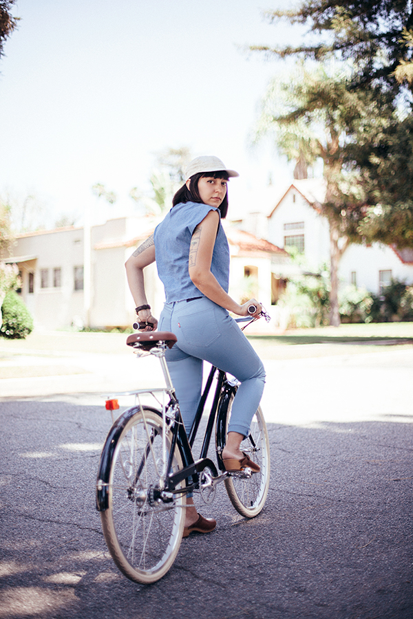
when it comes to life lately, it’s beginning to feel like all work and no play over here. so in between drying coats of paint in my house, i went for a quick bike ride around my neighborhood to get some fresh air, and to remember that my muscles can move in a direction other than that of a paint brush! and it was the perfect opportunity to swap out my paint-covered jeans to test out my new levi’s commuter skinny jeans. they’re part of their latest commuter collection, designed for cyclists, by cyclists. they’re basically a regular pair of high rise skinny jeans made with a super stretchy water-resistance performance fabric so that they are comfortable and practical to wear while cycling. they even have a little reflective strip along the inner side seam, which reveals itself when you roll up the cuffs. i really hate wearing “performance” gear unless i absolutely have to, but it’s nice to have the functionality when you’re riding around, so these are the perfect middle ground.

and as much as i love a good pair of dark denim, it was actually fun to play around with this lighter shade of cornflower blue. i’ve been experimenting a lot with mixing different shades of denim, so i tried them out with a cropped denim top and a simple pair of clogs for a tomboy vibe. it’s super casual, but i still feel like i’m retaining my sense of style, even when i’m spending more time focusing on paint colors than clothes!

wearing:
indigo jane top courtesy of loup
commuter skinny jeans courtesy of levi’s
vintage clogs
vintage linen baseball cap

willow three speed courtesy of brooklyn bicycle co.

calivintage_0611
calivintage_0663
calivintage_0598
calivintage_0687
calivintage_0693

smeg

SFD89D8A3E7F45E46F688541B92E698C9DF

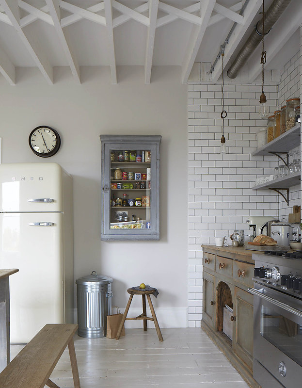
if you’ve spent any amount of time on pinterest, then you’ve probably found yourself drooling over impossible pictures of dream kitchens. i’ve been spending countless hours doing just that, because one of the larger projects that i knew i wanted to tackle in my new house was the kitchen. the house was built in 1926, but the whole kitchen was gutted and redone in 1970. at some point, i promise to share some really good “before” photos, but you can see some glimpses here: dark stained cabinets, sickly sea green tiles, and an avocado green oven! i can only assume that at one point, there was also a matching avocado refrigerator.

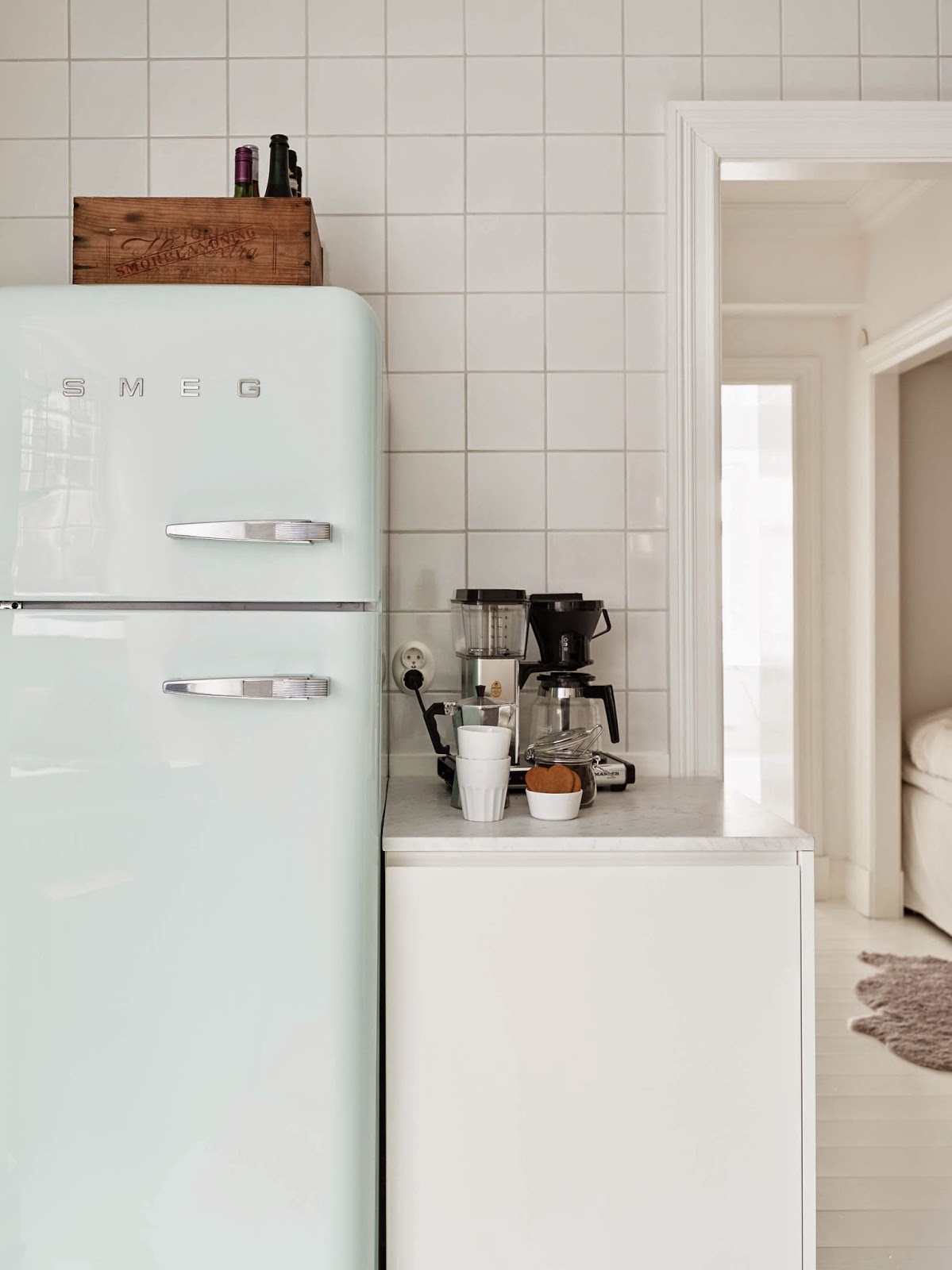
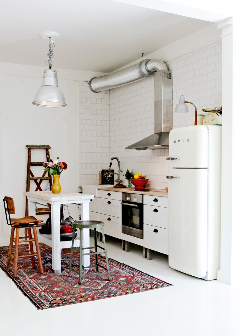
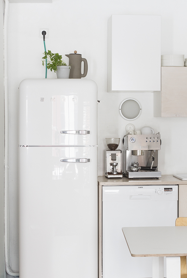
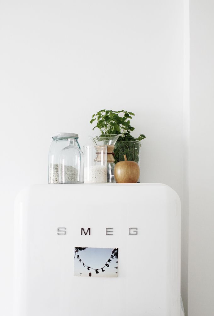
since i’m looking at my house as more of a restoration rather than a renovation, you might think that i’d be looking to go with a historically accurate 1920s-style kitchen. but if you really start to do research on kitchens of that era, you’ll see that they really don’t lend themselves to modern practicality. i think many people still had wood burning stoves and ice boxes! so instead, i’m going to be mixing and matching vintage elements for a space that will be modern and vintage all at once. think white painted wood cabinets with crystal door pulls, a butcher block countertop, subway tiles, a farm sink, perhaps a fancy chef’s range. i know, it might all sound way too cliche, but it’s the space i dream about creating… complete with a smeg refrigerator!

i’m sure you’ve seen it. it’s a total mid century style (but this many years later, i think we can just call it a classic). and despite a few giggles after seeing the name of the brand (did you know that it’s an acronym for smalterie metallurgiche emiliane guastalla?), i have to say, i’ve got my heart set on smeg.

image above: stadshem

HR_Utan-namn0002848
elle sweden

dadaa_smeg_2
my scandinavian home

jan2613-11
paul massey

63df8aa6bc70f07f1cb46a9d179b328b
varpunen

mid century wardrobe

freunde-von-freunden-tatjana-sprick-2835

a couple of months back, i started browsing craigslist on a whim. i’d always wanted a vanity in my bedroom, so i could perch at the mirror in the mornings to get ready, perhaps while glamorously wearing a robe. and as luck would have it, the very first search result was for the perfect little mid century vanity. i was actually surprised to find one from that particular era, since i’d figured such things had gone out of style by the 1950s, but lo and behold there it was in all of it’s sleek, modern splendor. it was being sold individually or as part of a set with two matching wardrobes. i wasn’t in the market for such a thing, so i hopped in the car to pick up my little dresser and called it a day. but don’t it always seem to go, that you don’t know what you’ve got till it’s gone? joni mitchell had it right. i almost instantly regretted that i didn’t buy the whole set, and now i can’t stop obsessing over finding one. the only catch is that by the 1950s, people definitely had closets and weren’t in the habit of keeping their clothes in giant wooden boxes. leave it to me to set my sights on some totally random piece of furniture that turns out to be rare and hard-to-find.

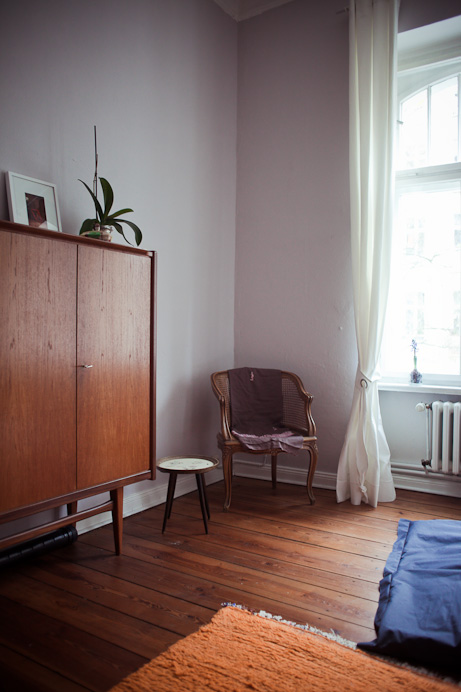
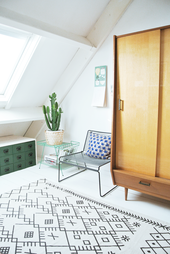
so while i scour craigslist and the local green sheet, here are a few inspirational images that are keeping me motivated to find my perfect wardrobe.

image above via freuden von freuden.

Wardrobe
adrian and simon

DSC_8594
my attic

c79a5524f9d09043c4af754ee2f76b08
post-patternism

outfit: outdoor inspiration, pt. 2

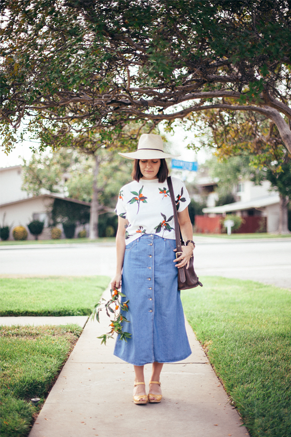
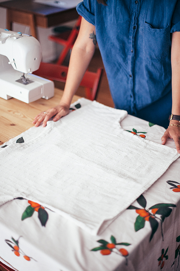
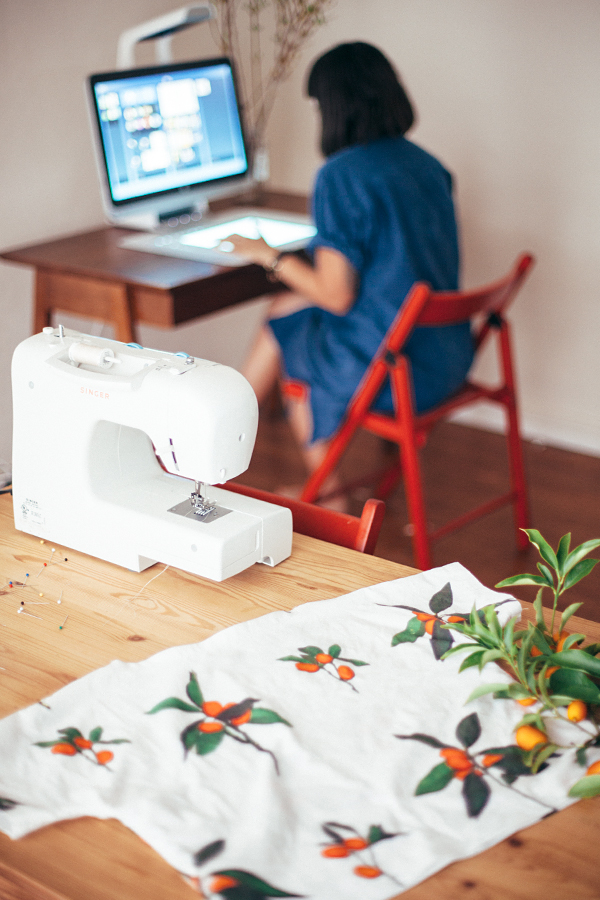
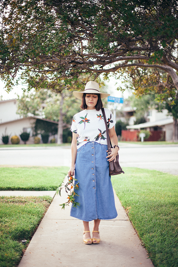
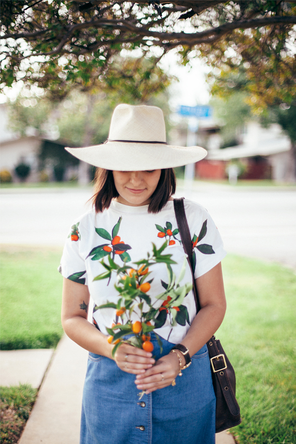
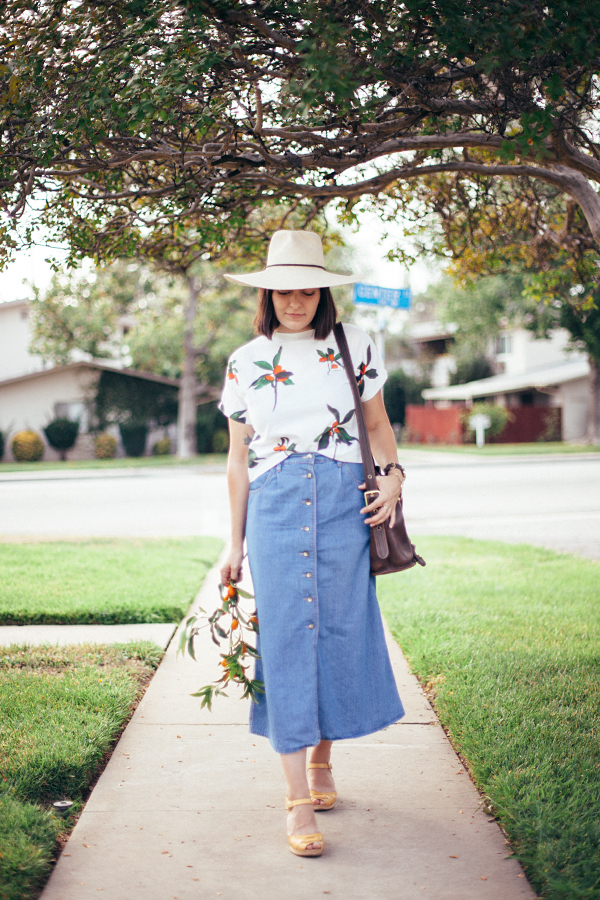
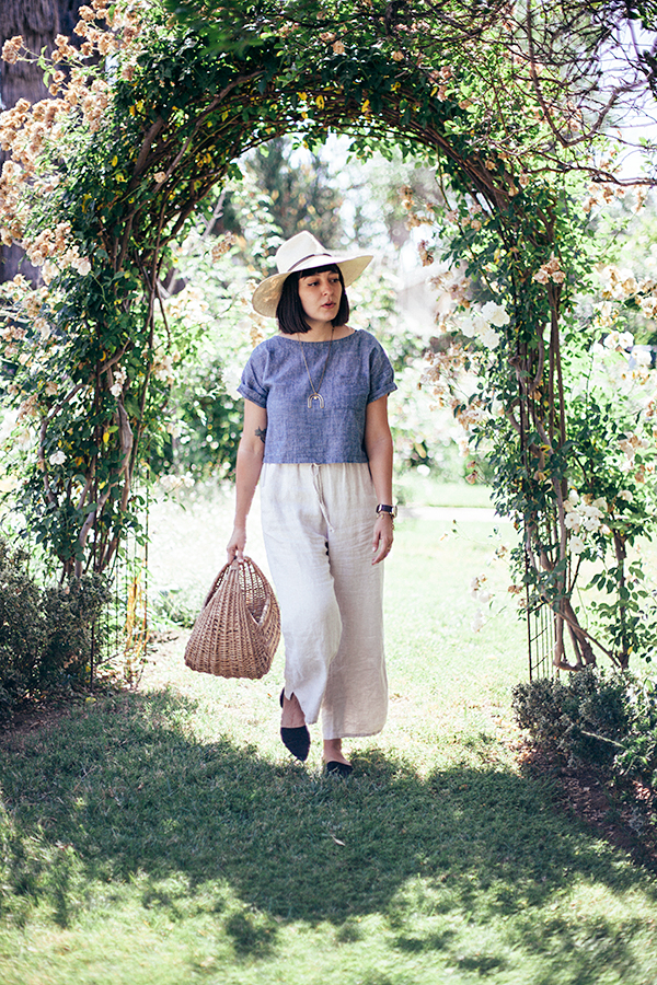
the time has finally come for me to reveal the final result of my recent project in collaboration with hp sprout! you can read this post to see the first part of the process, but i’ll also catch you up to speed right here. after playing around with the capture app, i chose a few different scans of bright orange kumquat branches to create a custom fabric for my very own shirt design. i uploaded my design to spoonflower, and in a couple of weeks my custom-printed fabric arrived, and i was ready to start sewing! i’m not much of a seamstress, so after doing a bit of research online, i decided to simply trace the pattern of a very simple top i already owned to use as my guide. it was literally two pieces of fabric sewn together and took all of 10 minutes to complete. but what really brought it to life was the bright  and cheerful pattern.

it was a really fun process to go from picking flowers in the garden, to designing my own custom print using sprout, and creating a finished product. i would never have even considered taking on a project like this, but with the sprout, i managed to create something in only a matter of hours.

wearing:
self-made top using fabric designed with my hp sprout
vintage denim skirt
brookes boswell wakefield hat in panama straw
vintage coach bucket bag
swedish hasbeens peep toe high
shinola runwell watch
gillian steinhardt right hand charm bracelet


summertime

calivintage_0127

they say that memorial day marks the first unofficial day of summer. we’ve had a couple weeks of unseasonably gloomy weather so far, but the sun has finally decided to come out and play. so of course, we’re celebrating with a tiny kiddie pool in the backyard. i haven’t had a backyard since i was a kid living at home, so it’s been a fun realization that i can just step out into my own little area when the weather is nice. adam is obsessed with his pool and usually makes a beeline for the hose every time we go out, requesting, “awa awa awa.” (we taught him agua instead of water.) i foresee a lot of this in our future.

my happy place

Processed with VSCOcam with a6 preset

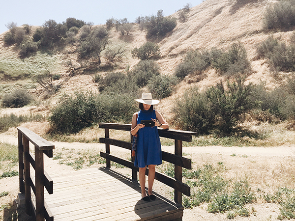
you may remember a couple of months back, i teamed up with hp to share a glimpse at how i’m able to work remotely utilizing mobile technology. well, for their latest campaign, they decided to expand upon the concept and encouraged a group of bloggers to share how we work from our ultimate happy places. at the time, i’d been spending a lot of time getting sun and snapping photos at the park. when i’m feeling overwhelmed, i pack myself a little picnic and head out for a leisurely hike and a bite to eat before diving in to a busy week. it gives me a chance to clear my head and get the fresh air that i need to tackle my countless jobs, and it’s a great place to take adam so he can run free and explore nature. but not so far off the beaten track that i can’t stay connected using my hp stream 8 tablet.

they just released the video, and it’s so much fun to catch a glimpse of my own happy place among so many other varied worplaces. it’s really inspiring to see the way others work, and a good reminder to myself to turn those dreamy aspirations into a reality in my own life. if you could work from anywhere, where would you go?

Processed with VSCOcam with a6 preset Processed with VSCOcam with a6 preset Processed with VSCOcam with a6 preset Processed with VSCOcam with a6 preset

this post was created in collaboration with hp. thank you so much for supporting the sponsors that make this blog possible.


work in progress

after yesterday’s quick decor post, i realized that i hadn’t caught you up to speed on where we are with the house! we’ve just been settling in and slowly unpacking for the most part, but i thought it might be fun to share some of the “before” photos of the house in the week prior to moving in! as i’ve shared before, the house was built in 1926 with one major renovation done in 1970. it’s got tons of vintage features like crystal door knobs, the original hex tiles in the bathroom, and beautiful vintage windows throughout. i was immediately drawn to it because it had not been updated with the standard builders grade cabinets or granite countertops, and it still maintained a lot of it’s original integrity. something that i could renovate to fit my tastes and restore to it’s original vintage charm.

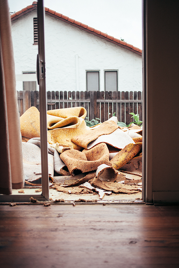
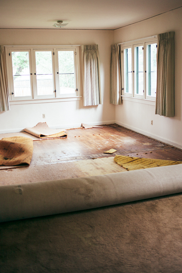
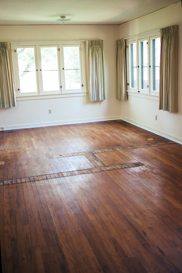
our first task? ripping out the terrible brown wall-to-wall carpeting that was covering the original hardwood floors. we knew there were wood floors under there, but it was a mystery as to what kind of condition they were in! i had been itching to get in there and pull it all up the entire time we were in escrow, and i can’t tell you how satisfying it was to finally get rid of that stuff! fortunately for us, the floors were in pretty decent condition, so we were able to move in. unfortunately, they’re still going to need to be refinished!


the moment of truth. pulling up the first corner of carpeting to reveal the floors underneath.


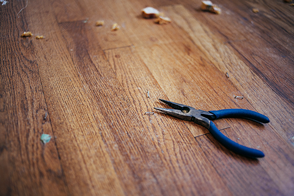
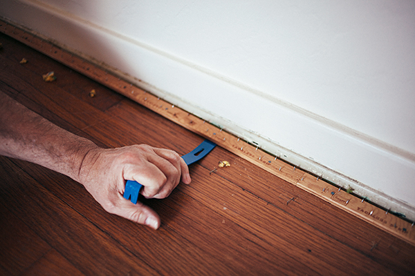
my hands were sore for days after pulling out every single staple from the floors with a pair of pliers. it seemed as though there were thousands!


i was most concerned about adam’s bedroom because even before we pulled out the carpeting, i could tell that a wall had been removed between the original room and a service porch. fortunately, the wood floors ran all the way through the room, but it definitely needs to be refinished along the area where the walls and closets had been. there were also a few holes where there had previously been hot and cold water pipes and what appears to have been a water closet! kinda gross, but it cleaned up pretty well, and i’ve covered it up with rugs in the meantime. also note those heavy seafoam green drapes straight from 1970! imagine this room after they set it up that year, complete with green shag carpet!


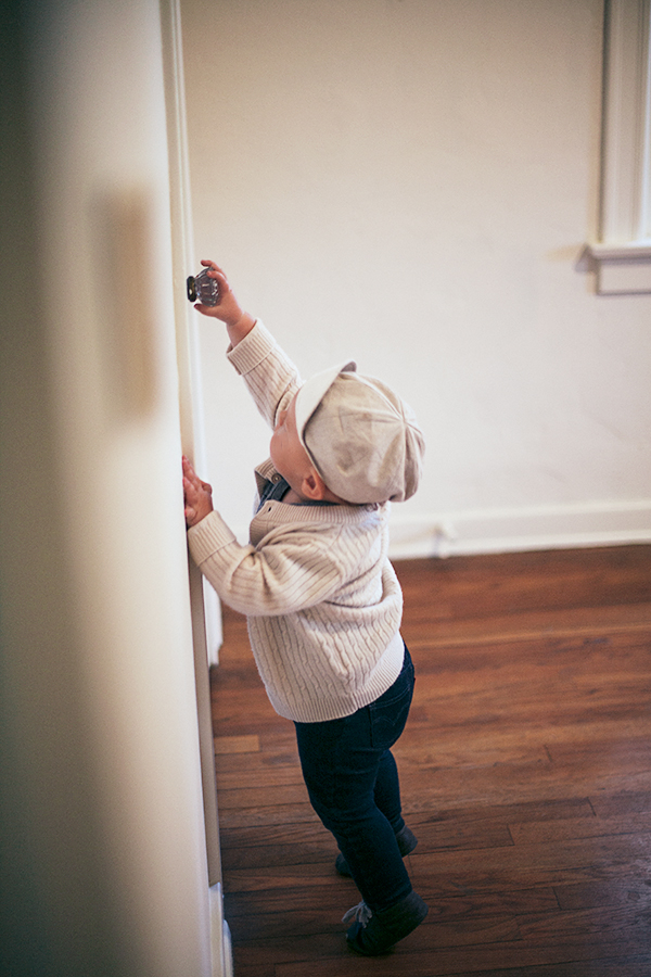
those vintage crystal door knobs are my favorite!


5 simple summer decor ideas

calivintage_0103

well, we finally did it! we moved into our little dream house. now we can just lay back and relax, right?  yeah, right after we unpack the piles of boxes and get to work on refinishing the wood floors, getting a new electrical panel, painting all of the kitchen cabinets… the list goes on! but just because we’ve got a big job ahead of us, doesn’t mean we can’t do simple little things around the house to brighten the mood. in fact, it’s pretty much a requirement when everything else is in disarray. so when glade challenged me to come up with 5 simple home decor tips for the summer season, it was just the kick in the butt i needed to spruce things up around this place while things get back to normal.

so without further adieu, here’s my list of 5 quick (and inexpensive) fixes around the house that have already made a major difference in welcoming the summer season, and helping to brighten up our little work-in-progress.

calivintage_0114

1. arrange items by color. this is a really simple decor idea that utilizes objects you already have in your home. change things up by reorganizing all of the books on your shelf by color instead of title. or go to the baby’s room and pick out a selection of toys in one color to highlight on a shelf or ledge. you can even rearrange the cosmetics on your vanity for a quick visual refresh. the fun with this one is that you can pick and choose which color to work with as the seasons change. i’m especially smitten with yellows and oranges for the warm summer months.
calivintage_0125

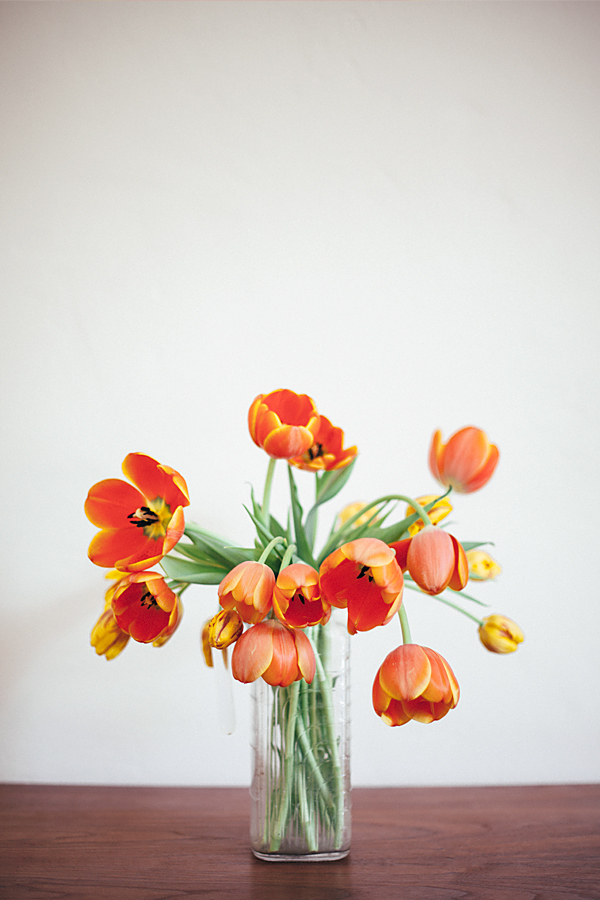
2. fresh flowers. probably one of my favorite cheap tricks for livening up the house is to run to the farmer’s market on saturday mornings to buy a few bunches of fresh flowers. these yellow and orange tulips are an instant mood lift and make me feel so much more happy in my home, even if the rest of the place is a disaster zone while we unpack all of the boxes!
calivintage_0096

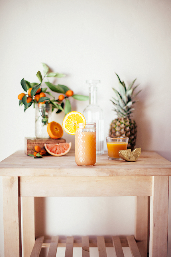
3. fresh fruit. it’s easy to add a few pops of color with seasonal blooms, but don’t forget the possibilities sitting right in your own kitchen! think outside the box (or kitchen, as it were) and slice a few citrus fruits to use as a centerpiece on the table or as an accent on the bar cart when guests come to visit. not only does fresh fruit add a cheerful ambience, but it smells delicious, and won’t go to waste. greyhounds, anyone?
calivintage_0084

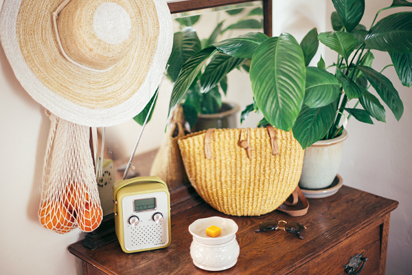
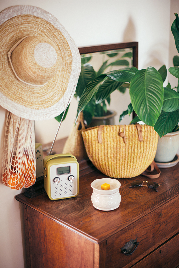
4. decorate with seasonal accessories. summer is quickly approaching, and all i can think about are lazy days spent lounging by the lake. with a laundry list of things to do and a toddler running around, i sometimes forget to take a step back and live a little! i gathered up some of my beach-going accessories that i already had in my closet and arranged them at the foyer, all ready for an impromptu trip to the lake. it creates a carefree ambience that really lightens the mood as you enter the house. and hey, you never know when the occasion might present itself!
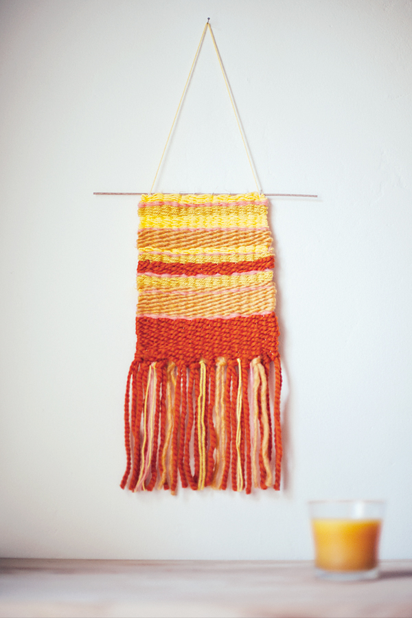
5. add texture. i’ve been spotting lots of pretty woven wall-hangings on pinterest lately, so i decided to give one a try. i made this simple little textile in just a couple of hours, and it’s already made a big impact. i tend to be a bit reserved when it comes to the decor in my home, so this quick little tapestry was an easy, no-commitment way for me to step outside of my comfort zone and test drive a different color.

this post was created in partnership with glade and was inspired by their limited edition scent, soak it in summer swim. thank you for supporting the sponsors that make this blog possible.
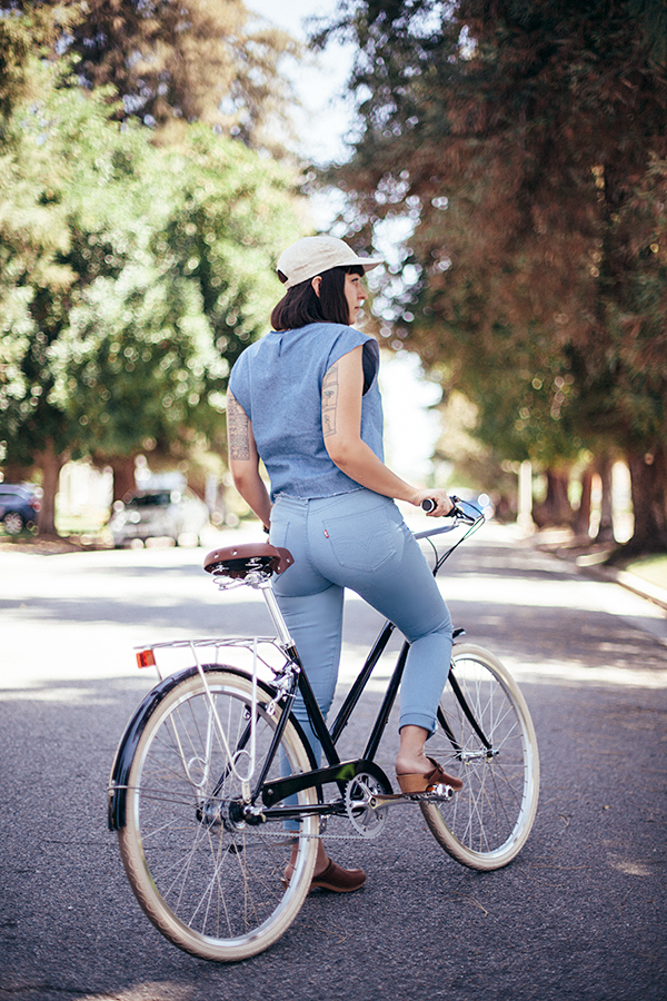
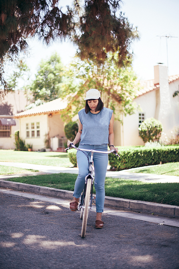
outfit: outdoor inspiration

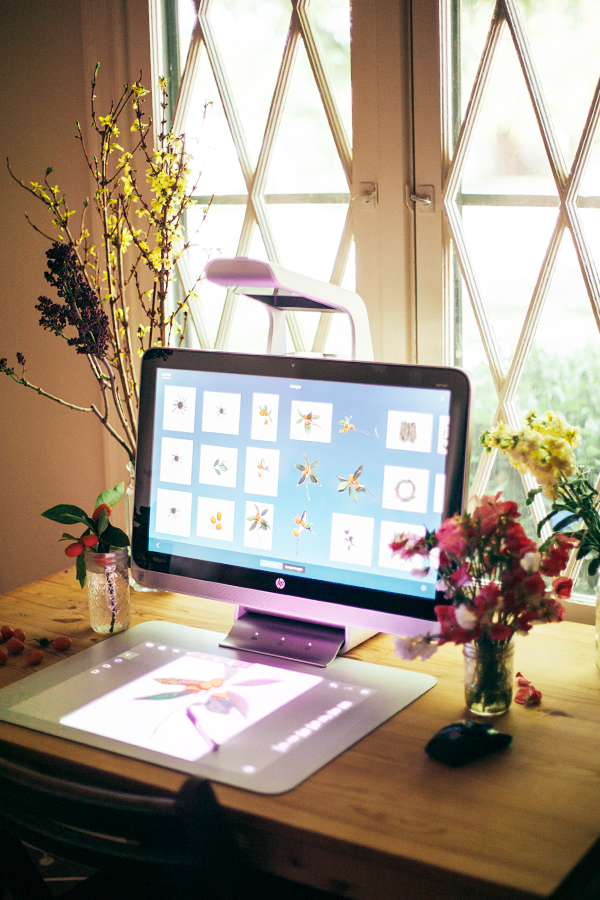
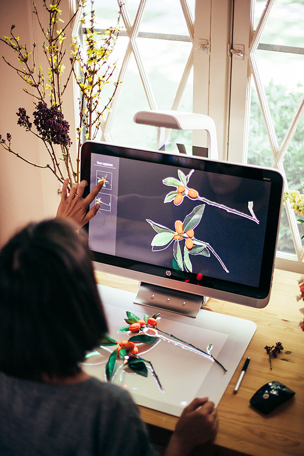
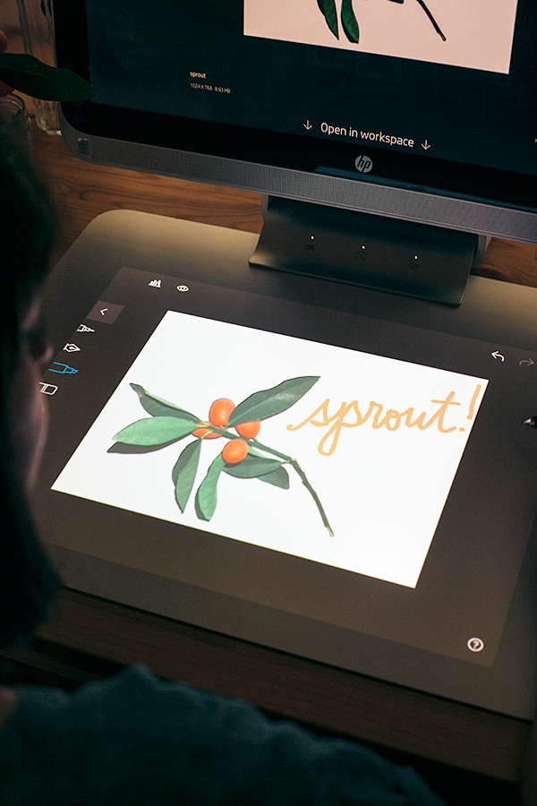
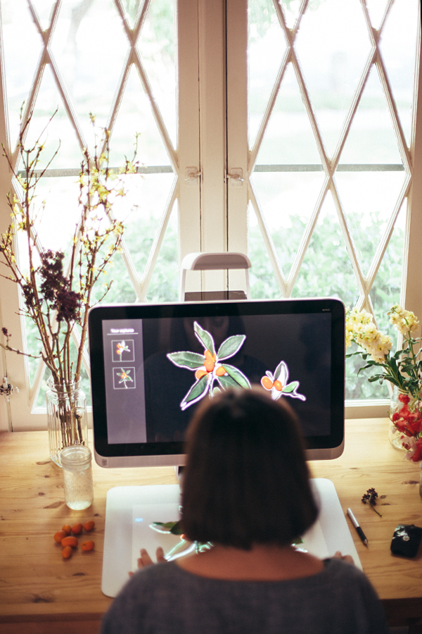
after all of the upheaval of moving into our new place over the last couple of weeks, i’m finally starting to settle back into a normal routine. there’s still tons of work left to do, but i try to make a little bit of time to work on creative projects to keep myself sane. so when hp sent me the new sprout and challenged me to create something with this new technology, i was more than ready for the opportunity to get creative. this new all-in-one computer combines a regular pc with a 3d camera, a touch mat, and a touch screen, transforming your desk’s surface into a digital-physical workspace. being the very hands-on person that i am, i was pretty excited to give it a try. so after brainstorming a bit, i decided to bring some of the outdoors in, and i headed out to my aunt’s garden to forage for natural objects to scan into the computer. you simply place on object on the touch mat, and the computer scans your image so you can start creating.

at first, i was a little overwhelmed with all of the possibilities. you can use the images to create greetings or invites, you can scan in fabric swatches to create moodboards for interior design, or you can create digital scrapbooks with photos and small objects. the possibilities are limitless, so i really had to reign myself in for my first project. but after playing around with some of the foliage, i decided to create my very own custom print for fabric! it’s something i’ve always wanted to do, but always seemed a bit too complicated before now. i just sent my pattern out to be printed using spoonflower, and should expect the fabric to arrive in the next couple of weeks, so stay tuned for part two of my project very soon!


the post was created in partnership with sprout! thank you for supporting the sponsors that make this blog possible.

this old house

remember when i wrote that very heartfelt post about how we missed out on our little vintage dream house? well, i have never been happier to say that i was wrong. we got the house! 

back when i wrote that post, i really truly thought it wasn’t ours. it had been a month since our offer was rejected without the opportunity to counter-offer. the sign in front had been taken down, and i’d finally let go of that little glimmer of hope that it could somehow be ours. i figured we would go through a few more “losses” before we finally found a place to call home. but the real estate gods must have been looking down on us, because about a week later, we got word that the sale had indeed fallen through. our real estate agent, rita shaw, rushed to the listing agent’s office right as the sellers were looking through the other offers. she negotiated with them and they accepted our offer right on the spot! i was in so much shock, i was afraid to share the news lest i be premature in my announcement once again. but a little over a month later, the house is truly ours.

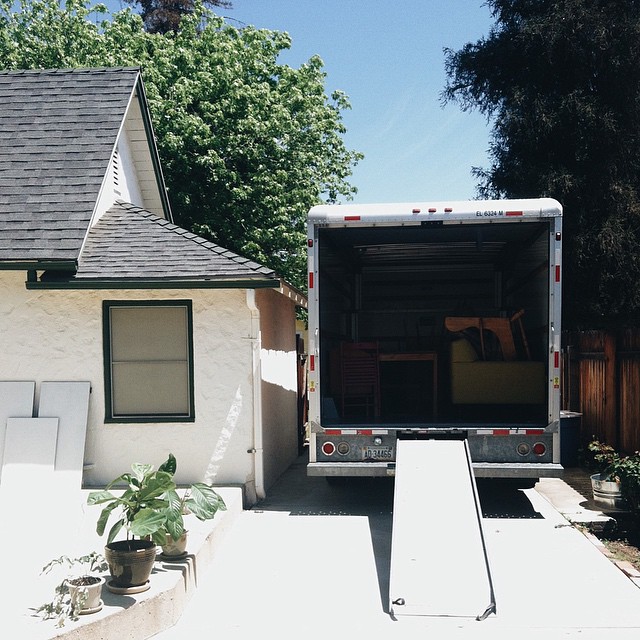
so to bring you up to speed since my last post, we’ve finally closed escrow and moved in just yesterday. prior to that, we got a home inspection and an appraisal, signed and submitted what seemed like an endless stream of papers, got approval on the loan, paid the down payment, and officially got the keys to our new home on friday. but even though we kinda breezed past the house hunting phase, the journey has really only just begun. it’s not what you would call a fixer, but it is a house that we bought with the hopes of making renovations here and there to truly make it our own. it was built in 1926, so the idea is to restore it back to it’s original charm. and of course, in true blogger form, i will be sharing the entire process with you all once i get my office set up with an internet connection. in the meantime, i’ll be sharing little glimpses of what we’ve been up to on instagram. so expect to see more updates in this space very soon!


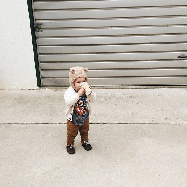
adam drinking his morning cup of “coffee” before the big day.


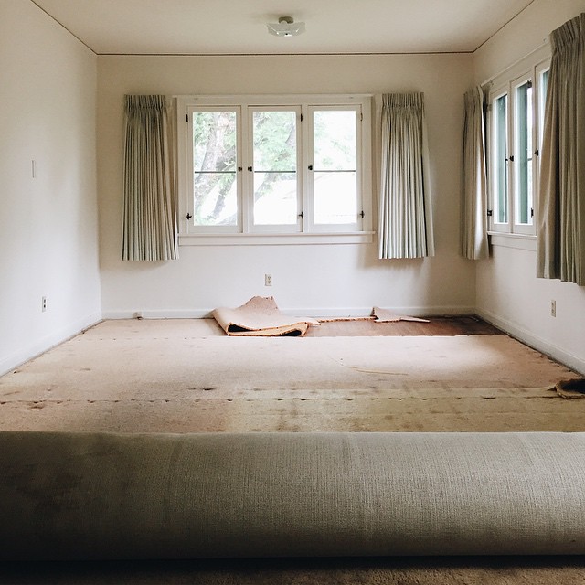
getting the first glimpse of the original 1926 hardwood floors beneath the ancient wall-to-wall carpeting. and check out those mint green drapes, straight from the only renovation to the house that took place in 1970. at least according to the permit records!


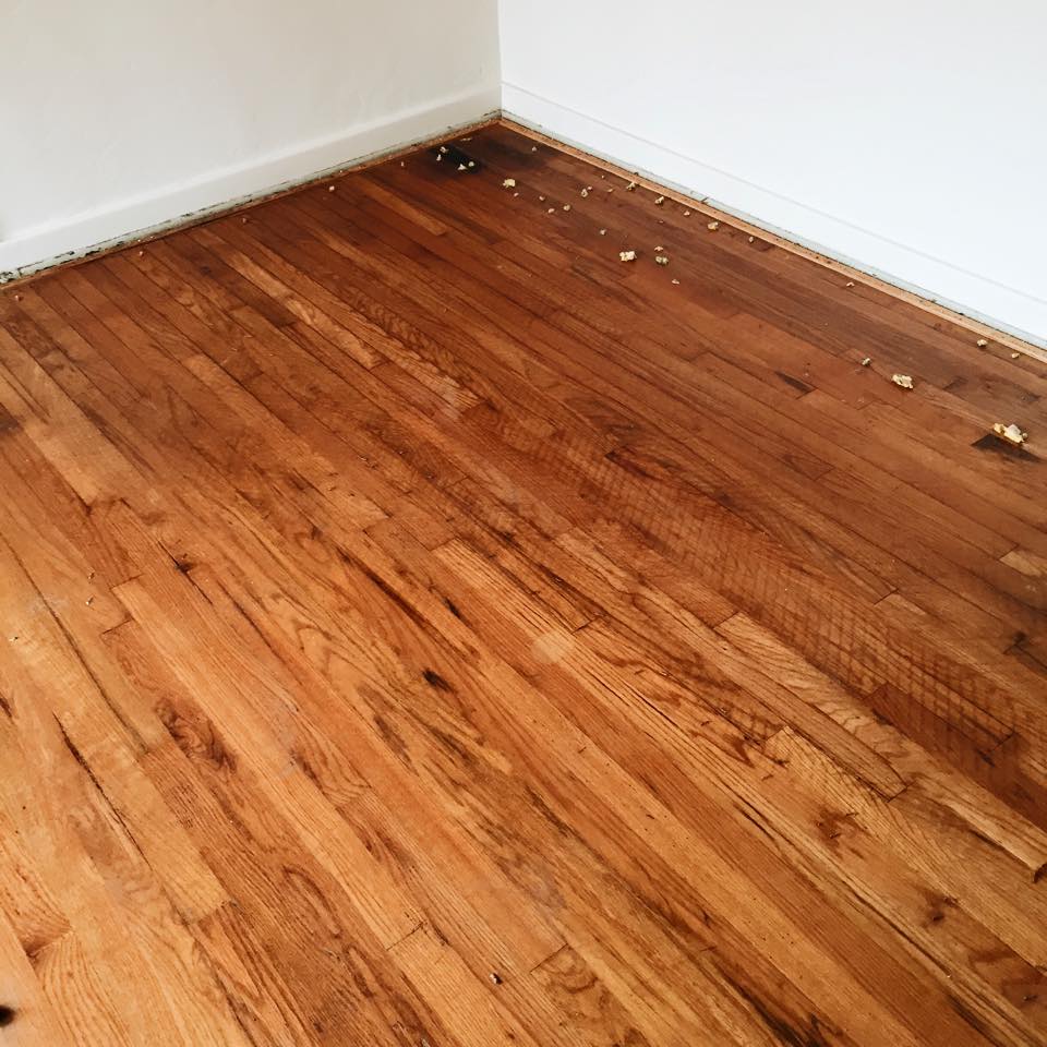
we spent hours and hours pulling up each and every staple from these floors. the wood is beautiful and it’s totally livable in the meantime, but we’re already looking into getting them refinished. one cool discovery was that even the kitchen has wood flooring beneath the vinyl tiles and subfloor.


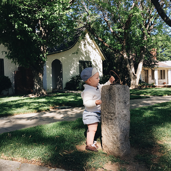
not sure what the story is here, but we have an old horse hitch out front!