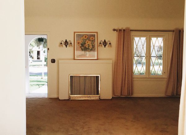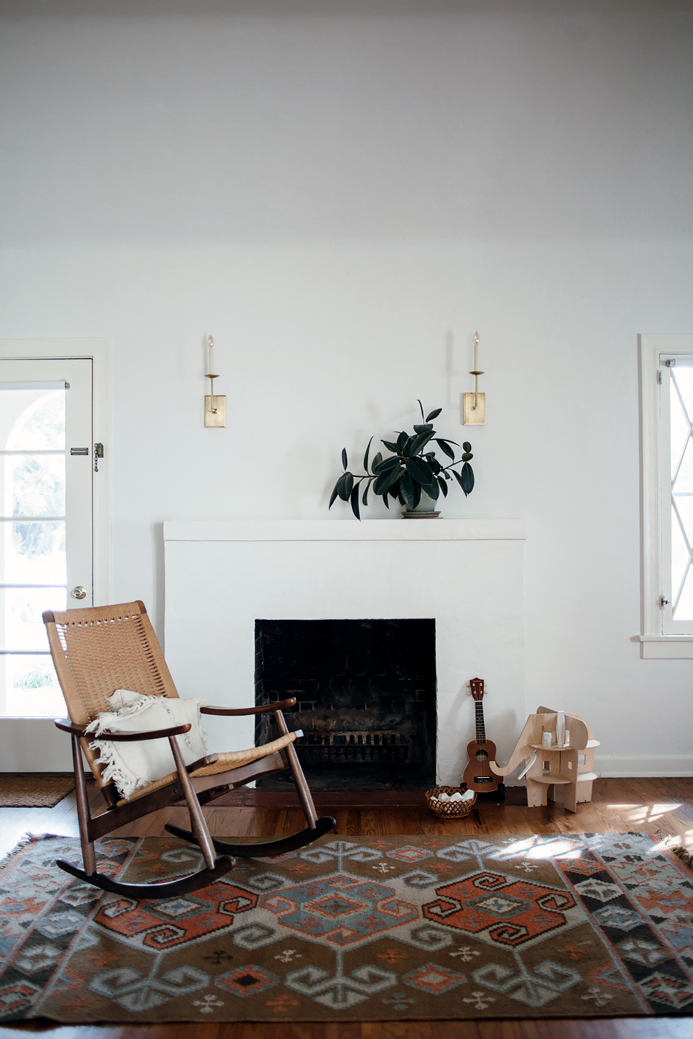
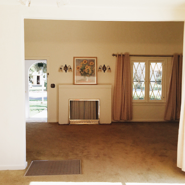
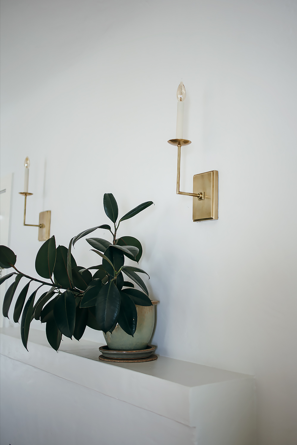
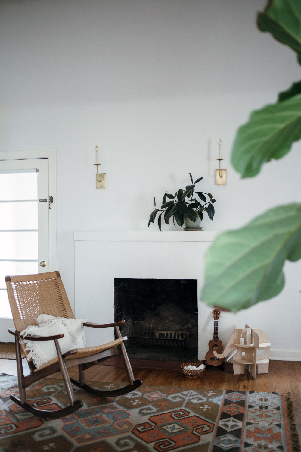
another little space in our house is coming together! i never say a project is “finished” because there are always improvements to be made, but i’m feeling pretty good about this transformation. if you take a quick scroll past the text, you’ll see what i mean. that photo down there is what it looked like the day we moved in. dirty brown carpet, heavy drapes, cheesy sconces, hotel room artwork. the fireplace was boarded up with a really hideous screen leaning up against it. when it was on the market, i’m sure some people took one look at this living room and turned right around, but i knew that it was just a matter of cosmetics. all it really took was a couple of days work. we peeled away that dirty carpet to reveal the original 1920s hardwood floors, we switched out the light fixtures, added our own decor, and slapped on a fresh coat of paint.
and today i’ve teamed up with true value to share my experience choosing the perfect shades of white for your home. but before i go too far on the subject, i do need to preface this by saying that it is nearly impossible to photograph white and get an accurate depiction. i tried to get as close of an approximation as possible with these photos, but the only way for you to truly see what these colors look like is to get some samples and paint your walls! it even took me a few different tries mixing different shades of white to land on something that i really loved. so if you’re on the hunt, i’ve done a little bit of the legwork for you.
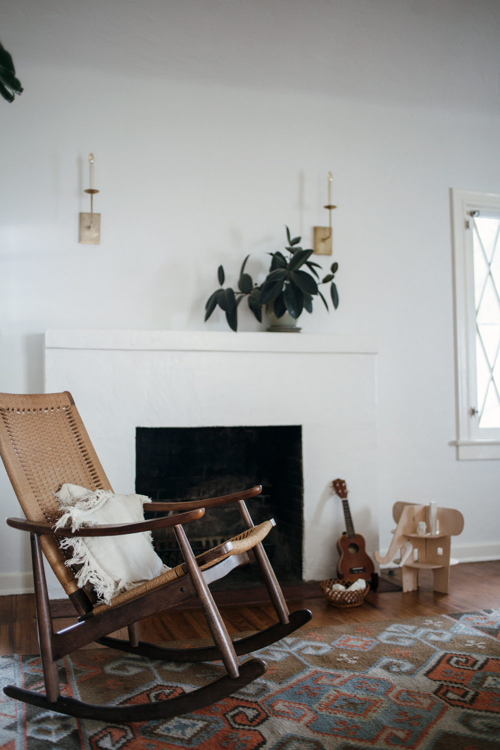
the walls are my absolute favorite shade of white. it is the true value easy care ultra premium flat interior in swiss coffee. the color was actually first recommended to me by my house painter and it is a standard shade that it available though many different brands. but it is still a standout choice and my personal favorite for my home. it’s a really great neutral white that isn’t too stark and clinical or too dark and yellow. it gives you that perfect scandinavian vibe– a nice soft white that serves as a clean backdrop for your decor. if you’ve ever had trouble with whites looking too blue or too dingy, then this color will be like a breath of fresh air.
it’s not as noticeable in the photos, but for the trim, i went with a slightly warmer shade of white– true value easy care ultra premium satin interior in sand dollar. i was going for more of a traditional look with this choice because i think it goes well with my 1920s home. i like it because it’s a nice creamy vanilla shade that helps to give just a little bit of dimension and depth without jumping out at you or competing with the decor. it just looks like it belongs. i actually had to go through quite a few different shades to land on this one, so i’ll share what i learned: look at the undertones of the shade you’re using! i was just plucking colors from the samples that i thought looked nice. but when i got home, they were either too pink or too yellow. i finally figured out that you can actually look at the undertones of the color formula as a guide to help you find a complimentary color. i took a look at the neutral undertones of swiss coffee and it helped steer me in the direction of the right shade to warm things up just a tad.
then it was just a matter of painting! this was the first time i’ve tried true value paints and i was really impressed with how viscous the formulas are. the ultra premium line just came out, and it is a paint and primer in one, so you can literally just slap on a coat or two and you’re done.
details: true value easy care ultra premium flat interior in swiss coffee on the walls and satin interior in sand dollar on the trim, visual comfort right angle sconces in hand rubbed antique brass, rock & pebble ele villa, areawear balancing blocks, vintage rocking chair and throw pillows, kosas home cosuma indoor outdoor kilim rug


This is a sponsored conversation written by me on behalf of True Value. The opinions and text are all mine.

